
Uploaded by
robert
5 SLIDES
190 VUES
50LIKES
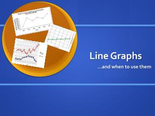
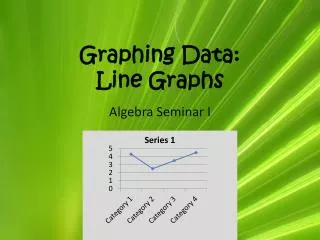
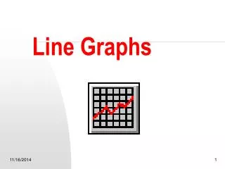
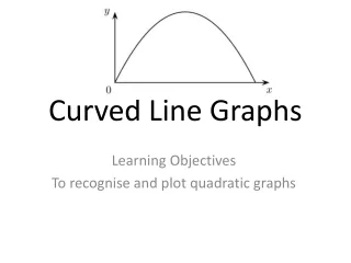
Line Graphs
DESCRIPTION
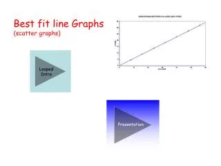
Line graphs are essential tools for comparing quantitative data across one or more categories over a specified time frame. They effectively illustrate trends by plotting data points on a Cartesian plane, where the x-axis represents time, and the y-axis reflects the quantitative values. This visual representation allows for clear insights into changes and patterns over time, making it easier to analyze data and make informed decisions.
Download
1 / 5
Télécharger la présentation 
Line Graphs
An Image/Link below is provided (as is) to download presentation
Download Policy: Content on the Website is provided to you AS IS for your information and personal use and may not be sold / licensed / shared on other websites without getting consent from its author.
Content is provided to you AS IS for your information and personal use only.
Download presentation by click this link.
While downloading, if for some reason you are not able to download a presentation, the publisher may have deleted the file from their server.
During download, if you can't get a presentation, the file might be deleted by the publisher.
E N D
Presentation Transcript
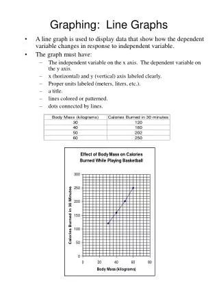
Line Graphs • A line graph compares quantitative data for one or more categories over a period of time, for example:
Time Period: Quantitative Data: X Axis Time Period Y Axis Quantitative Data


More Related