DESIGN PRINCIPLES
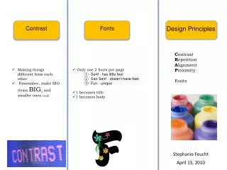
DESIGN PRINCIPLES. There are four basic principles of design which are:. CONTRAST ALIGNMENT REPETITION PROXIMITY. CONTRAST. Two items that are really different. Large type with a small type. A cool colour with a warm colour.

DESIGN PRINCIPLES
E N D
Presentation Transcript
There are four basic principles of design which are: CONTRASTALIGNMENTREPETITIONPROXIMITY
CONTRAST Two items that are really different.
Large typewith a small type.
vertical element (narrow column of text) with a A horizontalelement(row of text)
Widely spaced linesWidely spaced lineswithclosely packed lines closely packed lines closely packed lines closely packed linesclosely packed linesclosely packed lines
CONTRAST Large typewith asmall type. Horizontal with Widely spaced linesWidely spaced lineswithclosely packed lines closely packed lines closely packed lines closely packed lines Vertical Don’t forget reverse text. You do not have to use all of these contrast elements in one document. A cool colourwith awarm colour. Small graphics with a large graphic.
ALIGNMENT Nothing is just placed on the page without thinking about where you are placing it.
Items have a visual connection with something else on the page. Papatoetoe Pizzas Jimmy Smith 2323 Great South Road Papatoetoe, Auckland (09) 555-7676 This example has a nice arrangement with the text items grouped into logical proximity. This text is centre-aligned over itself, and centered on the page.
By moving all the elements to the right and giving them one alignment, the information is instantly more organised. The text items now have a common boundary connecting them together. Papatoetoe Pizzas Jimmy Smith 2323 Great South Road Papatoetoe, Auckland (09) 555-7676 The invisible line runs right down here, connecting the text.
REPETITION Where some aspects of design are repeated throughout the entire piece.
Headings and subheadings are a good place to start for creating repetitive elements, since you are probably already doing this. But take this repetitive element further and make it stronger. Here is an example...
Using font style and size Earthquake If you feel an earthquake take cover in a doorway or under something solid. DO NOT RUN OUTSIDE. Volcano If you are told a volcano may erupt STAY INSIDE and keep the doors and windows shut. Tsunami If you are told a Tsunami is coming do not go to the beach to watch it. GO INLAND.
With repetition also consider:- • A bold font • A thick rule (line) • A certain bullet • A colour • A particular format • Spacing On the next slide is an example of using repetition in design.
Success in the Stars Libra Sudden change may bring about some emotional unrest. Taurus An interesting situation will happen. Cancer Good time for long term planning. Aries Exciting changes are ahead. Gemini Look at new work opportunities. Success in the Stars Libra - sudden change may bring about some emotional unrest. Taurus - an interesting situation will happen. Cancer - good time for long term planning. Aries - exciting changes are ahead. Gemini - look at new work opportunities. Better. OK
PROXIMITY Information that is related is grouped together (e.g. page numbers, company details, contact details, price information, discounts.)
The page should have an instant visual clue as to the organisation and/or content of the page.
When you create a flyer, a brochure, a newsletter, or whatever, you know which pieces of information are logically connected, you know what information should be emphasised and what is important.
UNIVERSITY OF THE WEST COOPERATIVE EXTENSION WHAT’S HAPPENING IN… REDWOOD COUNTY FORESTRY August - 1996 Below are two examples of how you can improve a newsletter header with the proximity principles of design. What’s happening in… Redwood County Forestry University of the West Cooperative Extension August 1996 The bottom letterhead has had a few changes to improve it’s appearance including: changed from all capital letters to lowercase, which gave more room to make the title strong and bold, and which made the text easier to read. The corners were changed from rounded to straight, giving it a cleaner, stronger look. The tree graphic was enlarged and it broke out of the boundary, a common graphic trick.
Bibliography Williams, R. (1994). The Non-Designers Design Book. Peachpit Berkeley, CA.

