Chapter 4: Organizing The Page
210 likes | 366 Vues
Chapter 4: Organizing The Page. Several considerations affect an application’s layout design. Visual Hierarchy How to distinguish the relative importance of displayed components. Visual Flow How to effectively lead the user from primary to secondary information. Visual Clustering

Chapter 4: Organizing The Page
E N D
Presentation Transcript
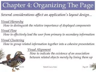
Chapter 4: Organizing The Page Several considerations affect an application’s layout design... • Visual Hierarchy • How to distinguish the relative importance of displayed components • Visual Flow • How to effectively lead the user from primary to secondary information • Visual Clustering • How to group related information together into a cohesive presentation • Visual Alignment • How to indicate the existence of an association between related objects merely by lining them up Tidwell Course Notes
Visual Hierarchy: Font Size More important components might be given larger fonts (including greater boldness) in order to emphasize their significance. Section headers are commonly given larger fonts, making it possible for users to avoid reading the small-font details of sections in which the users are not interested. The contrast between regular and bold fonts tends to draw user attention to text that is of particular importance. Tidwell Course Notes
Visual Hierarchy: Positioning The upper left-hand corner tends to draw users’ attention, but so does positioning components in a more isolated location. The most commonly used control may be conveniently placed in the most prominent location. Other important controls (like the buttons in this form) may be positioned in isolated locations that make them stand out. Tidwell Course Notes
Visual Hierarchy: Whitespace The strategic use of whitespace (including indentation and skipped lines) can be effective in drawing attention to particular components. Two forms with the same controls, but with somewhat different amounts of whitespace. Which is “better”? Tidwell Course Notes
Visual Flow: Focal Points Users’ eyes are trained to examine an interface in a top-to-bottom, left-to-right manner, but this can be circumvented by using particularly strong focal points. Here, the large scrambled image on the right draws the eye immediately to the right of the form. The graphical nature of the Preview components tends to attract the eye towards the bottom of the form. Tidwell Course Notes
Visual Grouping: Proximity Components that are near each other tend to become associated with each other in the minds of users. While there are labeled separators providing visual cues regarding grouping here, the “Bullet position” indentation controls are too isolated from that label to make their meaning completely clear. Four forms with identical contents - Which makes the best use of proximity? Tidwell Course Notes
Visual Grouping: Similarity Screen components that share the same shape, color, size, etc., tend to be associated with each other in users’ minds. The components in the right half of each editor dialog box are identically shaped and sized, reflecting their similar functionality. Tidwell Course Notes
Visual Alignment: Continuity Users tend to look for linear or curved patterns, and to follow those patterns when they are encountered. Does it make a difference whether the label beginnings are lined up vertically or diagonally? Tidwell Course Notes
Visual Alignment: Closure Users tend to look for enclosed patterns, even when they’re not specifically marked off, and to associate the objects within such enclosures. The strategic use of skipped lines, columns, and left and right justification facilitate the determination of which information belongs together in this display. Tidwell Course Notes
Pattern #32: Visual Framework In a multi-page application, employ the same basic layout on each page, thus encouraging users to focus on particular page content once they’re accustomed to the framework. Example: Microsoft Visio’s forms for setting line and fill styles with combo boxes for most parameters, trackbars for transparency parameters, a preview image at the bottom of each form, and identical action buttons. Tidwell Course Notes
Pattern #33: Center Stage The most significant information being displayed on an interface should be positioned in the largest region of the page, to gain immediate focus from the user. Example: In this Microsoft Management Console form, the graph plotting the performance of the system’s processor and memory dominates the display, drawing the attention of the user with its size and position, as well as its use of color and animation. Tidwell Course Notes
Pattern #34: Titled Sections Group related information together under a common title, and make that title stand out from the group itself. Example: In the “County Demographics” example, the various demographic categories are used as headers for the smaller groupboxes, with the name of the selected county itself used as the main groupbox header. Execute Tidwell Course Notes
Pattern #35: Card Stack When users only need to see one section of a form at a time, place each section on a separate panel and make only one panel visible at a time. Example: Napster appeared to be using buttons to switch between screens. Actually, this is a tabbed dialog control, with buttons instead of the default tabs. Tidwell Course Notes
Pattern #36: Closable Panels When users need to see several sections of a form at once, place all of the sections on separate panels, each of which can be opened and closed independently. Example: In Macromedia’s Fireworks, the title bars on the right of the display may be expanded to see the associated details, or contracted to hide them. Tidwell Course Notes
Pattern #37: Movable Panels Placing sections of an interface on panels that can be repositioned provides a means by which users may customize the interface to their own working styles. Example: In the Microsoft Visual Studio application, the user can customize the interface by dragging display panels (like the Properties panel shown here) and converting them between separate forms and panes within the main form. Tidwell Course Notes
Pattern #38: Right/Left Alignment When implementing a column of labels next to a column of controls on a form, right-align the labels and left-align the controls. Example: Compare the use of left-justified and right-justified labels in this “Phone Number Parser” application. Execute Tidwell Course Notes
Pattern #39: Diagonal Balance When left-right and top-bottom symmetry are not feasible, balance the contents of a page along the diagonal from upper left to lower right Example: In these Microsoft pages, the more diagonally symmetric versions on the left exhibit a better balance than the relatively asymmetric versions on the right . Tidwell Course Notes
Pattern #40: Property Sheet When presenting an editable object to the user, display a two-column layout of the object’s attributes and their current values. Example: Microsoft Excel permits users to set basic properties of spreadsheets as a means of documenting the purpose and design of each spreadsheet. Tidwell Course Notes
Pattern #41: Responsive Disclosure When walking a user through the steps of an application that fits on a single page, reveal the display one step at a time, as it’s needed. Example: In the “Presidents Gallery” application, the query regarding first names is hidden until the user enters a last name that belonged to multiple presidents. Execute Tidwell Course Notes
Pattern #42: Responsive Enabling When walking the user through a single-page application, it may be advantageous to merely disable parts of the display until they’re needed, providing the user with a visual cue of what’s coming. Example: When setting columns in a Microsoft Word document, the “Line between” and “Equal column width checkboxes are enabled when multiple columns are selected; the additional width fields are enabled when “Equal column width” is deselected, and the “Start new column” checkbox is enabled when “This point forward” is selected in the combo-box. Tidwell Course Notes
Pattern #43: Liquid Layout When the user resizes the application page, make sure that its contents are appropriately resized and repositioned accordingly. Example: In this graphics application, the 3D image is resized to fit the window, while preserving the image’s aspect ratio. In addition the fonts on the display panel are resized to fit the bottom section of the window. Execute Tidwell Course Notes