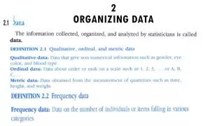
Chapter 2 Organizing Data
Chapter 2 Organizing Data. Section 2.1. Frequency Distributions, Histograms, and Related Topics. Do Now. Using the chart on the board, place a tally mark in two spots: The number of letters in your first name The number of letters in your last name

Chapter 2 Organizing Data
E N D
Presentation Transcript
Section 2.1 Frequency Distributions, Histograms, and Related Topics
Do Now • Using the chart on the board, place a tally mark in two spots: • The number of letters in your first name • The number of letters in your last name • Ex: My first name is Mark, so I’d put a tally mark at “4”. My last name is Frew, so I’d put an additional tally mark at “4”.
Histograms (Example) • http://www.cyber-wit.com/gallery_histogram.html#histogram
Copy Figure 2-8 into Notebook • Mound-shaped Symmetrical • Typical Uniform • Skewed Left • Skewed Right • Bimodal
Basic Steps for Creation by Hand • Determine the Number of Classes • Determine Class Width • Determine Class Boundaries • Tally • Find Relative Frequencies • Find Midpoints • Graph (X axis = # Line, Y Axis = Freq or Rel. Freq)
Do Now • Using the NFL Touchdown Data from 2011, complete the frequency distribution.
Steps in Excel: • Be sure Data Analysis Toolpack is installed • To Let Excel Decide on Bins: • Choose Data, Data Analysis, Histogram • Input Range is your data range. • Click Label if you have a title for your data. • Click Chart Output. • To make bars touch, click into white space on histogram:choose chart tools, design, chart layout #8 • Be sure to fix titles and labels
Steps in Excel: • To have User Defined Bins: • Next to your data, type the right endpoint of each of your bars, with the exception of the last bar. • Choose Data, Data Analysis, Histogram • Input Range is your data range. • Bin Range is your right endpoints. • Click Label if you have a title for your data. • Click Chart Output.
Do Now: • Display Homework • Download Weekly Hershey Stock Prices from my Wikisite and create a histogram of the prices.
Do Now • Display your homework • Download Class of 2012 Math PSAT scores from my wikisite
Do Now • Download NFL Touchdowns for Histograms • Using number of touchdowns: • Create a histogram of bin width 10 • Create another histogram having 8 bins
Quiz Directions • Download Eagles Roster from wikisite • Using the weights: • Create a histogram with 6 bins • Create a histogram with bin width of 30 (starting at minimum weight).
Do Now • Click on the link “USA Today Snapshots” from my wikisite. • Click through the four tabs (News, Sports, Money, and Life) • Find one bar graph of interest and one pie chart of interest. Record at least two interesting facts from each (for a total of 4).
Bar Graphs and Circle Graphs • Both show qualitative data. • Pie Charts are only used when you are representing “parts of a whole” and when selections are made in only one category. • Paretto Charts are Bar Graphs organized from greatest to least.
Now: • Download the Eagles Roster (again) from my wikisite. Which variables are qualitative?
Do Now • Copy important information from the blue box on page 59 into your notebook. • Display Homework (attempted pie graph of Eagles Positions)
Practice • Page 60 #1, 5, 8
Do Now • Download 100 meter dash data set from wiki. • Compare your homework with mine. • Titles? • Labels?
Quiz (download 2-2 quiz data) • Using “Phillies Winning Percentage”: • Create an adequately labeled graph that best represents the data. • Using “Buying Music Online” data set: • Choose an adequately labeled Paretto or Pie graph to display the data. (You will need to choose the correct option.) • Transfer both graphs to Word and display on one page.


