University of South Alabama: Organizing Data for Analysis
Learn about organizing raw and grouped data, constructing frequency tables, classifying data, and creating frequency distributions to analyze information effectively. Understand important statistical concepts and methods.

University of South Alabama: Organizing Data for Analysis
E N D
Presentation Transcript
Chapter 2 Organizing Data Nutan s. Mishra University of South Alabama
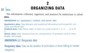
Raw Data A data recorded in the form as it was collected without ranking or processing is called raw data. Example: consider the status of following 20 students. The four status are SO, F, J, SE This also called ungrouped data. University of South Alabama
Grouped Data This is categorical (qualitative) data x= status f= frequency The data set consist of 20 members. The sum of frequencies of all the categories is equal to size of the data set . i.e. Σf = f1 + f2 + f3 + f4 = 20 University of South Alabama
Relative frequency Relative frequency of a category = frequency of that category/ sum of all frequencies University of South Alabama
Graphical presentation University of South Alabama
Organizing Data (quantitative) Consider the following table This is the organized data for the quantitative variable GPA. The table shows that there are 10 students whose GPA falls between 0 and 1 and … The values of x are divided into four distinct classes. Each class is an interval of values. University of South Alabama
Organizing Data (quantitative) This is called Frequency Distribution Table or just frequency distribution . Class width = upper boundary-lower boundary Class midpoint = (upper boundary+lower boundary)/2 University of South Alabama
Construction of frequency distribution That is how to divide data into classes? How many classes? Depends on size of the data set. Vary between 5 and 20. What should be the class width? Approximately (largest value-smallest value)/number of classes University of South Alabama
Example of classification Consider the following raw data on GPA of 30 students. We know that the variable GPA =x varies between 0 and 4 Number of classes can be 3 or 4 or 5. let it be 3 Then class width = (3.99-1.54)/3 = .81 1 University of South Alabama
Example of classification And the frequency table is as follows Relative frequency of a class = frequency of that class/ sum of all frequencies = f/Σf University of South Alabama
Important note about classification Most of the statistical software accept only raw data as input and they classify data for us. Thus if we are using a software to analyze our data, we do not have to worry about the classification part. Software gives us ability to change the number and width of the classes according to the need of the problem. University of South Alabama
Cumulative frequency distribution A cumulative frequency distribution gives the total number of values that fall below the upper boundary of each class. Example: Application 2.34 from the textbook frequency cumulative frequency University of South Alabama
Frequency Curve University of South Alabama
Ogive (Cumulative frequency curve) University of South Alabama
Stem and Leaf display A way of organizing and display quantitative data. Each value is divided into two parts – a stem and a leaf. \ To draw a stem-n-leaf plot its helpful to know the range of the data that is max value and min value If can not find out exact values of max and min, the approximate value can given us some idea about the range of the data. Consider the following data set of scores of 30 students in Statistics exam University of South Alabama
Stem and leaf display In this data set the values range between 50’s and 90’s. Thus we would like to count the number of values in 50’s, in 60’s in 70’s and so on That we declare the tenth place as stem and unit place as a leaf. Thus the resulting stem and leaf plot is as follows: University of South Alabama