Creating Graphs
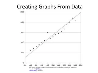
Creating Graphs. Fundamental Features of Graphs. All graphs have two, clearly-labeled axes that are drawn at a right angle. The horizontal axis is the abscissa, or X-axis. The vertical axis is the ordinate, or Y-axis.


Creating Graphs
E N D
Presentation Transcript
Fundamental Features of Graphs • All graphs have two, clearly-labeled axes that are drawn at a right angle. • The horizontal axis is the abscissa, or X-axis. • The vertical axis is the ordinate, or Y-axis. • The independent variable is plotted on the X-axis, and the dependent variable is plotted on the Y-axis. • The Y-axis must be a numerical scale. • The length of the X- and Y- axis conforms to the ¾ rule. • A graph contains only information related to the data and information that is necessary to interpret the graph.
Choosing Graphs • Graphs are selected based on the scale and continuity of measurement.
The Bar Graph • The Bar Graph: a form of graph that uses rectangles, or bars, to represent nominal categories. The bars do not touch. • The nominal categories are plotted on the X-axis. • The Y-axis of the bar chart may represent frequencies, percentages, or descriptive statistics such as the mean.
Histograms • Histogram: a form of bar graph used to represent information when the X-scale is interval or better.
The Line Graph • Line Graph: a form of graph in which a continuous line indicates the frequency or statistic presented along the Y-axis
Creating Graphs in SPSS • In SPSS, you are given an option to create a graph any time you perform a statistical operation • Click analyze in the menu bar. • Scroll down to descriptive statistics and select frequencies from the pop out menu. • In the frequencies dialog box, move the variable of interest to the variable window by highlighting it and clicking on the arrow. • At the bottom of the window, click charts. • In the charts dialog box, select the most appropriate graph for the data type. • Click continue. In the frequencies dialog box, click OK. • You can double click on the graph to edit titles, intervals, etc.
Creating Graphs in SPSS • To create graphs in SPSS, you can go to graphs in the menu bar. • Click graphs in the menu bar. Go to Legacy Dialogs. • Scroll down to the most appropriate graph. • In the chart dialog box, choose simple; summaries for groups of cases. Click Define. • If you want to display the frequency of the variable, under bar/line represents, do nothing. • If you want to display values of one variable as a function of another variable, check “other statistic”; the box underneath should light up. • Select the dependent variable and move it to the variable box. • Select the independent variable and move it to the category axis box. • Click continue. Click OK.
Creating Graphs in Excel • In all Excel graphs, Column A should include data for the X-axis. • In all Excel graphs, Column B should include data for the Y-axis. • Highlight the data (scroll the mouse over cells) you wish to use to create the chart. • In the menu bar, click on insert and select the appropriate chart (if you want a bar chart, select column). • After the graph is generated, click on it to make the chart tools available.
Creating Graphs in Excel • Under chart tools, select layout. • Remove chart title. Click on chart title and select none. • Add axis titles. Click axis titles. Enter the titles for both the horizontal (X) and vertical (Y) axes. • Remove the horizontal gridlines. Click gridlines, horizontal gridlines, none. • Remove legend. Click legends and select none. • For bar charts, insert data labels. Select data labels. Choose inside end. • Under chart tools, select format to change individual chart elements (e.g. bar color) or select design to choose from several preformatted styles and layouts. • In the Excel spreadsheet, adjust the height and width of the graph to follow the ¾ rule.