
Uploaded by
tamika
10 SLIDES
209 VUES
100LIKES
Creating Graphs from Data: A Step-by-Step Tutorial
DESCRIPTION
Learn how to create graphs from your data using Excel. Label variables with units, input data, highlight, insert and create your first scatter graph. Follow steps for linear regression and customize with titles and equations.
Download
1 / 10
Télécharger la présentation 
Creating Graphs from Data: A Step-by-Step Tutorial
An Image/Link below is provided (as is) to download presentation
Download Policy: Content on the Website is provided to you AS IS for your information and personal use and may not be sold / licensed / shared on other websites without getting consent from its author.
Content is provided to you AS IS for your information and personal use only.
Download presentation by click this link.
While downloading, if for some reason you are not able to download a presentation, the publisher may have deleted the file from their server.
During download, if you can't get a presentation, the file might be deleted by the publisher.
E N D
Presentation Transcript
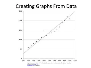
Creating Graphs From Data http://simple.wikipedia.org/wiki/Correlation#mediaviewer/File:Positive_correltion_lobf.JPGPositive correltion lobfCC BY 3.0 Benbenthehen - Own work
1. Edit Chart Title, Vertical Axis, Horizontal Axis, Tab and Math Equation2. Make sure you include units.


More Related