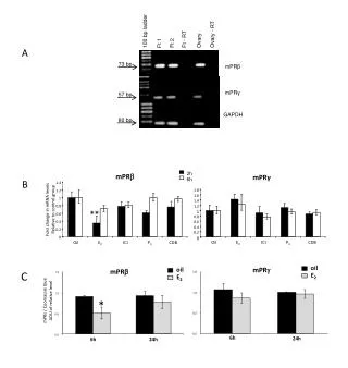
0.2
WFP Natural Disaster Grants 1987-2004. 0.9. 0.8. Less Democratic. More Democratic. 0.7. 0.6. 0.5. Number of Grants. 0.4. 0.3. 0.2. 0.1. 0. -2.5 -2 -1.5 -1 -0.5 0 0.5 1 1.5 2 2.5.

0.2
E N D
Presentation Transcript
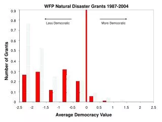
WFP Natural Disaster Grants 1987-2004 0.9 0.8 Less Democratic More Democratic 0.7 0.6 0.5 Number of Grants 0.4 0.3 0.2 0.1 0 -2.5 -2 -1.5 -1 -0.5 0 0.5 1 1.5 2 2.5 Average Democracy Value
WFP and OFDA Natural Disaster Grants 1987-2004 0.9 0.8 Less Democratic More Democratic 0.7 0.6 0.5 Number of Grants 0.4 0.3 0.2 0.1 0 -2.5 -2 -1.5 -1 -0.5 0 0.5 1 1.5 2 2.5 Average Democracy Value
Less Democratic More Democratic WFP Natural Disaster Grants 1987-2004 0.35 0.3 0.25 0.2 Number of Grants 0.15 0.1 0.05 0 -2.5 -2 -1.5 -1 -0.5 0 0.5 1 1.5 2 2.5 Average Democracy Value
WFP and OFDA Natural Disaster Grants 1987-2004 0.9 0.8 Less Democratic More Democratic 0.7 0.6 0.5 Number of Grants 0.4 0.3 0.2 0.1 0 -2.5 -2 -1.5 -1 -0.5 0 0.5 1 1.5 2 2.5 Average Democracy Value
WFP Natural Disaster Grants 1987-2004 0.4 0.35 Less Democratic More Democratic 0.3 0.25 0.2 Number of Grants 0.15 0.1 0.05 0 -2.5 -2 -1.5 -1 -0.5 0 0.5 1 1.5 2 2.5 Average Democracy Value
WFP and OFDA Natural Disaster Grants 1987-2004 0.9 0.8 Less Democratic More Democratic 0.7 0.6 0.5 Number of Grants 0.4 0.3 0.2 0.1 0 -2.5 -2 -1.5 -1 -0.5 0 0.5 1 1.5 2 2.5 Average Democracy Value
Differences • The first combination transitions the best, and is a little less confusing since the next graphs kind of make the WFP aid data look like two different data sets in the two graphs when you switch from one to the other. Also, the bars could be set to white and completely invisible instead of having the light green. • The second combination allows for more impact of the initial WFP data (with the first set, the data only extends to half of the height = less dramatic) • The third combination is the same as the second, but with a different scale for the number of grants so that the arrows don’t move when you transition to the second slide.
How to edit graphs • All the scale #s and titles are text boxes, so you should be able to change font in PowerPoint, the Y axis is individual ones, while the x-axis is only one with spaces between each number • I was using the Group and Ungroup commands under the Drawing toolbar to copy and move stuff around to keep everything together, probably easiest to stick with that if you need to resize or move objects • The bar colours were set in Excel (I am planning to send the file to Peter), with the light green one on the first slide as green with a sparse dot pattern (click on the bars and go to fill effects and have background colour as white)
![Altitude= [0.2, 4.0km]](https://cdn4.slideserve.com/464372/nasa-s-cloud-absorption-radiometer-dt.jpg)