DISTRIBUTION MAPS
Learn how to read population density and wind turbine distribution maps. Discover key tips and examples for interpreting dot and legend distribution maps effectively. Test your knowledge with questions provided for practice.

DISTRIBUTION MAPS
E N D
Presentation Transcript
DISTRIBUTION MAPS DOT LEGEND
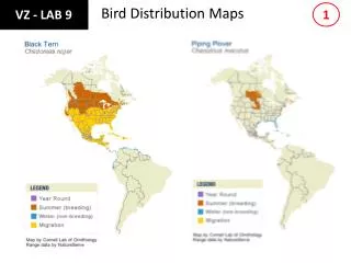
DISTRIBUTION MAPS • One type of distribution map uses related colours to show general location of a particular topic. The basic rule for reading these maps is the darker the colour, the greater the amount or the higher the concentration of what the colour represents. • Examples: population, fishing, wind turbines, animals, etc.
READING THESE MAPS • Step 1 – use the legend to learn the meaning of the colours • Step 2 – find the areas of the map with darker colours – showing the more populated areas. • Questions : what part of Ireland (compass direction) has the highest concentration of people? • What part has the lowest?
DOT DISTRIBUTION MAP • On this type of map, dots are used to show the specific locations of something. For example the population distribution. • Step 1 use the legend to see what a dot represents. • Step 2 – look for tight clusters of dots on the map – if the dots form a line, the pattern is called linear. Scattered dots in an area of the map show that the feature is not concentrated.
NOW IT’S YOUR TURN • Use these questions with the maps provided. • Wind Turbines • What parts (compass directions) of North America have the highest concentration of wind turbines? • Approximately how many wind turbines are there around the Great Lakes? • Hydro Electric Map • What part (compass direction) of NA have the highest concentration of existing Hydro Electric plants? • Why are there not a lot of hydro electric plants in the middle of the USA?

