Statistical Models in S
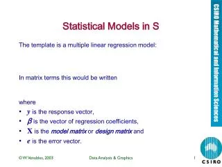
Statistical Models in S. The template is a multiple linear regression model: In matrix terms this would be written where y is the response vector, β is the vector of regression coefficients, X is the model matrix or design matrix and e is the error vector. Model formulae.

Statistical Models in S
E N D
Presentation Transcript
Statistical Models in S The template is a multiple linear regressionmodel: In matrix terms this would be written where • y is the response vector, • βis the vector ofregression coefficients, • X is the model matrixor design matrixand • e is the error vector. Data Analysis & Graphics
Model formulae General form:yvar ~term1 + term2 + … Examples: y ~ x– Simple regression y ~ 1 +x– Explicit intercept y ~ -1 + x– Through the origin y ~ x +x^2– Quadratic regression y ~ x1 + x2 + x3– Multiple regression y ~ G +x1 +x2– Parallel regressions y ~ G/(x1 + x2)– Separate regressions sqrt(Hard) ~ Dens+Dens^2– Transformed Data Analysis & Graphics
More examples of formulae y ~ G– Single classification y ~ A +B– Randomized block y ~ B + N*P– Factorial in blocks y ~x + B + N*P– with covariate y ~ .-X1– All variables except X1 . ~ . + A:B– Add interaction (update) Nitrogen ~ Times*(River/Site) - more complex design Data Analysis & Graphics
Generic functions for inference The following apply to most modelling objects Data Analysis & Graphics
Example: The Janka data Hardness and density data for 36 samples ofAustralian hardwoods. Source: E. J. Williams, “Regression Analysis”,Wiley, 1959. [ex-CSIRO, Forestry.] Problem: build a prediction model for Hardnessusing Density. Data Analysis & Graphics
The Janka data. Hardness and density of 36 species of Australian hardwood samples Data Analysis & Graphics
Janka data - initial model building We might start with a linear or quadratic model (suggested by Williams) and start checking thefit. > jank.1 <- lm(Hard ~ Dens, janka) > jank.2 <- update(jank.1, . ~ . + Dens^2) > summary(jank.2)$coef Value Std. Error t value Pr(>|t|) (Intercept) -118.00738 334.96690 -0.35230 0.726857 Dens 9.43402 14.93562 0.63165 0.531970 I(Densˆ2) 0.50908 0.15672 3.24830 0.002669 Data Analysis & Graphics
Janka data: a cubic model? To check for the need for a cubic term we simply add one more term to the model > jank.3 <- update(jank.2, . ˜ . + Densˆ3) > summary(jank.3)$coef Value Std. Error t value Pr(>|t|) (Intercept) -6.4144e+02 1.2357e+03 -0.51911 0.60726 Dens 4.6864e+01 8.6302e+01 0.54302 0.59088 I(Densˆ2) -3.3117e-01 1.9140e+00 -0.17303 0.86372 I(Densˆ3) 5.9587e-03 1.3526e-02 0.44052 0.66252 A quadratic term is necessary, but a cubic is notsupported. Data Analysis & Graphics
Janka data - stability of coefficients The regression coefficients should remain morestable under extensions to the model if we standardize, or even just mean-correct, thepredictors: > janka$d <- scale(janka$Dens, scale=F) > jank.1 <- lm(Hard ~ d, janka) > jank.2 <- update(jank.1, .~.+d^2) > jank.3 <- update(jank.2, .~.+d^3) Data Analysis & Graphics
summary(jank.1)$coef Value Std. Error t value Pr(>|t|) (Intercept) 1469.472 30.5099 48.164 0 d 57.507 2.2785 25.238 0 > summary(jank.2)$coef Value Std. Error t value Pr(>|t|) (Intercept) 1378.19661 38.93951 35.3933 0.000000 d 55.99764 2.06614 27.1026 0.000000 I(d^2) 0.50908 0.15672 3.2483 0.002669 > round(summary(jank.3)$coef, 4) Value Std. Error t value Pr(>|t|) (Intercept) 1379.1028 39.4775 34.9339 0.0000 d 53.9610 5.0746 10.6336 0.0000 I(d^2) 0.4864 0.1668 2.9151 0.0064 I(d^3) 0.0060 0.0135 0.4405 0.6625 Why is this so? Does it matter very much? Data Analysis & Graphics
Checks and balances > xyplot(studres(janka.lm2) ~ fitted(janka.lm2), panel = function(x, y, ...) { panel.xyplot(x, y, col = 5, ...) panel.abline(h = 0, lty = 4, col = 6) }, xlab = "Fitted values", ylab = "Residuals") > qqmath(~ studres(janka.lm2), panel = function(x, y, ...) { panel.qqmath(x, y, col = 5, ...) panel.qqmathline(y, qnorm, col = 4) }, xlab = "Normal scores", ylab = "Sorted studentized residuals") Data Analysis & Graphics
Janka data: Studentized residuals against fitted values for the quadratic model Data Analysis & Graphics
Janka data: Sorted studentized residuals against normal scores for the quadratic model Data Analysis & Graphics
Janka data - trying a transformation The Box-Cox family of transformations includessquare-root and log transformations as specialcases. The boxcoxfunction in the MASS library allowsthe marginal likelihood function for thetransformation parameter to be calculated anddisplayed. It’s use is easy. (Note: it only appliesto positive response variables.) > library(MASS, first = T) > graphsheet() # necessary if no graphics device open. > boxcox(jank.2, lambda=seq(-0.25, 1, len=20)) Data Analysis & Graphics
Janka data - transformed data The marginal likelihood plot suggests a logtransformation. > ljank.2 <- update(jank.2, log(.)˜.) > round(summary(ljank.2)$coef, 4) Value Std. Error t value Pr(>|t|) (Intercept) 7.2299 0.0243 298.0154 0 d 0.0437 0.0013 33.9468 0 I(d^2) -0.0005 0.0001 -5.3542 0 > lrs <- studres(ljank.2) > lfv <- fitted(ljank.2) > xyplot(lrs ~ lfv, panel = function(x, y, ...) { panel.xyplot(x, y, ...) panel.abline(h=0, lty=4) }, xlab = "Fitted (log trans.)", ylab = "Residuals (log trans.)", col = 5) Data Analysis & Graphics
Plot of transformed data > attach(janka) > plot(Dens, Hard, log = "y") Data Analysis & Graphics
Selecting terms in a multiple regression Example: The Iowa wheat data. > names(iowheat) [1] "Year" "Rain0" "Temp1" "Rain1" "Temp2" [6] "Rain2" "Temp3" "Rain3" "Temp4" "Yield" > bigm <- lm(Yield ~ ., data=iowheat) fits a regression model using all other variablesin the data frame as predictors. From the big model, now check the effect of dropping each term individually: Data Analysis & Graphics
> dropterm(bigm, test = "F") Single term deletions Model: Yield ~ Year + Rain0 + Temp1 + Rain1 + Temp2 + Rain2 + Temp3 + Rain3 + Temp4 Df Sum of Sq RSS AIC F Value Pr(F) <none> 1404.8 143.79 Year 1 1326.4 2731.2 163.73 21.715 0.00011 Rain0 1 203.6 1608.4 146.25 3.333 0.08092 Temp1 1 70.2 1475.0 143.40 1.149 0.29495 Rain1 1 33.2 1438.0 142.56 0.543 0.46869 Temp2 1 43.2 1448.0 142.79 0.707 0.40905 Rain2 1 209.2 1614.0 146.37 3.425 0.07710 Temp3 1 0.3 1405.1 141.80 0.005 0.94652 Rain3 1 9.5 1414.4 142.01 0.156 0.69655 Temp4 1 58.6 1463.5 143.14 0.960 0.33738 Data Analysis & Graphics
> smallm <- update(bigm, . ~ Year) > addterm(smallm, bigm, test = "F") Single term additions Model: Yield ~ Year Df Sum of Sq RSS AIC F Value Pr(F) <none> 2429.8 145.87 Rain0 1 138.65 2291.1 145.93 1.8155 0.18793 Temp1 1 30.52 2399.3 147.45 0.3816 0.54141 Rain1 1 47.88 2381.9 147.21 0.6031 0.44349 Temp2 1 16.45 2413.3 147.64 0.2045 0.65437 Rain2 1 518.88 1910.9 139.94 8.1461 0.00775 Temp3 1 229.14 2200.6 144.60 3.1238 0.08733 Rain3 1 149.78 2280.0 145.77 1.9708 0.17063 Temp4 1 445.11 1984.7 141.19 6.7282 0.01454 Data Analysis & Graphics
Automated selection of variables >stepm <- stepAIC(bigm, scope = list(lower = ~ Year)) Start: AIC= 143.79 .... Step: AIC= 137.13 Yield ~ Year + Rain0 + Rain2 + Temp4 Df Sum of Sq RSS AIC <none> NA NA 1554.6 137.13 - Temp4 1 187.95 1742.6 138.90 - Rain0 1 196.01 1750.6 139.05 - Rain2 1 240.20 1794.8 139.87 > Data Analysis & Graphics
A Random Effects model • The petroleum data of Nilon L Prater, (c. 1954). • 10 crude oil sources, with measurements on the crude oil itself. • Subsamples of crude (3-5) refined to a certain end point (measured). • The response is the yield of refined petroleum (as a percentage). • How can petroleum yield be predicted from properties of crude and end point? Data Analysis & Graphics
A first look: Trellis display For this kind of grouped data a Trellis display, by group, with a simple model fitted within each group is often very revealing. > names(petrol) [1] "No" "SG" "VP" "V10" "EP" "Y" > xyplot(Y ~ EP | No, petrol, as.table = T, panel = function(x, y, ...) { panel.xyplot(x, y, ...) panel.lmline(x, y, ...) }, xlab = "End point", ylab = "Yield (%)", main = "Petroleum data of N L Prater") > Data Analysis & Graphics
Fixed effect Models Clearly a straight line model is reasonable. There is some variation between groups, but parallel lines is also a reasonable simplification. There appears to be considerable variation between intercepts, though. > pet.2 <- aov(Y ~ No*EP, petrol) > pet.1 <- update(pet.2, .~.-No:EP) > pet.0 <- update(pet.1, .~.-No) > anova(pet.0, pet.1, pet.2) Analysis of Variance Table Response: Y Terms Resid. Df RSS Test Df Sum of Sq F Value Pr(F) 1 EP 30 1759.7 2 No + EP 21 74.1 +No 9 1685.6 74.101 0.0000 3 No * EP 12 30.3 +No:EP 9 43.8 1.926 0.1439 Data Analysis & Graphics
Random effects > pet.re1 <- lme(Y ~ EP, petrol, random = ~1+EP|No) > summary(pet.re1) ..... AIC BIC logLik 184.77 193.18 -86.387 Random effects: Formula: ~ 1 + EP | No Structure: General positive-definite StdDev Corr (Intercept) 4.823890 (Inter EP 0.010143 1 Residual 1.778504 Fixed effects: Y ~ EP Value Std.Error DF t-value p-value (Intercept) -31.990 2.3617 21 -13.545 <.0001 EP 0.155 0.0062 21 24.848 <.0001 Correlation: ..... Data Analysis & Graphics
The shrinkage effect > B <- coef(pet.re1) > B (Intercept) EP A -24.146 0.17103 B -29.101 0.16062 C -26.847 0.16536 D -30.945 0.15674 E -30.636 0.15739 F -31.323 0.15595 G -34.601 0.14905 H -35.348 0.14748 I -37.023 0.14396 J -39.930 0.13785 > xyplot(Y ~ EP | No, petrol, as.table = T, subscripts = T, panel = function(x, y, subscripts, ...) { panel.xyplot(x, y, ...) panel.lmline(x, y, ...) wh <- as(petrol$No[subscripts][1], "character") panel.abline(B[wh, 1], B[wh, 2], lty = 4, col = 8) }, xlab = "End point", ylab = "Yield (%)") Data Analysis & Graphics
Note how the random effect (red, broken) lines are less variable than the separate least squares lines. Data Analysis & Graphics
General noteson modelling • Analysis of variance models are linearmodels but usually fitted using aovratherthan lm. The computation is the same butthe resulting object behaves differently inresponse to some generics,especiallysummary. • Generalized linear modelling (logisticregression, log-linear models,quasi-likelihood, &c) also use linearmodelling formulaein that they specify themodel matrix, not the parameters.Generalized additive modelling (smoothingsplines, loess models, &c) formulae arequite similar. • Non-linear regression uses a formula, but acompletely different paradigm: the formulagives the full model as an expression,including parameters. Data Analysis & Graphics
GLMs and GAMs: An introduction • One generalization of multiple linear regression. • Response, y, stimulus variables • The distribution of Y depends on the x's through a single linear function, the 'linear predictor' • There may be an unknown 'scale' (or 'variance') parameter to estimate as well • The deviance is a generalization of the residual sum of squares. • The protocols are very similar to linear regression. The inferential logic is virtually identical. Data Analysis & Graphics
Example: budworms (MASS, Ch. 7) Classical toxicology study of budworms, by sex. > Budworms <- data.frame(Logdose = rep(0:5, 2), Sex = factor(rep(c("M", "F"), each = 6)), Dead = c(1, 4, 9, 13, 18, 20, 0, 2, 6, 10, 12, 16)) > Budworms$Alive <- 20 - Budworms$Dead > xyplot(Dead/20 ~ I(2^Logdose), Budworms, groups = Sex, panel = panel.superpose, xlab = "Dose", ylab = "Fraction dead", key = list(......), type="b") Data Analysis & Graphics
Fitting a model and plotting the results Fitting the model is similar to a linear model > bud.1 <- glm(cbind(Dead, Alive) ~ Sex*Logdose, binomial, Budworms, trace=T, eps=1.0e-9) GLM linear loop 1: deviance = 5.0137 GLM linear loop 2: deviance = 4.9937 GLM linear loop 3: deviance = 4.9937 GLM linear loop 4: deviance = 4.9937 > summary(bud.1, cor=F) … Value Std. Error t value (Intercept) -2.99354 0.55270 -5.41622 Sex 0.17499 0.77831 0.22483 Logdose 0.90604 0.16710 5.42207 Sex:Logdose 0.35291 0.26999 1.30713 … (Residual Deviance: 4.9937 on 8 degrees of freedom Data Analysis & Graphics
> bud.0 <- update(bud.1, .~.-Sex:Logdose) GLM linear loop 1: deviance = 6.8074 GLM linear loop 2: deviance = 6.7571 GLM linear loop 3: deviance = 6.7571 GLM linear loop 4: deviance = 6.7571 > anova(bud.0, bud.1, test="Chisq") Analysis of Deviance Table Response: cbind(Dead, Alive) Terms Resid. Df Resid. Dev Test Df 1 Sex + Logdose 9 6.7571 2 Sex * Logdose 8 4.9937 +Sex:Logdose 1 Deviance Pr(Chi) 1 2 1.7633 0.18421 Data Analysis & Graphics
Plotting the results attach(Budworms) plot(2^Logdose, Dead/20, xlab = "Dose", ylab = "Fraction dead", type = "n") text(2^Logdose, Dead/20, c("+","o")[Sex], col = 5, cex = 1.25) newdat <- expand.grid(Logdose = seq(-0.1, 5.1, 0.1), Sex = levels(Sex)) newdat$Pr1 <- predict(bud.1, newdat, type = "response") newdat$Pr0 <- predict(bud.0, newdat, type = "response") ditch <- newdat$Logdose == 5.1 | newdat$Logdose < 0 newdat[ditch, ] <- NA attach(newdat) lines(2^Logdose, Pr1, col=4, lty = 4) lines(2^Logdose, Pr0, col=3) Data Analysis & Graphics
Janka data, first re-visit From transformations it becomes clear that • A square-root makes the regression straight-line, • A log is needed to make the variance constant. One way to accommodate both is to use a GLM with • Square-root link, and • Variance proportional to the square of the mean. This is done using the quasi family which allows link and variance functions to be separately specified. family = quasi(link = sqrt, variance = "mu^2") Data Analysis & Graphics
> jank.g1 <- glm(Hard ~ Dens, quasi(link = sqrt, variance = "mu^2"), janka, trace=T) GLM linear loop 1: deviance = 0.3335 GLM linear loop 2: deviance = 0.3288 GLM linear loop 3: deviance = 0.3288 > range(janka$Dens) [1] 24.7 69.1 > newdat <- data.frame(Dens = 24:70) > p1 <- predict(jank.g1, newdat, type = "response", se=T) > names(p1) [1] "fit" "se.fit" "residual.scale" [4] "df" > ul <- p1$fit + 2*p1$se.fit > ll <- p1$fit - 2*p1$se.fit > mn <- p1$fit > matplot(newdat$Dens, cbind(ll, mn, ul), xlab = "Density", ylab = "Hardness", col = c(2,3,2), lty = c(4,1,4), type = "l") > points(janka$Dens, janka$Hard, pch=16, col = 6) Data Analysis & Graphics
Negative Binomial Models • Useful class of models for count data cases where the variance is much greater than the mean • A Poisson model to such data will give a deviance much greater than the residual degrees of freedom. • Has two interpretations • As a conditional Poisson model but with an unobserved random effect attached to each observation • As a "contagious distribution": the observations are sums of a Poisson number of "clumps" with each clump logarithmically distributed. Data Analysis & Graphics
The quine data • Numbers of days absent from school per pupil in a year in a rural NSW town. • Classified by four factors: > lapply(quine, levels) $Eth: [1] "A" "N" $Sex: [1] "F" "M" $Age: [1] "F0" "F1" "F2" "F3" $Lrn: [1] "AL" "SL" $Days: NULL Data Analysis & Graphics
First consider a Poisson "full" model" > quine.1 <- glm(Days ~ Eth*Sex*Age*Lrn, poisson, quine, trace = T) … GLM linear loop 4: deviance = 1173.9 > quine.1$df [1] 118 Overdispersion. Now a NB model with the same mean structure (and default log link): > quine.n1 <- glm.nb(Days ~ Eth*Sex*Age*Lrn, quine, trace=T) … Theta( 1 ) = 1.92836 , 2(Ls - Lm) = 167.453 > dropterm(quine.n1, test = "Chisq") Single term deletions Model: Days ~ Eth * Sex * Age * Lrn Df AIC LRT Pr(Chi) <none> 1095.3 Eth:Sex:Age:Lrn 2 1092.7 1.4038 0.49563 Data Analysis & Graphics
Manual model building • Is always risky! • Is nearly always revealing. > quine.up <- glm.nb(Days ~ Eth*Sex*Age*Lrn, quine) > quine.m <- glm.nb(Days ~ Eth + Sex + Age + Lrn, quine) > dropterm(quine.m, test="Chisq") Single term deletions Model: Days ~ Eth + Sex + Age + Lrn Df AIC LRT Pr(Chi) <none> 1107.2 Eth 1 1117.7 12.524 0.00040 Sex 1 1105.4 0.250 0.61728 Age 3 1112.7 11.524 0.00921 Lrn 1 1107.7 2.502 0.11372 Data Analysis & Graphics
> addterm(quine.m, quine.up, test = "Chisq") Single term additions Model: Days ~ Eth + Sex + Age + Lrn Df AIC LRT Pr(Chi) <none> 1107.2 Eth:Sex 1 1108.3 0.881 0.34784 Eth:Age 3 1102.7 10.463 0.01501 Sex:Age 3 1100.4 12.801 0.00509 Eth:Lrn 1 1106.1 3.029 0.08180 Sex:Lrn 1 1109.0 0.115 0.73499 Age:Lrn 2 1110.0 1.161 0.55972 > quine.m <- update(quine.m, .~.+Sex:Age) > addterm(quine.m, quine.up, test = "Chisq") Data Analysis & Graphics
Single term additions Model: Days ~ Eth + Sex + Age + Lrn + Sex:Age Df AIC LRT Pr(Chi) <none> 1100.4 Eth:Sex 1 1101.1 1.216 0.27010 Eth:Age 3 1094.7 11.664 0.00863 Eth:Lrn 1 1099.7 2.686 0.10123 Sex:Lrn 1 1100.9 1.431 0.23167 Age:Lrn 2 1100.3 4.074 0.13043 > quine.m <- update(quine.m, .~.+Eth:Age) > addterm(quine.m, quine.up, test = "Chisq") Single term additions Model: Days ~ Eth + Sex + Age + Lrn + Sex:Age + Eth:Age Df AIC LRT Pr(Chi) <none> 1094.7 Eth:Sex 1 1095.4 1.2393 0.26560 Eth:Lrn 1 1096.7 0.0004 0.98479 Sex:Lrn 1 1094.7 1.9656 0.16092 Age:Lrn 2 1094.1 4.6230 0.09911 Data Analysis & Graphics
> dropterm(quine.m, test = "Chisq") Single term deletions Model: Days ~ Eth + Sex + Age + Lrn + Sex:Age + Eth:Age Df AIC LRT Pr(Chi) <none> 1094.7 Lrn 1 1097.9 5.166 0.023028 Sex:Age 3 1102.7 14.002 0.002902 Eth:Age 3 1100.4 11.664 0.008628 The final model (from this approach) can be written in the form Days ~ Lrn + Age/(Eth + Sex) suggesting that Eth and Sex have proportional effects nested within Age, and Lrn has the same proportional effect on all means independent of Age, Sex and Eth. Data Analysis & Graphics
Generalized Additive Models: Introduction • Strongly assumes that predictors have been chosen that are unlikely to have interactions between them. • Weakly assumes a form for the main effect for each term! • Estimation is done using penalized maximum likelihood where the penalty term uses a measure of roughness of the main effect forms. The tuning constant is chosen automatically by cross-validation. • Any glm form is possible, but two additional functions, s(x, …) and lo(x,…) may be included, but only additively. • For many models, spline models can do nearly as well! Data Analysis & Graphics
Example: The Iowa wheat data revisited Clear that Year is the dominant predictor. If any others are useful, Rain0, Rain2 and Temp4, at most, could be. > iowa.gm1 <- gam(Yield ~ s(Year) + s(Rain0) + s(Rain2) + s(Temp4), data = iowheat) The best way to appreciate the fitted model is to graph the components. > par(mfrow=c(2,2)) > plot(iowa.gm1, se=T, ylim = c(-25, 25)) Data Analysis & Graphics