Mutimedia Screen Design
90 likes | 107 Vues
Learn essential components for screen design, typography, color choice, and organization. Discover how to create clear, visually appealing presentations for optimal impact. Enhance your slides with proper text formatting and layout techniques.

Mutimedia Screen Design
E N D
Presentation Transcript
Mutimedia Screen Design template credit freegoogleslidestemplates.com arranged by Jesse Peters
Multimedia Screen Design Three Key Components Screen Design Typography Media
Font & Slide Text Typefaces need to be clear and easily read. The best choices include Helvetica,Arial, Calibri, and Verdana. 1 Use short text lines. No more than twelve. Readers can get lost with long lines. 2 3 The use of bolding, underlining, italicizing, and highlighting can be useful to your readers.
Font & Slide Text Typefaces need to be clear and easily read. The best choices include Helvetica, Arial, Calibri, and Verdana. Use short text lines. No more than twelve. Readers can get lost with long lines. The use of bolding, underlining, italicizing, and highlighting can be useful to your readers.
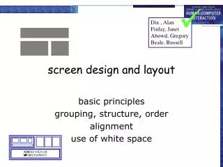
Screen Design Information Presented The amount of information on a page matters. Too much and it becomes distracting. Grouping Information Showing what information goes together. A visual marker to identify what information belongs together. Organization & Layout Keeping groups of information displayed in clear sections or page divisions. Includes spacing between sections and white space.
Color Choice & Theme Color Pattern Theme The overall look of your presentation should feel the same. Select colors that look pleasant and complemen each other. Repeat them.
Typography How not to present your text This font is far too small and challenging to read. It is also just clumped together in one long stream of words. I could change the topic to last nights baseball game and the user wouldn’t know because they have more than likely left the site the second they saw the font. When you squeeze a bunch of tiny text together in one area it does not catch the eye’s attention, but actually distracts it. If someone wanted to read a novel they would pick up a book and do just that. THe text in a digital setting needs to be clear, to the point, and easy to read. This has been painful for me to type.
Poor Screen Design You don’t want to distract the reader from the important information. This is a text box that has no clear organizational structure. It is too long and appears to be random. The red box to the left does not fit the overall color theme and is simply distracting. The heading is too large and obnoxious. There is just too much happening on this slide. You might call it “busy”. You need to make sure your audience or viewers are not spending their time trying to figure out what to go to next.
Multimedia Screen Design All of the pieces must come together. Screen Design Media White Space Typography Color Pattern Implement additional ways to convey the information Typeface, Size, Length. It must be neat and easy to follow Make the pages look clean and pleasing to the eyes Maintain a constant color theme