Download

1 / 40
400 likes | 565 Vues
y. x. Exploratory data analysis Cross tabulations and scatter diagrams. Exploratory data analysis consists of simple arithmetic and easy-to-draw graphs that can be used to summarize data quickly. The Stem and Leaf Display. A stem-and-leaf display shows both the rank order

E N D
y x • Exploratory data analysis • Cross tabulations and scatter diagrams
Exploratory data analysis consists of simple arithmetic and easy-to-draw graphs that can be used to summarize data quickly
The Stem and Leaf Display • A stem-and-leaf display shows both the rank order • and shape of the distribution of the data. • It is similar to a histogram on its side, but it has the • advantage of showing the actual data values. • The first digits of each data item are arranged to the • left of a vertical line. • To the right of the vertical line we record the last • digit for each item in rank order.
Example: Hudson Auto Repair The manager of Hudson Auto would like to have a better understanding of the cost of parts used in the engine tune-ups performed in the shop. She examines 50 customer invoices for tune-ups. The costs of parts, rounded to the nearest dollar, are listed on the next slide.
Stretched Stem and Leaf • If we believe the original stem-and-leaf display has condensed the data too much, we can stretch the display by using two stems for each leading digit(s). • Whenever a stem value is stated twice, the first value corresponds to leaf values of 0 - 4, and the second value corresponds to leaf values of 5 - 9.
A Stem and Leaf Display for the Auto Parts Cost data 5 6 7 8 9 10 2 7 2 2 2 2 5 6 7 8 8 8 9 9 1 1 2 2 3 4 4 5 5 5 6 7 8 9 9 9 0 0 2 3 5 8 9 1 3 7 7 7 8 9 Stem 1 4 5 5 9 Leaf
Stretched Stem and Leaf for Hudson Auto parts data 2 5 5 6 6 7 7 8 8 9 9 10 10 7 2 2 2 2 5 6 7 8 8 8 9 9 1 1 2 2 3 4 4 5 5 5 6 7 8 9 9 9 0 0 2 3 5 8 9 1 3 7 7 7 8 9 1 4 5 5 9
Leaf Units A single digit is used to define each leaf. In the preceding example, the leaf unit was 1. But it does not have to be 1. The leaf unit can be 0.1, 10, or 100.
Example: Leaf unit = .1 Suppose we have the following data: 8.6 11.7 9.4 10.2 11.0 8.8 The leaf unit is .1. Thus: 8 9 10 11 6 8 4 2 0 7
Example: Leaf Unit = 10 If we have data with values such as 1806 1717 1974 1791 1682 1910 1838 a stem-and-leaf display of these data will be Leaf Unit = 10 16 17 18 19 8 The 82 in 1682 is rounded down to 80 and is represented as an 8. 1 9 0 3 1 7
Crosstabulations and Scatter Diagrams So far we have considered only ONE variable (parts cost, audit time). But often we are interested in tabular and graphical data that uncover the relationship between TWO variables.
Crosstabulations • A tabular method for summarizing the data for two variables simultaneously • Crosstabulations can be used when • one variable is qualitative and the other is quantitative, • both variables are qualitative, or • both variables are quantitative.
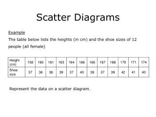
Example: Finger Lakes Homes • Crosstabulation The number of Finger Lakes homes sold for each style and price for the past two years is shown below. qualitative variable quantitative variable Home Style Price Range Colonial Log SplitA-Frame Total 18 6 19 12 55 45 <$99,000 > $99,000 12 14 16 3 30 20 35 15 Total 100
Crosstabulation: Row or Column Percentages • Converting the entries in the table into row percentages or column percentages can provide additional insight about the relationship between the two variables.
Crosstabulation: Row Percentages Home Style Price Range Colonial Log Split A-Frame Total 32.73 10.91 34.55 21.82 100 100 < $99,000 > $99,000 26.67 31.11 35.56 6.67 Note: row totals are actually 100.01 due to rounding. (Colonial and > $99K)/(All >$99K) x 100 = (12/45) x 100
Crosstabulation: Column Percentages Home Style Price Range Colonial Log Split A-Frame 60.00 30.00 54.29 80.00 <$99,000 > $99,000 40.00 70.00 45.71 20.00 100 100 100 100 Total (Colonial and > $99K)/(All Colonial) x 100 = (12/30) x 100
Using Excel’s PivotTable Reportto Construct a Crosstabulation Step 1: Click on the Insert tab on the ribbon Step 2: In the Tables group, click the icon above PivotTable Step 3 When the Create Pivot Table dialog box appears: Choose Select a table or rangeEnter A1:C301 in the Table/Range box Select New Worksheet ClickOK Chapter 2 file Restaurant.xlsx
Using the Pivot table Field List • Step 1: In the PivotTable Field List, go to Choose Fields to add to report: • Drag the Quality Rating Field to the Row Labels area. • Drag the ($)Meal Price field to the Column Labels area. • Drag the Restaurant field to the Values area. • Step 2: Click Sum of Restaurant in the Values area • Select Value Field Settings. • Step 3: When the Value Field Settings dialog box appears: • Under Summarize value field by, choose Count • Click OK
Finalizing the PivtotTable Report • Step 1: Right-click in cell B4 (or any other cell containing meal prices) • Select Group • Step 2: When the Grouping dialog box appears: • Enter 10 in the Starting at box • Enter 49 in the Ending at box • Enter 10 in the By box • Step 3: Right-click on Excellent in cell A5 • Choose Move • Select Move “Excellent” to End • Step 4: Close the PivotTable Field List box
Crosstabulation for the LA Restaurant Example Chapter 2 file Restaurant.xlsx
Crosstabulation: Simpson’s Paradox • Data in two or more crosstabulations are often aggregated to produce a summary crosstabulation. • We must be careful in drawing conclusions about the • relationship between the two variables in the • aggregated crosstabulation. • Simpson’ Paradox: In some cases the conclusions based upon an aggregated crosstabulation can be completely reversed if we look at the unaggregated data.
You might think Luckett is the better Judge. However, a larger share of Kendall’s cases were in municipal court—where the likelihood of being overturned on appeal is higher.
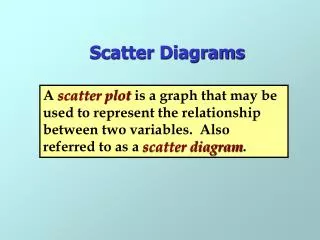
Scatter Diagram and Trendline • A scatter diagram is a graphical presentation of the • relationship between two quantitative variables. • One variable is shown on the horizontal axis and the • other variable is shown on the vertical axis. • The general pattern of the plotted points suggests the • overall relationship between the variables. • A trendline is an approximation of the relationship.
A Positive Relationship Y 0 X
A Negative Relationship Y 0 X
No Apparent Relationship Y 0 X
Example: Panthers Football Team • Scatter Diagram The Panthers football team is interested in investigating the relationship, if any, between interceptions made and points scored. x = Number of Interceptions y = Number of Points Scored 14 24 18 17 30 1 3 2 1 3
35 30 25 20 15 10 5 0 1 0 2 3 4 Scatter Diagram y Number of Points Scored x Number of Interceptions
Example: Panthers Football Team • Insights Gained from the Preceding Scatter Diagram • The scatter diagram indicates a positive relationship • between the number of interceptions and the • number of points scored. • Higher points scored are associated with a higher • number of interceptions. • The relationship is not perfect; all plotted points in • the scatter diagram are not on a straight line.
Using Excel’s Chart Wizard to Constructa Scatter Diagram and Trendline • Formula Worksheet (showing data entered)
. . . continue Using Excel’s Chart Wizardto Construct a Scatter Diagram Step 1 Select cells A1:B6 Step2 Click the Chart Wizard button on standard toolbar Step 3 When the Chart Wizard - Step 1 of 4 - Chart Type dialog box appears: Choose XY (Scatter) in the Chart Type list Choose Scatter from the Chart subtype display Click Next >
. . . continue Using Excel’s Chart Wizardto Construct a Scatter Diagram Step 4 When the Chart Wizard- Step 2 of 4 -Chart Source Data dialog box appears: Click Next >
. . . continue Using Excel’s Chart Wizardto Construct a Scatter Diagram Step 5 When the Chart Wizard - Step 3 of 4 – Chart Options dialog box appears: Select the Titles tab and then Type Scatter Diagram for the Panthers in the Chart title: box Type Number of Interceptions in the Value (X) axis: box Type Number of Points Scored in the Value (Y) axis: box
Using Excel’s Chart Wizardto Construct a Scatter Diagram Step 5 (continued) Select the Legend tab and then Remove the check in the Show Legend box Click Next > Step 6 When the Chart Wizard – Step 4 of 4 - Chart Location dialog box appears: Specify a location for the new chart Click Finish
Using Excel’s Chart Wizard to Construct a Scatter Diagram
Using Excel’s Chart Wizard to Constructa Scatter Diagram and Trendline • Adding a Trendline Step 1 Position the mouse pointer over any data point in the scatter diagram and right click Step 2 Choose the Add Trendline option Step 3 When the Add Trendline dialog box appears: Select the Type tab and then Choose Linear from the Trend/ Regression type display Click OK
Using Excel’s Chart Wizard to Constructa Scatter Diagram and Trendline
Scatter Diagram for the Stereo and Sound Equipment Store Example
Scatter Diagram for the Stereo and Sound Equipment Store Example—with a Trendline