Scatter diagrams
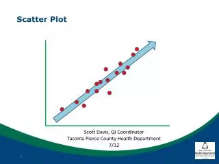
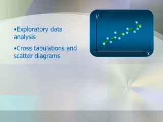
Scatter diagrams show the relationship between two sets of variables . By looking at the graph you can see whether there is a link between variables. Where there is a link it is called correlation . Scatter diagrams. By Kimberley Pang. Example – plotting the points .

Scatter diagrams
E N D
Presentation Transcript
Scatter diagrams show the relationship betweentwosets of variables. By looking at thegraph you can see whether there is a link between variables. Where there is a link it is called correlation. Scatter diagrams By Kimberley Pang
Example – plotting the points To plot the points, take the x co-ordinate (French mark) and the y co-ordinate (German mark) and line it up to the axes. For example, Josh’s mark is (42, 48), so you would need to plot these co-ordinates on the graph. Do this with all the results.
Theline of bestfit goes roughly through the middle of all the scatter points on a graph. The closer the points are to the line of bestfit the stronger the correlation is. • The line of bestfit shows the trend, but it is onlyapproximate and any readings taken from it will be estimations. Line of Best fit
Example – Line of best fit Draw the line of best fit by placing it in the middle of most of your points. A line of best fit can only be drawn if there is strong positive or negative correlation. The line of best fit does not have to go through the origin (0,0)

