Download
1 / 8
120 likes | 537 Vues
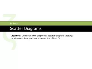
ζ. Dr Frost. Scatter Diagrams. Objectives: Understand the purpose of a scatter diagram, spotting correlation in data, and how to draw a line of best fit. What are scatter diagrams?.

E N D
ζ Dr Frost Scatter Diagrams Objectives: Understand the purpose of a scatter diagram, spotting correlation in data, and how to draw a line of best fit.
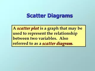
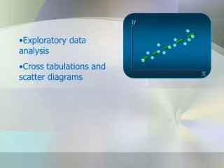
What are scatter diagrams? They display data involving two variables. For example, we might collect compare students’ test performance in English and Maths.
How can they help us interpret data? They can help us identify if there is any relationship between the two variables. The relationship between two variables is known as correlation. ? How are English and Maths test scores related? If someone’s English test score is higher, their Maths score tends to be higher. ? Schoolboy ErrorTM: “A higher English score means their Maths score will be higher.” We call this relationship: Positive correlation ?
Different types of correlation There’s 3 types you should be able to identify. Weak negative correlation ? ? Type of correlation: Weak positive correlation ? ? strength type No correlation ? ? Strong positive correlation ?
Line of best fit We can add a line of best fit to the scatter diagram. This allows us to estimate one variable’s value given the other. If a boy gets 50% in his English test, what score might we expect him to get in his Maths test? 65% ? (I used Excel to generate this trendline.)
Line of best fit We can add a line of best fit to the scatter diagram. This allows us to estimate one variable’s value given the other. Here’s a more interesting question... Can you come up with an equation that could estimate a Maths Score (y) from an English score (x)? y = 0.55x + 38.5 ? We can find the gradient by picking two random points on the line suitably far apart. (0, 39) and (80, 82) The y-intercept seems to be about 39. Change in y is 43 Δy Δx 43 80 m = = = 0.54 Change in x is 80
Line of best fit y-intercept: 17 ? Gradient: -0.18 ? Equation of line: -0.18x + 17 ?
Line of best fit y = -0.18x + 17 If someone’s age is 50, how many hours would we therefore expect them to be on the internet? (-0.18 x 50) + 17 = 8 ?