Analyzing Data with Graphs: Mean, Median, Mode, and Frequency Display
Learn how to calculate mean, median, mode, and analyze frequency using different graphing techniques. Understand when to use each measure of central tendency. Practice with stem-and-leaf plots and recognize misleading graphs.


Analyzing Data with Graphs: Mean, Median, Mode, and Frequency Display
E N D
Presentation Transcript
Bell Ringer • Get out your notebook and prepare to take notes on Chapter 9 • Convert your height to inches and be prepared to write this value on the whiteboard
Chapter 9 Using Graphs to Analyze Data
9.1 – Finding Mean, Median, and Mode (Page 412)9.2 – Displaying Frequency (Page 418) • Essential Questions: • How do we find the mean, median, and mode of a set of values? • How do we choose which measure of central tendency to use? • When are line plots, frequency tables, and histograms useful?
9.1 – Mean, Median, Mode • Central Tendency: • Single value that summarizes how a set of data is centered • Mean: • Average • Sum of data values divided by the number of data values • Median: • Middle value when the data values are arranged in numerical order • Mean of two middle terms for an even number of data values • Mode: • Item with the greatest frequency • Possible to have no mode, one mode, or more than one mode
9.1 cont. • Range: • Measure of how spread out the data in a set are • Difference between the greatest and least values in a set • Outliers: • A data item that is much higher or lower than the other data items • Have very little effect on the median and mode
9.1 cont. • When to use mean, median, and mode: • Example: The income of people who live in a town
9.2 – Displaying Frequency • Frequency • Number of times a data item occurs • Line Plot • Displays data with X marks above each data value on a number line
9.2 cont. • Frequency Table • Lists frequency of each item in a set of data • Histogram • Special type of bar graph with no spaces between bars • Height of bar shows the frequency • Intervals are of equal size and do not overlap
9.1/9.2 - Closure • How do we find the mean, median, and mode of a set of values? • Mean: the sum of data values divided by the number of data items • Median: the middle value or mean of the two middle values • Mode: the data value or values that occur most often • How do we choose which measure of central tendency to use? • Mode: when data is not numerical • Mean: when there are no outliers • Median: when outliers are likely • When are line plots, frequency tables, and histograms useful? • Quickly organize and display data • Useful when there are a large number of data values
9.1/9.2 - Homework Page 414-416, 2-24 even Page 420-421, 2-22 even
Bell Ringer • Get out your 9.1/9.2 homework assignment • Get out your notebook and prepare to take notes on Section 9.4 • Think of some ways that a graph could be misleading and list them in your notebook
9.4 – Reading Graphs Critically (Page 428) • Essential Questions: • How do we recognize misleading graphs? • How do we choose the appropriate scale for a graph?
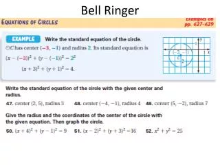
9.4 cont. • Misleading Graphs: • A scale that does not begin at zero may be misleading • Appropriate Graph Techniques: • Scale must include least and greatest values • Scale must be divided into equal increments
9.4 cont. • Example 1: Explain why the new graph is more clear than the previous graph.
9.4 cont. • Note:
9.4 cont. • Example 2:
9.4 cont. • Example 3: • The following graph makes it appear that almost twice as much is earned on Thursday as on Monday. Explain. The vertical scale begins at 66 instead of
9.4 cont. • Example 4: • Using two different scales, make two bar graphs for the following data. Use a break symbol in only one of the graphs.
9.4 cont. • Example 5: • The graph makes it appear that about 6 times as many people prefer apple juice to prune juice. Why? • The Vertical Scale has a break in it and it begins at 10. • How would you redraw the graph to more accurately portray the data?
9.4 - Closure • How do we recognize misleading graphs? • Not starting at zero on the vertical scale • Using intervals that are too small, too large, or unequal • How do we choose the appropriate scale for a graph? • Use equal intervals • Include entire range • No breaks in the actual data!
9.4 - Homework Page 429-431, 1-7, 11-16
Bell Ringer • Get out your 9.4 homework assignment • Get out your notebook and prepare to take notes on Section 9.5 • Order the following data values from least to greatest in your notebooks
9.5 – Stem-and-Leaf Plots (Page 433) • Essential Question: • How do we read a stem-and-leaf plot?
9.5 cont. • Stem-and-Leaf Plots: • Graph that shows numerical data arranged in order • Each data item is broken down into a stem and a leaf • Stem is on the left and the leaf is on the right
9.5 cont. • Example 1: • Make a stem-and-leaf plot for the following data:
9.5 cont. • Example 2: • Make a stem-and-leaf plot for the following data:
9.5 cont. • Example 3: • Make a stem-and-leaf plot for the following data:
9.5 cont. • Back-to-Back Stem-and-Leaf Plots: • Compare two data sets in one stem-and-leaf plot
9.5 cont. • Example 4: • Make a back-to-back stem-and-leaf plot for the following data:
9.5 - Closure • How do we read a stem-and-leaf plot? • Use the key to understand the relationship between stem and leaf
9.5 - Homework Page 435-436, 1-9, 12
Bell Ringer • Get out your 9.5 homework assignment • Get out your notebook and prepare to take notes on Section 9.6 • Recall the definition of “median”
9.6 – Box-and-Whisker Plots (Page 438) • Essential Question: • How do we make a box-and-whisker plot?
9.6 cont. • Box-and-Whisker Plot: • Graph that summarizes a data set along a number line • Quartiles: • Divide data into four equally-sized groups • Lower Quartile – median of the lower half of the data • Middle Quartile – median of the entire data set • Upper Quartile – median of the upper half of the data
9.6 cont. • Example 1: • Write a statement that compares the data in the following box-and-whisker plots:
9.6 cont. • Example 2: • Write a statement that compares the data in the following box-and-whisker plots: The range for the girls’ heights is greater than the boys’. Overall, the boys tend to be taller than the girls. The girls’ upper quartile is equal to the boys’ lower quartile.
9.6 cont. • Example 3: • Make a box-and-whisker plot for the following data:
9.6 cont. • Example 3 (cont.):
9.6 cont. • Example 3 (cont.):
9.6 cont. • Example 4: • Make a box-and-whisker plot for the following data:
9.6 - Closure • How do we make a box-and-whisker plot? • Order data • Find quartiles • Draw the box and the whiskers
9.6 - Homework Page 440-441, 2-14 even, 17
Bell Ringer • Get out your 9.6 homework assignment • Get out your notebook and prepare to take notes on Section 9.7 • Plot the following points on the coordinate plane: Maksim: Juvon: Madison: Eli: Quinton: Tatiyana: Taylor: Cody: Colton: Jared:
9.7 – Making Predictions From Scatter Plots(Page 444) • Essential Question: • How can we make scatter plots and use them to find a trend?
9.7 cont. • Scatter Plots: • Graph that displays two sets of data as ordered pairs • Shows whether or not two sets of data are related
9.7 cont. • Example 1: • Make a scatter plot for the data in the table below: Value (in thousands) Age (in years)
9.7 cont. • Example 2: • Make a scatter plot for the data below:
9.7 cont. • Trends:
9.7 cont. • Trend Line: • Drawn onto the scatter plot • Approximates relationship between data sets • Used to make predictions about data values that don’t appear on scatter plot • Possible to have no trend line
Example 3: • Use the following scatter plot to predict the height of a tree that has a circumference of 175 in: 88 ft