Download
1 / 35

E N D
Actually iwas just thinking while preparing my presentation that what should be the contents of my introductory slide. How should I start with my presentation. I was bit confused.all of a sudden something click into my mind and I prepared this slide specially for my introductory part.i just don’t knowhow much I’ll bbe able to make the things clear for you all,HOweveri will definitely try to make them as simple and shor for all of you.please be attentive for rest of the time and I am sure you al must get some important things and points from this presentation. Hope this will help you all in your future proffessional life.
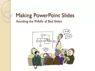
THE MAKING OF POWERPOINT SLIDES Subrata Paul PGDACR 08 - 09 Avoiding The Pitfalls Of The Bad Slides
Topics to be covered • Outlines • Slide structures • Transitions and Animations • Fonts • Color • Background
Topics (contd….) • Graphs • Spellings and grammar • Conclusion • Questions • 10 commandments of PowerPoint
Outlines • 1st and 2nd slides as outline of the presentation. • Example : the previous slide • Follow the order of the outline for rest of the presentation. • Main points on the outline slides . • Example : titles of the slides
Slide structure • 1 – 2 slides per minute. • Point form and not complete sentences. • Rule of 6x6. • No more than six words across. • No more than six bullet points. • Keywords and phrases should be used.
Slide structure This slide contains too many words for presentation slide. There are exactly the same number of points in this slide as in previous one. But they are not written in point form and hence it is very difficult for the audience to read them. And also it is very difficult for the presenter to describe every point. In short, the audience will spend more of the time in reading this slide than listening to the presenter.
Slide structure • One point at a time: • Help audience concentrate. • Prevent audience from reading ahead. • Help to keep presentation focused.
Slide structure • No distracting animation should be used. • No over boarding of slides with animation. • Consistent use of animations.
Transitions and Animations • Less is more……… • Visual effects should be used in less doses – The more we emphasize everything, we emphasize nothing.
Transitions and Animations • Animations in the text that enters “from left” should not be used. • Loud and unpleasant sounds should be avoided. • Too many sound effects should be avoided. • Too many transitions and animations should be avoided.
Transitions and Animations • Presentation should be pleasing and interesting without over using transitions, sounds and animations. • Experiment with various effects before using them on the final presentation.
Fonts • At least an 28-point font. • Different font size for headings and subheadings. • Example : this font is 26, the main points are in 29 and the heading is in 44 point font.
Fonts • Small fonts are difficult to read. • CAPITALIZE ONLY WHEN NECESSARY. IT IS DIFFICULT TO READ. IUMRING TO GQNGIUSIONS • Complicated fonts should not be used.
Fonts • Standard fonts like Times New Roman or Arial should be used. • The presentation may look like this on a different computer: • This is one of the bad fonts used ever in any presentation. • This is one of the bad fonts used ever in any presentation.
Color • Color of font must sharply contrast with the background. • Example: Blue font with white background. • Colors should be used to reinforce the logic of the slide structure. • Example : Light blue title and Dark blue text. • Different colors to emphasize a word. • But should be used occasionally.
Color • Non contrasting colors are difficult to read. • Using colors todecorate are actually distractingandannoying. • Different colors for different points are unnecessary. • Using different colors for secondary points are also unnecessary. • Trying tobeverycreativeisalsosometimesverybad.
Color • No more than four colors should be used per slide: • Headings • Sub-headings (if any) • Main points • Sub-points (if any) • Colors should be consistent throughout the presentation. • Avoid using very sharp colors like red.
Background • Backgrounds used should be attractive but simple. • Light backgrounds should be used. • Background should be consistent throughout the presentation.
Background • Backgrounds that are distracting or difficult to read should not used. • We must be consistent with the background used.
Graphs • Graphs should be used rather than just charts and words. • Data in graphs are easier to comprehend and retain than the raw data. • Graphs should always be titled.
Graphs • Minor gridlines are unnecessary. • Font is too small. • Colors are illogical. • Title is missing. • Shading is distracting.
Spelling and Grammar • Each slide should be thoroughly checked and rechecked: • Spelling mistakes. • Repeated words. • Grammatical errors. • And the best option is ……………… Ask some one else to read and check your slides.
Conclusion • The audience always remembers the last wordings….. • Strong and effective closing should be used. • A conclusion slide should contain: • Summary of the main points. • Future aspects.
Questions • The presentation should end with a simple question slide. • Audience is invited to ask questions. • Presentation should not be ended abruptly.
The 10 commandments of PowerPoint • Do not put War and peace on one slide. • Do not use fonts smaller than 28 point. • Do not use busy backgrounds or ineffective colors. • Do not complicate slides with too many graphs and tables.
The 10 commandments of PowerPoint • Use animations, audio and pictures in moderation. • You must back up your presentation. • Do not read the slides word by word. • You must practice.
The 10 commandments of PowerPoint • You must allow the listener time to process. • You should acknowledge all the references used.
References • Buchholz, Susan and Jill Uhlman. “12 Commandments for PowerPoint.” The Teaching Professor. June/July 2004: 4-4. http://src2.epnet.com/School/DeliveryPrintSave 2 Nov. 2005. • PowerPoint Etiquette, Created by Kathy SchrockAdministrator for TechnologyNauset Public SchoolsOrleans, MA • PowerPoint etiquette, Teaching, Learning, Technology Center (TLTC) • www.google.com
Last but not the least • Remember…… • Preview presentation on the presentation equipment to used. • Rehearse rehearse and rehearse. • Is your presentation the one you would like to sit through??