Wine Cellars Website Usability Analysis Report
This report analyzes the usability of David Clinton Wine Cellars' website, providing recommendations to improve form and function, enhance readability, and boost positive usability factors while addressing negative aspects. Suggestions focus on building brand identity, increasing customer engagement, and optimizing functionality for wine sales.

Wine Cellars Website Usability Analysis Report
E N D
Presentation Transcript
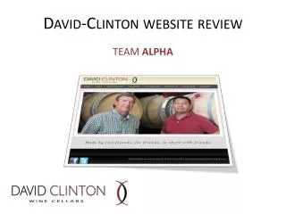
David Clinton Wine Cellars Website Usability Analysis TEAM PICANTE CEJA, DAMSKEY, KALFSBEEK, WEIS MARCH 9, 2013 BUS 519E
Form & Function Usability is a combination of Form & Function Form : design concept recommendations Function: usability recommendations Overall Goals: 1) Build brand through unique, consistent identity and messaging 2) Increase the mailing/customer list 3) Good functionality to sell out of wine!
Function • Readability Statistics • Positive Usability Factors • Negative Usability Factors • Suggestions for Improvements
Function – Readability Stats • Flesch Kincaid Score = 74.9 • 12-15 year olds should be able to read easily • 6thgrade reading level • 1.79% “complex” words
Function – Positive Attributes • Loads quickly • Font size/Logo • Flash is minimal • Home Page 5-second test • Tag Line • Navigation • “Founder Bios” prominent • Links • Consistency in style/format • Above the Fold • URL
Function – Negative Attributes • No mailing list sign up • Text/Background Contrast • ALT tags on logos but not on photos • Drop-downs • Minimal Content (+ or -) • No ecommerce • Clicks from Purchase • Links are Red rather than Blue • No Search function
Function - Suggestions • Mailing List • Ecommerce • Text/background contrast and color schemes • Put yourselves out there in “Founder Bios” • Consolidate “Founder Bios” & “our Story” • Navigation menu for “Events/News” • Include release parties, etc • Videos/pics • Facebook “Like” counter • Add ALT tags to photos, videos, etc • Links to blue underline
Form – 4 Concepts Stealth & WealthFriends & Family Elegant EgalitariansScience Sells
Concept 1 – Stealth & Wealth“Too cool for school” • Features: • One or few pages • Mailing list sign up is primary focus • Emphasis on exclusivity and scarcity • Communications are by email directly to customers, as opposed to on website • Minimal social media • Examples: Screaming Eagle Hundred Acre
Concept 2 - Elegant Egalitarians“Wine by friends, for friends, to share with friends” • Features: • Wine for sale on site AND by release • Good overview of winery information in well-designed multiple pages • Elegant and simple presentation; refinement of existing site • Minimal social media but can build over time • Examples: Harlan Estate B. Kosuge Wines
Concept 3 – Friends & Family“It’s a party, come on in!” • Features: • Strong social media focus • Use of video to build interest and mailing list • Annual parties partnered with venues • Active blog • Examples: Ceja Vineyards Swanson Vineyards
Concept 4 – Science SellsGalileo: “Wine is sunlight held together by water” • Features: • Focus on the “science” personalities of David and Clinton • Creative content and images to build brand • Each customer communication is finely crafted and builds a buzz due to creative content (both images and writing) • Medlock Ames Douglas Gayeton Photography Project • Examples: Medlock Ames Matthiasson Vineyard Blog
Summary • Build brand through unique, consistent identity and messaging • Focus on build mailing/customer list • Good functionality to sell out of wine!