
Design Principles
Understanding key design principles is crucial for creating visually appealing and effective documents. This guide outlines the importance of proximity in organizing related items, alignment techniques to enhance readability, and the significance of repetition for consistency. It also explores the three major font families: serif, sans serif, and decorative fonts, highlighting examples like Times, Arial, and Bernard MT Condensed. By applying these principles, you can improve the visual attraction and overall impact of your designs.

Design Principles
E N D
Presentation Transcript
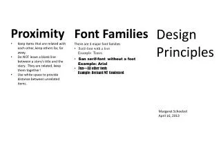
Proximity • Keep items that are related with each other, keep others far, far away. • Do NOT leave a blank line between a story’s title and the story. They are related, keep them together! • Use white space to provide distance between unrelated items. Design Principles • Font Families • There are 3 major font families • Serif-font with a foot • Example: Times • San serif-fontwithout a foot • Example: Arial • Fun—All other fonts • Example: Bernard MT Condensed Margaret Schoelzel April 16, 2013
Alignment • Contrast • Visual attraction on the page • Keep elements the same or very different • Make darks dark and light items light • Place dark text on a light background and light text on a dark background • Make big items bigand small ones small • Repetition • Aim for consistency. • Repetition will strengthen the reader’s sense of recognition. • Repeat elements throughout your document. • Repeat fonts, font sizes, colors, and graphics. • There are four alignments: • Left- use for large blocks of text that need to be read. This is a traditional style. • Right- Use for titles and small amounts of text. This is funky. • Centered- Use for titles. Is formal.


