Download
1 / 18
230 likes | 357 Vues
Discover the significance of colors and their psychological effects. Explore how colors evoke emotions and influence behavior in various contexts. Learn about color schemes for creating harmonious visual experiences.

E N D
Psychology of Color By Michael Fluharty
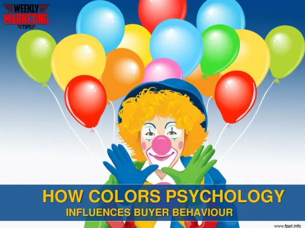
Why use color? • Color is a necessary and meaningful constant for sighted people. • It is used as a powerful psychological tool in every area of society. • i.e. Campbell's soup
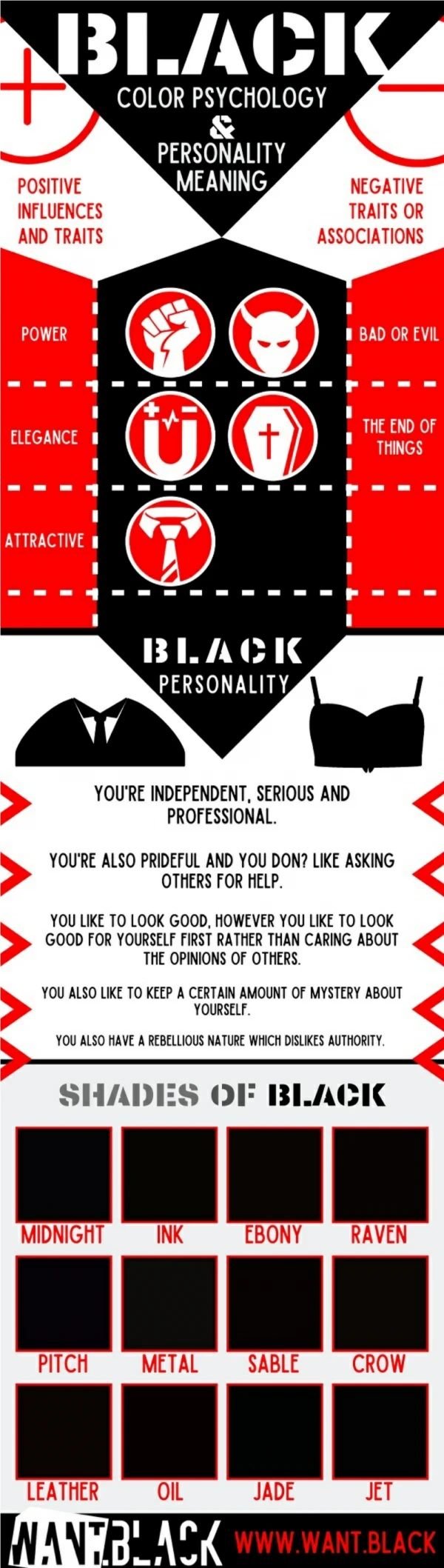
Psychology of Black • Black is a serious color that evokes strong emotions • Black is the color of authority, power, stability, strength, and intelligence. • (i.e. Black horn rimmed glasses.) • Black is also synonymous with evil or grieving • (i.e. A black cowboy hat)
Psychology of White • For most of the world this is the color associated with purity and cleanliness. • (i.e. Wedding dresses or doctors coats) • It is also used to project the absence of color, or neutrality. • It is a compression of all the colors of the spectrum.
Psychology of Gray • Gray is most associated with the practical, timeless, middle-of-the-road, solid things in life. • Too much gray invokes no emotion. • Some shades of gray are associated with old age, death, taxes, depression or a lost sense of direction.
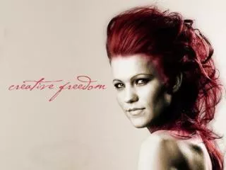
Psychology of Red • Red is often the first color the eye will be drawn too. • Red is the color of energy, and is associated with movement and excitement. • Red is the symbol of life. • Pink is the most calming of all the colors.
Psychology of Blue • Ask people their favorite color and a clear majority will say blue. • Most shades of blue actually cause the body to produce chemicals that are calming. • Over the ages blue has become associated with steadfastness, dependability, wisdom and loyalty. • Studies show sports are enhanced by blue. • (i.e. more reps in the gym)
Psychology of Green • Green has many meanings. • The color of growth, nature, and money. • It can also be associated with envy, good luck, generosity and fertility. • (i.e. Green with envy.) • It is the traditional color of peace, harmony, comfortable nurturing, support and well paced energy.
Psychology of Yellow • Yellow is associated with laughter, happiness and good times. • Brain releases more serotonin when surrounded by yellow. • Yellow can be quickly overpowering if over-used. • Some shades of yellow are associated with cowardice. • (i.e. Yellow bellied.)
Psychology of Orange • Orange is the color associated with fun times, happy and energetic days, warmth and organic products. • It is also associated with ambition.
Psychology of Purple • Purple is a royal color that is associated with wealth, prosperity, rich sophistication. • This color stimulates the brain activity used in problem solving. • If used in the proper amount, it lends an air of mystery, wisdom, and respect.
Psychology of Brown • This color is most associated with reliability, stability, and friendship. • It's the color of the earth itself . • (i.e. “Terra Firma”) • It too is associated with things being natural or organic. • In India it is the color of mourning.
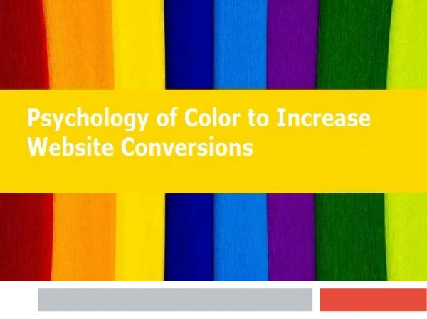
How to use colors together • But how should one use colors together? • There a couple of schemes used to invoke feeling. • Monochromatic, Complimentary, and Triple color schemes.
Monochromatic Color Scheme • This is the use of a single color in varying shades.
Complimentary Color Scheme • This scheme uses a high contrast of color by selecting colors directly opposite from one another on the color wheel . • This puts a warm color with a cool color and is pleasing to the eye.
Triple Color Scheme • This scheme uses three colors equally spaced from each other around a color wheel.
Conclusion • Color is essential in displaying thoughts and ides. • It helps keep people interested and thoughtful. • We would have no joy in life if there were no color.