Download
1 / 55
550 likes | 568 Vues
This presentation explores the various useful features of Unisys Weather website and how they can be incorporated into weather data lessons. It covers daily weather maps, local forecasts, satellite imagery, radar plots, and more. The presentation also highlights the potential for differentiation and higher-level learning using the site's complex data.

E N D
Classroom use of web-sourced weather maps Mark Powers Vergennes Union High School http://www.uvm.edu/~swac/
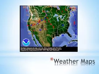
Unisys Weather • Unisys is the site I have used most in the last three years of this project. There are a number of products available on the site that are useful every day, some that can be used occasionally and some rarely or never in an introductory unit on weather data. The amount, and varying complexity of the data also allows for taking the project to higher levels of differentiation. In this presentation I will describe some of the useful locations on the site and how they can be used. • http://weather.unisys.com/index.php
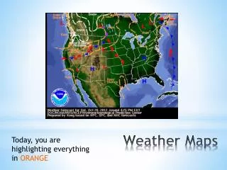
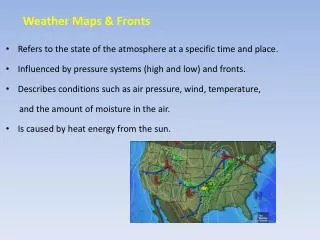
Home page shows a generalized daily weather map that has a loop capability to show weather system development, and a link to local forecasts.
Typical link to local weather forecast, and links to regional plots
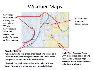
Visible water vapor plot (compare to location of fronts on main map)
Good page to inform users of various levels of the site features.
Archive information can be useful in a variety of applications.
Both plots are interesting to see what similarities and differences there are in these areas.
Link to analyses section where some data plots will be familiar while others may not.
I display some of these occasionally to show how graphic displays can show numerical data in another way.
The meteograms are a good compilation display and the Skew T plots are of interest to people who have some experience with balloon soundings
This is a good description of how pressure not height is important in upper air plots.
Upper air station model plot information differs from surface station model plots.
Good summary of how sounding diagrams are used but more background knowledge is helpful in understanding these plots.
Doppler radar plots showing potential areas of severe weather like thunderstorms and tornadoes.
The following section of slides is the NAM (North American Mesoscale Model) type of forecast product.
Notice again that pressure, not height is used do describe the plot location.