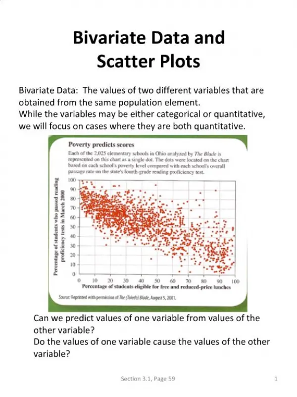
Bivariate Data
Bivariate Data. 3.9 4 credits. Bivariate Data. Learning objectives. Know what bivariate data is plot graphs of bivariate data write reports on bivariate data. A nalysis-. T REND from the graph I can see a . . . . . . . strong positive linear relationship


Bivariate Data
E N D
Presentation Transcript
Bivariate Data 3.9 4 credits
Bivariate Data Learning objectives • Know what bivariate data is • plot graphs of bivariate data • write reports on bivariate data
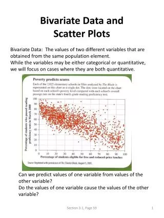
Analysis- • TREND from the graph I can see a . . . . . . . • strong positive linear relationship • moderate positive linear relationship • weak positive linear relationship • strong negative linear relationship • moderate negativelinear relationship • weak negativelinear relationship • non linear, strong positive relationship . . . . . . . • non linear, moderate negative relationship . . . . . . . . • no relationship • strong relationship with outliers • strength, direction, linear or non linear • strength can be written as ‘weak to moderate’
Analysis- • ASSOCIATION • I can see that the association is positive because as x variable nameincreases the y variable name increases. • Link your relationship back to the context.
Analysis- • RELATIONSHIP • comment on what you can see, use the correlation coefficient to back up your strength statement. • The relationship is strong and linear as I can see most of the points are fairly close to the trend line. This is confirmed by the correlation coefficient of 0.8451, indicating that the linear relationship is quite strong.
Analysis- • SCATTER • how consistent is the scatter? Are there areas that are denser or sparser than others? • The scatter appears to be reasonably consistent throughout the data range with no obvious areas with more points
Analysis- • OUTLIERS • explain why the outlier might be there. Is it . . . • a measurement error • an impossible real life value • incorrectly entered data • If you believe that an outlier is an erroneous value and you can justify this conclusion, you can remove it. • what happens when you remove it and re-plot the graph? • was it an influential point • best plan – point it out, show what happens when you remove it, make a comment then put it back in.
Analysis- • GROUPING • has your data ended up in clusters? Then comment on it! • no clusters? Then comment on it! • Link your comments to what you can see. • Looking at the graph I can not see any obvious grouping. • Looking at the graph I can see there is some evidence of grouping with a bunch less than 0.4 carats, a bunch around 0.55 carats, 0.75 carats and 1 carat. All of these bunches still fit the trend line reasonably closely.