
Effective Document Design: Principles of Proximity, Contrast, and Alignment
This guide outlines essential design principles for creating visually appealing documents. Learn about the significance of proximity, where related items are grouped closely while unrelated items are distanced using white space. Understand the importance of contrast in capturing reader attention through size, color, and shape differentiation. Explore the consistency of repetition by maintaining the same fonts and color schemes throughout your document. Lastly, grasp the different types of alignment to create stronger visual connections. Perfect for enhancing your document’s effectiveness.

Effective Document Design: Principles of Proximity, Contrast, and Alignment
E N D
Presentation Transcript
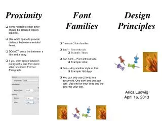
Proximity • Items related to each other should be grouped closely together. • Use white space to provide distance between unrelated items. • DO NOT use a line between a title and a story. • If you want space between paragraphs, use the space after function in Format Paragraph. • Font Families • There are 2 font families: • Serif— Font with tails. • Example: Times • San Serif— Font without tails. • Example: Arial • Fun— Any another style of font. • Example: Giddyup • You can only use 2 fonts in a document. One serif and one san serif. Use one for your titles and the other for your text. Design Principles Arica Ludwig April 16, 2013
Contrast • You want to grab your readers attention. • Add visual interest to your page. • Make color, size and shape different. • Makebig things BIG andlittle things little. • Make text dark and background light or vise versa. • Repetition • The document should look the same way throughout. • Use the same font and font sizes. Titles should be one size, text another. • Use a similar graphic format throughout. • Use a similar color scheme throughout. • Alignment • Alignment creates a visual connections. • There are 4 types of alignment. • Left- This is the most common. Use when your reader will read lots of text. • Right- This is a funky, modern alignment. This is used for titles. • Center- This one is boring. Center titles when you want to be formal. • Block- This gives you smooth edges left and right.


