
Essential Design Principles for Effective Document Layout
Understand the key principles of effective document design with this guide focusing on proximity, contrast, repetition, and alignment. Learn to keep related items together and unrelated items apart for clarity. Explore the three major font families: serif, sans serif, and fun fonts, and comprehend how to create visual attraction through contrast. Discover the importance of consistency by repeating elements and the different alignment styles suitable for various types of text. Enhance your document's readability and aesthetic appeal with these foundational design strategies.

Essential Design Principles for Effective Document Layout
E N D
Presentation Transcript
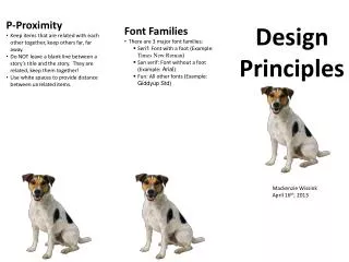
P-Proximity • Keep items that are related with each other together, keep others far, far away. • Do NOT leave a blank line between a story’s title and the story. They are related, keep them together! • Use white spaces to provide distance between unrelated items. Design Principles • Font Families • There are 3 major font families: • Serif: Font with a foot (Example: Times New Roman) • San serif: Font without a foot (Example: Arial) • Fun: All other fonts (Example: GiddyupStd) Mackenzie Wissink April 16th, 2013
C-Contrast • Visual attraction on the page. • Keep elements the same or very different. • Make darks dark and light items light. • Place dark text on a light background and light text on a dark background. • Make big items big andsmall ones small. • R-Repetition • Aim for consistency. • Repetition will strengthens the reader’s sense of recognition. • Repeat elements throughout your document. • Repeat fonts, font sizes, colors, and graphics. • A-Alignment • There are four alignments: • Left: Use for large blocks of text that need to be read. This is a traditional style. • Right: Use for titles and small amounts of texts. This is funky. • Centered: Use for titles. This is formal. • Block: Use in newspapers.


