Graphic Communication
A – Z of DTP Desk Top Publishing Terms. Graphic Communication. STUDENTS’ NOTES

Graphic Communication
E N D
Presentation Transcript
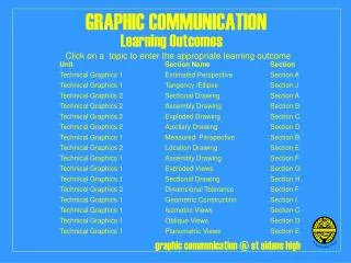
A – Z of DTP Desk Top Publishing Terms Graphic Communication
STUDENTS’ NOTES This unit is designed to try and assist with the learning and understanding of the terminology, or language, which you are required to know about when using Desk Top Publishing (DTP) systems in your study of Computer Aided Graphics/Design systems in Graphic Communication. To assist you in learning terminology you should use the following routes: 1.Read books on Graphic Design and Desk Top Publishing 2. Look at examples of existing published materials. 3. Experiment with the DTP software package available until you have acquired some knowledge of its main features. When using computer software, remember to use: · On-line Help software within your DTP package · DTP software manuals · Dictionaries/Glossaries 4. Use the Glossary of Common DTP Terminology, supplied with this course, as a reference. Design for DTP. When undertaking a piece of Desk Top Publishing work it is important to know the following information: 1. Who is going to use the document/publication? (Target market) 2. What is the document for? (Function) 3. What production limitations are there? (Cost, Print Run, Colour, Size, Deadlines) Before starting any work on a computer-based system it is important to do initial preparation on paper: · Thumbnail Sketch Layoutsto generate ideas quickly · Full Size Working Roughsshowing position of text, headings and artwork and any main features of the publication. This will allow you to draw up a specification which you can use to control your work on the computer to produce your Final Presentation Visual. Note: See worked examples of Single and Double Page Layouts · Make mock-ups showing any special folds or features required in the post-printing processes · Look at samples of paper, card, or other materials required in the production.
Basic Rules for Graphic Design The main function of Graphic Design is to MAKE AN IMPRESSION. The following points will help you in design for DTP: 1. Keep it simple. One appropriate visual concept is often all that is required. 2. Avoid mixing layout styles. Use either an asymmetrical or a symmetrical layout not both. 3. Limit the number of visual elements on a page. ‘One picture says a thousand words’ but too many pictures can actually reduce the impact of a page. 4. Avoid ‘junk type’. Many DTP packages supply many different typefaces. Many are specialised typefaces and are not suitable for most general use. Think about legibility. 5. Avoid mixing typefaces. Mixing of type starts to affect legibility and can make lettering look like a collage. (However, mixed type can sometimes be used to good effect in design of headings) 6. Limit the number of typefaces in the publication to a maximum of three. Often, careful adjustment of font sizes and weights will give all the variety necessary for a publication from one typeface. 7. Create a visual contrast. Think about how you want the readers’ eyes to move across the pages of the document. 8. Create visual hierarchies. Decide which elements are most important and arrange the pages of the document so that readers are drawn to these elements. 9. Make full use of white space. Avoid filling pages up with too much information. An overloaded page often ‘turns the reader off’. 10. Avoid changes that are too subtle, they can look like mistakes. Many familiar layouts for publications work because they are tried and tested. Be original but avoid being too ‘smart’.
Page Layout The following example page layouts shows some of the most common elements of DTP page layouts. Different publications tend to follow different layout styles depending on who is to read them and what type of information is being imparted to the reader. Example 1. Three column magazine, journal or tabloid newspaper single page layout with left justified text type. Note: Underlined terms are commonly examined terms
Example 2. Non-fiction book single column double page layout with fully justified text type and large left margins. Note: Most fiction books are read voluntarily by the reader and therefore have a very passive single column layout with fewer illustrations (unless they are children's publications) Fiction books usually require a little more variation in layout to sustain readers’ interest. Note: Underlined terms are commonly examined terms
Example 3. A 3 column single page layout showing non-printing area with printing register marks and non-printing layout grid. Note: Underlined terms are commonly examined terms
Designing for Desktop Publishing The following pages detail the basic process for producing desktop publishing design solutions and show some worked examples of single and double page layouts. It is important to produce ideas on paper using freehand and formal drawing methods in order to develop an understanding of traditional publishing processes and to ensure that a clear design specification is developed before using any DTP package to develop finished presentation visuals. This ensures efficient use of computer systems and saves paper. Stage 1 Thumbnail Sketches Develop ideas for page layouts using thumbnail sketches. At this stage it is important to generate a variety of ideas showing different layout solutions. Sketch freehand. Try to be aware of any restrictions imposed by the brief. Stage 2 Working Roughs Draw up full size working roughs showing: position of margins, gutters, columns etc size and position of typefaces; style and content of artwork; colour tints/block background colours and type of paper/card to be used. Use these working roughs to develop a design specification for use on a DTP package. Note: Use lined or grid paper, drawing instruments, copies of artwork and lettering samples to help with layout. Stage 3 Presentation Visuals Produce presentation visuals, or final design solutions, on a DTP package incorporating all the elements of the design specification. The presentation visuals should be full scale showing all typefaces and illustrations. The visuals should be presented to the client as best quality hard copy output from a laser printer or bubble jet printer.
Example 1 Single Page Layout - Business Stationery The following example is designed to introduce students to a variety of DTP single page layout formats and offers the opportunity to use imported artwork produced in formal drawing, freehand sketching, or CAD exercises (for example: an orthographic view of a computer mouse). Brief Design Business Stationery for a computer hardware company. Include in your solution: headed paper, compliments slip and business card. Your solutions for headed paper and compliments slip must be designed to fit a standard business envelope. Thumbnail Sketches
Working Roughs The example below shows the working rough which was produced manually on squared paper. The notes contained on the working rough form the specification for the finished presentation visual to be produced on the DTP package.
Presentation Visual The half scale image below shows the final presentation visual produced on a DTP package with imported graphics from a drawing package. Single page layout - Headed paper The design has changed slightly since the working layout was produced reflecting the development of the concept on the DTP package.
Example 2. Double Page Layout CD-ROM Cover The following example is designed to introduce students to a variety of DTP double page layout formats and offers the opportunity to use imported artwork produced in formal drawing, freehand sketching or CAD exercises. Brief Design a cover for a CD-ROM Encyclopaedia produced by a computer software company. Include in your solution: software company logo. Your solution must fit a standard CD-ROM transparent casing. Thumbnail Sketches
Presentation Visual The illustration below shows a half scale view of the finished CD-ROM double page layout. The layout includes text and graphics produced on drawing and paint packages. The graded tone areas were produced using fill features on the drawing package but these could equally be added during the print process. This type of layout would normally be produced in landscape format, or using a double page layout on the DTP package being used.
GLOSSARY OF COMMON DESK TOP PUBLISHING (DTP) TERMS A Alignment Positions of text lines on a page or column. e.g. Aligned left (flush left, ragged right) Aligned right (flush right, ragged left) Justified (flushed on both left and right) Arabic numerals The numerals in common use: 1, 2, 3, 4, 5, 6, 7, 8, 9, 0 (as distinct from Roman numerals: I, II, III, IV, V, etc.) Artwork Any black and white, or colour, original prepared for reproduction. Automatic hyphenation The automatic insertion of a hyphen in a word which does not fit on the end of a line. The page layout software normally checks an internal dictionary of words to make sure that the word can be hyphenated before insertion. B Banner In newspaper work, a main headline running across the top of the page. Often used to describe the title heading on a newspaper or journal. Baseline In type, the line on which both capitals (e.g. G, H) and lowercase (e.g. x, m) letters stand. Bleed To bleed is to extend an artwork graphic or photographic frame beyond the trimmed edge of the page. The bleed is the amount by which the image extends beyond the trimmed edge - commonly 3mm. Bold type A heavier, blacker version of a type (commonly used with Roman type) Box Text which is ruled off on all four sides. Bullet/Blob/Cannon ball A symbol, e.g. large dot, square, asterisk, etc., which is used to emphasise key points in text. Bullets are often used to highlight lists within a block of text.
C Camera-ready-copy Fully prepared page(s) of text and graphics ready for photographing for reproduction by a conventional printing process, e.g. offset lithography. Caps Capitals, upper case letters. Cap height The height of capital letters in a given font. Caption The descriptive text accompanying an illustration. Centre-spread/fold The pair of pages that come at the centre of a folded section (e.g. pages 4 and 5 in an 8 page section) Note: A double-page layout design is often used for a centre-spread in magazines and newspapers. Column The vertical strip, or band, on a page into which text can be placed. Note: The columns on a page are usually set up before frames containing graphics, or photographs are located on the page. The columns often provide a structure to build the page. Column guides Non-printing screen page guides denoting margins and columns. Column rules Lines (rules) inserted between columns of text. Column width The horizontal size, or width, of a column. Copy Any matter - words or illustrations- such as handwritten text, typescript, photographs, artwork which are to be reproduced by printing. Crop/Cropping To mark artwork and graphics in order to indicate which portion is to be reproduced. In DTP: Cropping is the on-screen cutting of photographic or graphic images to remove excess material using a frame grabbing process. Crop marks are the intersecting lines that page layout packages print at the corners of a page if the actual page size is smaller than the paper on which it is printed. The crop marks indicate the actual printable page. Cut-off rule A horizontal line (rule) printed across text columns to separate different text items - usually in newspapers and magazines.
D Descender The lower portion of lowercase letters which drop below x-height For example: g, j, p, q, y. Desk Top Publishing (DTP) The creation of a whole publication on computer, and preparing it for printing without using the traditional processes of typing, typesetting, cutting and pasting and layout. Display type The larger sizes of type - i.e. those sizes used for headlines. (14 pt and above) E Earpiece Small advertisements that appear in the top corners of newspapers and broadsheet publications. Em The width of the point size being used. e.g. An 8pt em is 8 points wide. The 12pt em is used in printing to measure width and depth of columns and pages. Em dash A dash which prints the width of the point size being used Em space A fixed space which is the width of the point size being used. En Half the width of the point size being used. Note: En dash and En space are used the same way as Em dash and Em space. End paper Leaves of paper that join the text of a book to the binding. Expanded/extended A wide version of a standard typeface. F Facing page Two pages which face each other, when the publication is open, in a double sided publication - e.g. book, magazine. The even numbered page is on the left, the odd numbered pages are on the right. Folio A printed page number in a publication. Font (Fount) Is a set of type in one size and style. In DTP, ‘font’ is used to describe ‘type styles’ the size of which can be changed by the operator. Foot (margin) The margin at the foot of a page in which the footer is usually located.
G Graphic Line, box, circle options available within page layout packages. An illustration /artwork prepared on a paint, draw, CAD, graph applications package or captured by image scanner which is then imported into the page layout package. Grid All CAG systems provide ‘transparent’ grids; patterns which appear on the screen as drawing aids but do not necessarily form part of the drawing. Grids are used to divide the page up into orderly areas with which to structure the printed elements of the page. Grids are very important tools in designing DTP layouts. Guide Non-printing lines on the screen page (usually dotted) which mark grid lines, columns, margins etc. These are intended to assist in the placement on text and graphics on the page. Gutters DTP - refers to the spaces between columns on a page. Footer A line of text/or page number (folio) placed at the bottom of the page which is repeated throughout the main body of the document. (See Header) Footnote Text placed at the bottom of a page prefixed by a superscript number (or bullet character) which is cross-referenced by the same character in the text. Footnotes are used to provide additional or subsidiary information. Format In DTP terms, is the arrangement of text on a page defined by the page size, alignment and text style. Formatting means applying a style or alignment to a document or paragraph. Frame/Frame grab DTP packages use frames to capture images, or inputted text, in order that they can be manipulated separately on a page and if necessary worked on using separate software.
H Handles The small rectangles, or other icons, which surround a selected frame. Handles allow the frame to be resized, moved, or rotated independently of the other items on the DTP page. Hard copy Any copy of drawings, or documents, produced on a printer, or plotter. Head (margin) The margin at the top of a page in which the header is usually located. Header A line of text and/or page number placed at the top of a page which repeats throughout the main body of the publication. (see: Footer) Headline Line or lines of type set in a display (large) size of type and placed above accompanying text. A headline usually guides the reader on the content of the body text. A headline may be repeated on the top of each page of a publication as a header, or may be used only once at the beginning of the publication. Highlight 1. DTP - refers to the procedure of selecting text by cursor. Selected text is usually shown reversed i.e. black on white becomes white on black. Highlighted text can then be modified in terms of typeface, point size etc. 2. In the reproduction of continuous tone originals (e.g. photographs) highlights are the lightest areas of the picture. Hot metal Strictly speaking, a type from a casting machine but widely used to describe any type set in relief on a metal body. (See: Letterpress) Hue Colour. Often used in graphics packages for colour adjustment settings. Hyphenate Inserting a hyphen in a word in order to allow the word to be split between lines. (See: Automatic hyphenation)
I Icon An on-screen representation of an action or command that a page layout program can carry out. These are usually designed to allow the user to execute actions using a cursor action, often with a mouse, instead of the key board. Image area That portion of a printed page defined for the assembly of text and graphics - i.e. the area within the set margins. Image grabber A special cursor function in DTP packages which allows the user to ‘grab’ screen graphic images and perform actions such as moving, copying and cropping. Imposition The arrangement of pages on a printing plate so that when the sheet is folded the sequence of pages is correct. Imprint In printing, this refers to the piece of text in a publication which states the name and address of the printer/publisher of the publication. *Import This is a DTP menu function which brings a text file, or graphic, from an external application into a DTP page layout. Indent Beginning a line of text further in from the left margin than the rest of the text. (See: hanging indent, indent paragraph, nested indent) Indent paragraph Where the complete paragraph of text is indented by a set amount from the left margin. Initial (letter) The use of a large letter to start the first paragraph of continuous text. Raised initial is where the initial letter is base aligned with the first line of text and rises above it. Drop initial letter is when the top of the initial letter is aligned with the top of the first text line and drops to occupy the start of the second line. Highly decorated initial letters were used in very early handwritten text, for example The Book of Kells. Some DTP packages use the term Big First Letter. Ink jet printer A non- impact printer that ‘draws’ the characters by squirting ink at the paper from a fine jet whose position can be altered by program commands. *Input A term used to describe information being sent to a computer. Common DTP inputs include: fax, scanner, floppy disk, mouse, keyboard.
Internet/World Wide Web The international on-line information system. The Net is used to source information and images for DTP and also to transfer information between different organisations. Italic type A type of lettering style in which the characters slope to the right. Many fonts are available in bold and italic as well as normal forms. Italic fonts are often used to highlight text, or to insert notes within a body of normal text. J Justification Setting of type lines in which the space between words is varied from line to line so that each line is of equal length. K Kerning A DTP function which is used to adjust the spacing between pairs of individual letters on a page. This is used to eliminate unwanted ‘white space’ and to enhance the visual impact of words. L Laid Paper with a clearly visible wire pattern which is formed during manufacture. Landscape A page layout function which arranges the page so that its widest side is horizontal. This is often used in the layout of leaflets which requires folding (gatefold or concertina fold) opposite: Portrait Laser Printer A non-contact printing device predominantly used in DTP. Laser printers use a laser beam focused on an electrically charged drum which forces the ink to follow the light pattern to form the image required. Laser printing is very fast and produces a high quality output. Layout grid The on-screen design plan for a publication created on page layout software by specifying paper size, margins, column widths which show on the screen as nonprinting guides. (See: grid) Leaders A series of dots in line, often used to ‘lead’ the eye in from one column to another. Used also in form design to indicate areas which have to be filled in by the user - e.g. name and address panels.
M Make-up The operation of assembling all elements - text, captions, headlines, illustrations, etc. - on a page, or pages. The great advantage of DTP packages is that they do this onscreen very accurately, and that mistakes can easily be rectified without starting the whole process from scratch. Margins The area of white space at the outside of a printed page - top, bottom, left, right surrounding the image area. Individual margins can be adjusted easily on DTP packages allowing for different binding techniques to be used for the same publication. These are called margin guides. (See: back, binding, head, foot, foredge) Montage A combination of separate images combined to give a composite picture/image. O Original Any photograph, drawing, or piece of artwork provided as copy for reproduction. Outline A typeface which uses an outline effect. e.g. OUTLINE Overlay Some DTP packages allow for the printing of the colours which make up a full colour page onto separate pages, complete with register marks. These separations, or overlays, can then be supplied to a commercial printer who will produce separate printing plates for each colour and will print final copies in the colours specified, using the register marks to accurately position each colour element. (See: Register mark) P Page One side of a leaf or sheet of paper. Page size The dimensions of the pages of a publication. The page size is the finished size and may be different from the paper size which may be larger to allow for a trim allowance. (particularly in pages which contain a bleed ) Point The basic unit of measurement in printing. 12pts = 1Pica em.- the unit of type measurement. Portrait A page layout function which arranges the page so that its widest side is vertical. This is the common page layout used in letters, books, newspapers and magazines. see: Landscape
Proof A trial printing of a piece of printed material for the purposes of checking and marking alterations for revision prior to the final print run taking place. Q Quotes Marks which indicate speech, e.g. They can be ‘single’ or “double”. R Register mark A cross-hair target symbol placed outside the page area to provide a guide for the commercial printer when printing multicolour work. Each register mark should overprint exactly for accurate registration. The register marks are located outwith the page size and are removed when the publication is trimmed. Retouching Manual, or computer-aided, adjustment to an illustration/photograph. Reverse (cameo) Reproducing the whites in an original as black and the blacks as whites, e.g. reversed text is white on a black background. River Uneven lines, or patches, of white space running through a page or column of text. This effect is caused when the eye picks up the pattern of word spacing running down the text. Run The number of copies of a publication to be printed. Run on, extra copies printed at the same time as the original run. S Sans serif A typeface with no serifs - i.e. with no terminal strokes on the letters. Examples include: Arial, Univers, Helvetica, Futura, Avant Garde. Serif The small terminal stroke at the end of a main stroke of a letter. Typefaces which have serifs are derived from hand-cut letters or calligraphic lettering styles. e.g. Times Roman is a serif font. Shadow A typeface which uses a drop-shadow effect. e.g. SHADOW (See: Text formatting, Drop-shadow) Spine The bound edge of a document/publication. Subheading A heading appearing within the body of the text.
T Templates These are dummy publications that act as a model, providing the structure and general layout for particular document types. For example: business letter, greetings card, report, etc. Templates can be run by Wizards which help beginners when they start up a software program for the first time. Text type The sizes of type used for normal body text; generally taken to be those sizes below 14pt. Typeface A matching set of characters for printing, identifiable by their design, with distinct names (e.g. Arial, Helvetica, Futura etc.), and usually available in a variety of sizes. Type sizes The standard point system used to describe type sizes. This is based on 72 points to an inch. (12 points is, therefore, 1/6” high) U Underline A typeface which is underlined. Uppercase Capital letters, e.g. CAPITAL LETTERS. W White space Areas of empty space on a page. When used effectively in page layout/design, white space aids comprehension by complementing and setting off graphic images and areas of solid text.