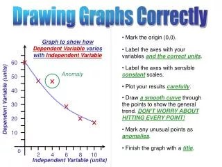
Guidelines for Correctly Drawing and Labeling Graphs of Dependent and Independent Variables
This guide provides essential steps for constructing accurate graphs that illustrate the relationship between a dependent variable and an independent variable. Key points include marking the origin (0,0), labeling axes with variables and correct units, applying sensible scales, and carefully plotting results. Ensure to draw a smooth curve that represents the overall trend without needing to touch every point. Anomalies should be indicated clearly, and conclude your graph with an appropriate title to convey the purpose of your data representation effectively.

Guidelines for Correctly Drawing and Labeling Graphs of Dependent and Independent Variables
E N D
Presentation Transcript
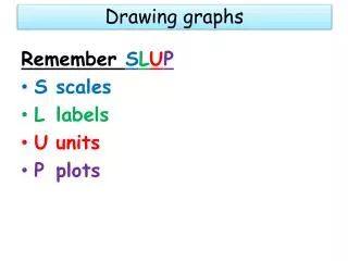
Drawing Graphs Correctly • Mark the origin (0,0). Graph to show how Dependent Variable varies with Independent Variable • Label the axes with your variables and the correct units. 60 • Label the axes with sensible constant scales. Anomaly 50 • Plot your results carefully. 40 • Draw a smooth curve through the points to show the general trend. DON’T WORRY ABOUT HITTING EVERY POINT! Dependent Variable (units) 30 20 • Mark any unusual points as anomalies. 10 • Finish the graph with a title. 0 2 4 6 8 10 Independent Variable (units)
Graph to show how Dependent Variable varies with Independent Variable 60 Anomaly 50 40 Dependent Variable (units) 30 ü 20 Perfect! 10 0 2 4 6 8 10 Independent Variable (units) Drawing Graphs Correctly Graph to show how Dependent Variable varies with Independent Variable 60 60 50 (units) Anomaly 50 40 40 Dependent Variable Independent Variable 30 30 û ü 20 Spot the errors! 20 10 10 5 0 2 2 4 4 6 6 8 8 10 10 Independent Variable Dependent Variable (units)