Frequency Distribution
Frequency Distribution. Definition. Frequency Distribution is a statistical technique to explore the underlying patterns of raw data. Preparing frequency distribution tables, we can answer question like How frequently was a certain score observed in a given sample/population


Frequency Distribution
E N D
Presentation Transcript
Definition • Frequency Distribution is a statistical technique to explore the underlying patterns of raw data. • Preparing frequency distribution tables, we can answer question like • How frequently was a certain score observed in a given sample/population • Around which score(s), was the majority of scores collected • What is the rank of a certain score in a given sample/population
An Example • Let’s try to prepare a sample table. • Which score, do you expect to get from the midterm exam of Statistics • To organize the raw scores, order them from highest to lowest • As you can see, there are still too many numbers. • One way to summarize them is to use intervals • Let’s use interval width of 3. • Let’s use interval width of 5 • Grouping error
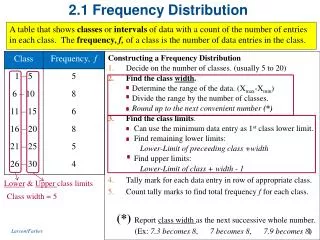
How can we decide the interval width • Be sure that your class intervals are mutually exclusive • Make all intervals to same width • Make the intervals continuous throughout the distribution • Place the interval containing the highest score value at the top • For most work, use 10 to 20 class intervals • Choose a convenient interval width • When possible, make the lower score limits multiples of the interval width
To Prepare a Frequency Distribution Table • Find the lowest and the highest scores • Find the range by subtracting lowest score from highest • Divide the range by 10 and 20 to find the largest and the smallest intervals (i) • Determine the score at which the lowest interval begin • Record the limits of all class interval • Use the tally system • Convert each tally to frequency
An Example • On the example sheet, measurements of height for 30 students are presented. • Prepare a frequency distribution table with appropriate interval width • Find the lowest and the highest scores • Find the range by subtracting lowest score from highest • Divide the range by 10 and 20 to find the largest and the smallest intervals (i) • Determine the score at which the lowest interval begin • Record the limits of all class interval • Use the tally system • Convert each tally to frequency
Apparent vs. Real Limits • In the worksheet, the heights of the students are presented as discrete variables. • If we got more accurate measures, the scores for height would be much more like 176.4 rather than 176. • So, we round up or round down to deal with continues scores. That is, the real score for 176 ranges between 175.5 and 176.5. • So, what are the real limits for the interval of 172-174? • Now, write the real limits for students’ height
Relative Frequency Distribution • A relative distribution table shows the categories or score values and the proportions or percentage of the total number of the cases that they represent. • Relative frequencies are particularly helpful when comparing frequency distributions in which the number of the cases differs
The Cumulative Frequency Distribution • A cumulative frequency distribution shows how many cases lie below the upper real limit of each class interval. • To prepare this • Start at the bottom and record for each class interval the total frequency of cases falling below its upper real limit. That is cumulative f • Be sure the cumulative f for the highest interval is equal to n • To compute cumulative proportion divide cumulative f to n (N) • To compute cumulative percent multiply cumulative proportion by 100
Percentiles and Percentile Ranks • A percentile point is a point on the measurement scale below which a specified percentage of the cases in the distribution falls • A percentile rank is the percentage of the cases falling below a given point on the measurement scale. • For instance, 50% of the students in sociology class have midterm scores lower than 52.2. So, 52.2 is a percentile point showing the 50thpercentile. But, percentile rank of score 52.2 is 50.
Computing Percentiles from Grouped Data • Sometimes we only have the grouped data and we cannot access raw scores. • What if we need to find a percentile from grouped data? Let’s consider the Final Exam Scores gathered from PSY101 class
Computing Percentiles from Grouped Data • To compute percentile from grouped data, we need to assume that the scores are evenly distributed throughout the interval. • Find which interval the score falls into. • Find how many cases are located in this interval • Find the difference between the percentile rank and the cumulative of the lower interval. That is, the number of the cases that we need to go up to reach the percentile rank • Calculate the proportion for the percentile and multiply it by the interval width • Add the result to the lower limit of the interval
Computing Percentiles from Grouped Data • What is the value of 25th percentile? • 25th percentile is the score below which 25 % of actual scores fall. • We have 89 cases. So, 25% of 89 cases is 22.25 • Working up from the bottom of distribution, we find that the 22.25th case will fall in the class interval 55-59. • We need to find lower limit of the interval. It is 54.5.
Computing Percentiles from Grouped Data • What is the value of 25th percentile? • To find the percentile 25, we use the assumption that the scores are evenly distributed throughout the interval. • The value of 25th percentile point will be located at 22.25 cases up from the bottom of distribution. • 20 cases are below the interval 55-59. So, we need to come up 2.25 (22.25-20=2.25) to reach this position. • That is, we need to come up 2.25 out of the 8 (f in this interval) equal parts in the interval.
Computing Percentiles from Grouped Data • What is the value of 25th percentile? • The interval width is 5. So, for each person we go up .63 ponts (5/8=.63). For 2.25 person we need to go up 1.42 points. • That is 1.42 point. So adding that point to the lower limit, we can find 55.91 is the 25% percentile. • Now you find 60th and 85th percentile.
Computation of Percentile Rank • We might need to know percentile rank rather than percentile score. • To find the percentile rank, we need to follow similar steps • Let’s try to find percentile rank of 77
Computation of Percentile Rank • The score is in the interval of 75-79. To reach 77, we need to come up from 74.5 to 77. That is 2.5 point. • There are 12 cases in this interval and the interval width is 5. • We assume that the scores were evenly distributed. • To find the position of this score in the interval, we need to calculate a proportion. That is 2.5/5X12= 6
Computation of Percentile Rank • There are 64 cases below the interval of 75-79. So, we need to add the location of the score 77. That is 64 + 6 = 70 • So, 70 cases is under the score 77. To find the percentile rank we need to calculate the proportion: 70/89X100= 78.65. So, the percentile rank of 77 is 78.55. • Now you calculate interval rank for the score 38 and 55
Graphic Representation of Frequency Distribution • The aim of the graphic representation is to provide a simple and visual presentation. So, there is no extra information in graphics • We will learn • Histogram • Frequency Polygon • Bar diagram • Pie Chart • Cumulative Percentage Curve • Stem-and-leaf Displays
Histogram • Construct a frequency table • Decide on suitable scale for horizontal axis. The number of intervals + 2 is ok • Draw bars of equal width for each class interval. The height of the par corresponds to the frequency in that particular interval. • Be sure there is no gap between interval, unless there is an empty interval • Identify the class intervals along the horizontal axis. Use either interval mid points or real limits.
The Frequency Polygon • Construct a frequency table • Decide the horizontal and vertical axes • Label the interval midpoints • Be sure there is no gap between interval, unless there is an empty interval • Place a dot above the midpoint of each interval at a height equal to the frequency • Connect the dots with straight line.
Bar Diagram and Pie Chart • Appropriate for categorical data. • The order of the categories is not important unless the categories are rank ordered. • For a pie chart we use proportions. • Let’s say we have 44 females and 5 males in psychology class. • Then, 44/49= 90% of the class is female and 5/49=10 % is male • The angle for females in a pie chart is 360X0.90=324 • The angle for males is 360X0.10=36
Cumulative Percentage Curve • It is similar to Frequency polygon. • But this time we use upper limit of the interval on the horizontal axis. • And we show the increase in the scores. • If there is no score in a certain interval, the line in the graph continues horizontal. • It does not goes down
Stem-and-leaf Displays • A statistic for exploratory data analysis • To prepare the figure • Choose the interval width • Put the first digit of the lowest interval at the top. That is stem • Write the second digit of the lowest score in this interval, then second digit of the higher score. That is leaf.