Creating Charts and Pivot Tables
600 likes | 796 Vues
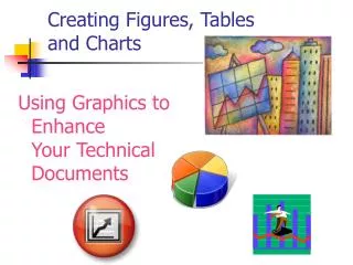
Creating Charts and Pivot Tables. Lesson 10. Objectives. Software Orientation: The Insert Tab. The Insert tab contains the command groups you’ll use to create charts in Excel (see the figure).

Creating Charts and Pivot Tables
E N D
Presentation Transcript
Creating Charts and Pivot Tables Lesson 10
Software Orientation: The Insert Tab • The Insert tab contains the command groups you’ll use to create charts in Excel (see the figure). • To create a basic chart in Excel that you can modify and format later, start by entering the data for the chart on a worksheet. Then, you can select that data and choose a chart type to graphically display the data.
Software Orientation: The Insert Tab • Simply by choosing a chart type, a chart layout, and a chart style—all of which are within easy reach on the Insert tab’s ribbon—you will have instant professional results every time you create a chart. • Use the illustration on the previous slide as a reference throughout this lesson as you become familiar with and use Excel’s charting capabilities to create attention-getting illustrations that communicate an analysis of your data.
Step-by-Step: Select Data to Include in a Chart • Before you begin these steps, LAUNCH Microsoft Excel. • OPEN the Financial History file for this lesson. • Select B4:B10 (the 2004 data) on the Sales History worksheet. • On the Insert tab, in the Charts group, click the Pie button. Click the first 2-D Pie chart. A color-coded pie chart with sections identified by number is displayed and the Chart Tools tabs (Design, Layout, and Format) become available, with the Design tab active. This chart, however, doesn’t work: It includes the column label (2004) and total sales amount as its two largest portions, and these amounts should not be included in an analysis of sales for 2004.
Step-by-Step: Select Data to Include in a Chart • Click in the chart’s white space and press Delete. The chart is now deleted and the Chart Tools tab disappears. • Select B5:B9, click the Insert tab, click Pie in the Charts group, and click the first 2-D Pie chart. The correct data is displayed, but the chart is difficult to interpret with only numbers to identify the parts of the pie as in the figure.
Step-by-Step: Select Data to Include in a Chart • Click in the chart’s white spaceand press Delete. • Select A4:B9, click the Insert tab, and click Pie in the Charts group. Click the first 2-D Pie chart. As in the figure, the data is clearly identified with a title and a label for each pie section. • Create a Lesson 10 folder and SAVE the workbook as Building Charts. • LEAVE the workbook open to use in the next exercise.
Step-by-Step: Choose a Chart for Your Data • USE the workbook from the previous exercise. • On the Sales History worksheet, click on the pie chart’s white space and press Delete to delete the pie chart. • Select A4:F9, click the Insert tab, and click Column in the Charts group on the Insert tab. Click 3-D Clustered Column on the drop-down list (first subtype under 3-D Column). The column chart illustrates the sales for each of the revenue categories for the five-year period. The Chart Tools tab appears with the Design tab active. • Anywhere on the chart, click, hold and drag the chart below the worksheet data and position it at the far left. • Click outside the column chart to deselect it. Notice that the Chart Tools tab disappears.
Step-by-Step: Choose a Chart for Your Data • Select A4:F9, click the Insert tab, and click Line in the Charts group. Click 2-D Line with Markers (first chart in the second row). Position the line chart next to the column chart. The Chart Tools tab is on the Ribbon with the Design tab active. Refer to the figure. • SAVE the workbook with the same name, Building Charts. • LEAVE the workbook open to use in the next exercise.
Step-by-Step: Create a Bar Chart • USE the workbook from the previous exercise. • Click the Expense History workbook tab. • Select A4:F9. Click the Bar icon in the Charts Group on the Insert tab. • Click the Clustered Bar in 3-D subtype. The data is displayed in a clustered bar chart and the Design tab is active on the Chart Tools tab. NOTE:A ScreenTip displays the chart type name when you rest the mouse pointer over a chart type or chart subtype.
Step-by-Step: Create a Bar Chart • Position the clustered bar chart on the left below the worksheet data. • Deselect the chart by clicking anywhere on the worksheet; select A4:F9. On the Insert tab, click the Bar icon in the Charts group. • Click Stacked Bar in 3-D. • Position the stacked bar graph next to the 3-D bar graph. • SAVE and CLOSE the workbook. • LEAVE Excel open to use in the next exercise.
Step-by-Step: Format with a Quick Style • LAUNCH Microsoft Excel if it is not already open. • OPEN the Financial History file for this lesson. • On the Expense History worksheet tab, select A4:A9. Press Ctrl and select F4:F9. You have selected two non-adjacent ranges to use for your chart.
Step-by-Step: Format with a Quick Style • On the Insert tab, click Piein the Charts group and click Pie (the first option on the left) under 2-D. The 2008 data is displayed on the chart and the Design tab is active (see the figure).
Step-by-Step: Format with a Quick Style • In the Chart Layouts group on the Design tab, click Layout 1. The pie chart now displays the percentage that each sales category contributes to total sales. When you apply Layout 1 and Style 4 to the expense chart, additional information is added to the chart and the appearance changes. • In the Chart Styles group, click Style 4. The chart’s color scheme is changed. Position the chart below the data. You have just applied a Quick Style. • On the Sales History worksheet, select A4:A9. Press Ctrl and select F4:F9. You have again selected non-adjacent cell ranges to use in the next chart.
Step-by-Step: Format with a Quick Style • Click Bar in the Charts group and click Clustered Horizontal Cylinder (third row). The clustered bar chart appears on the worksheet. • Drag the chart below the worksheet data. • Click Layout 2 in the Chart Layouts group on the Design tab. Click Style 4 in the Chart Styles group. You have applied your second Quick Style. • SAVE the workbook as Chart Styles. • LEAVE the workbook open to use in the next exercise.
Step-by-Step: Change the Fill Color or Pattern • USE the workbook from the previous exercise. • Click in the chart area of the Clustered Horizontal Cylinder chart on the Sales History worksheet to display the Chart Tools on the Ribbon. • Click the Format tab and click Format Selection in the Current Selection group. The Format Chart Area dialog box opens. See the figure.
Step-by-Step: Change the Fill Color or Pattern • Select Solid fill. Click the Color arrow and click Olive Green, Accent 3, Lighter 40%. A light green fill has been added to the entire background chart area. • Select Picture or texture fill. Click the Texture arrow and click Newsprint (center of selection options). The textured format replaces the color fill as the background in the chart area. • Click Close to close the dialog box.
Step-by-Step: Change the Fill Color or Pattern • In the Current Selection group, click the arrow in the Chart Elements selection box and click Plot Area. The plot area in the chart becomes active as illustrated in the figure. • Click the More arrow next to the colored outlines window in the Shape Styles group. The Outline Colors Style Galleryopens.
Step-by-Step: Change the Fill Color or Pattern • Mouse over the Outline Style gallery to locate and click Subtle Effect – Blue, Accent 1. This applies a light blue gradient style to the plot area. • In the Current Selection group, click the arrow in the Chart Elements selection box and click Legend. This action makes the legend inside the chart active. Press Delete. • SAVE your workbook. • LEAVE the workbook open to use in the next exercise.
Step-by-Step: Change the Chart’s Border Line • USE the workbook you saved in the previous exercise. • In the Current Selection group, click the arrow in the Chart Elements selection box and click Chart Area. The chart area section on the chart becomes active. • Click the more arrow next to the colored outlines window in the Shape Styles group. The Outline Colors Style Gallery opens. • Scroll through the outline styles to locate and click Colored Outline – Blue, Accent 1. The chart is outlined with a light blue border. • In the Current Selection group, click the arrow in the Chart Elements selection box and click Plot Area.
Step-by-Step: Change the Chart’s Border Line • Mouse over the Outline Style gallery to locate and click Colored Outline – Red, Accent 2. A red border is put around the plot area. • In the Current Selection group, click the arrow in the Chart Elementsselection box and click Walls. This activates the walls inside your chart. Mouse over the Outline Style gallery to locate and click Colored Outline – Black, Dark 1. Your chart will resemble the figure. • SAVE your workbook. • LEAVE the workbook open to use in the next exercise.
Step-by-Step: Format the Data Series • USE the workbook you saved in the previous exercise. • Select the chart on the Sales History worksheet. Click the arrow in the Chart Elements selectionbox and select Series “2008”. This makes the cylinders in the chart active. • In the Shape Styles group, click Shape Fill. The color gallery opens. • Point to Texture. Click Denim. Your chart cylinders have now had the Denim texture applied. • Click the arrow in the Chart Elements selection box and click Series “2008” Data Labels. The data labels in your chart are now active.
Step-by-Step: Format the Data Series • Click Shape Outline in the Shape Styles group. This opens the color gallery. • Click Blue under Standard Colors. • Mouse over the data series for coffee and espresso on the bottom cylinder to activate the crosshair cursor. Click and hold the left mouse button to drag the data series above the bar so that the label is completely visible. See the figure.
Step-by-Step: Format the Data Series • Click the Expense History worksheet tab. In the Chart Elements selection box click Chart Title. Place your insertion point behind the 8 and key Expenses at the end of the existing text. You have edited the chart title, and it should read 2008 Expenses. • SAVE the workbook. CLOSE the workbook. • LEAVE Excel open to use in the next exercise. NOTE: The data series is the most important element of the chart. Use formatting tools to call attention to the graphic and the label.
Step-by-Step: Modify a Chart’s Legend • OPEN the Financial History file for this lesson. • On the Sales History worksheet, select the cell range A4:F9. • Click Column in the Charts group on the Insert tab; the Column chart options menu appears. • Select Stacked Column in 3D from the Column chart menu; the chart is inserted and the Chart Tools tabs become available. • Click the more arrow at the bottom right of the Chart Layouts group When the Layout gallery opens, click Layout 4. The legend has moved and appears below the plot area.
Step-by-Step: Modify a Chart’s Legend • Click to select the chart’s legend and in the Outline styles, click the Colored Outline – Blue, Accent 1 style. This will enclose the legend in a light blue border as illustrated in the figure.
Step-by-Step: Modify a Chart’s Legend • With the legend still selected right-click to display the shortcut menu. Click Font; the Font dialog box appears. • In the Font dialog box, select Small Caps in the Effects option area and click OK. This applies the small capital letter format to the text in the legend. • Place your mouse cursor directly on the text for Coffee and Espresso in the legend; right-click to display the shortcut menu and click Font. The Font dialog box opens. • In the Font dialog box, click the Font color button, and then click Green from the drop-down color palette. Click OK to apply the color to the Coffee and Espresso legend text and close the dialog box.
Step-by-Step: Modify a Chart’s Legend • Repeat step 9 for each legend item and apply the following font colors: • Bakery: Red • Coffee Accessories: Orange • Packaged Coffee/Tea: Light Blue • Deli: Blue • SAVE the file as Chart 1. • LEAVE the workbook open to use in the next exercise.
Step-by-Step: Add Elements to a Chart • USE the workbook from the previous exercise. • With the chart still active click the Layout tab. • Click Axis Titles in the Labels group, then point to the Primary Vertical Axis Title in the drop-down menu that appears; the Primary Vertical Axis Title options list is displayed. • Click Vertical Title. An Axis title text box appears in the chart. Select the Axis Title text, and key (In Thousands) in the title text box. • Click Chart Title in the Labels group. Click Above Chart in the drop-down menu that appears. A text box displaying Chart Title is inserted above the columns.
Step-by-Step: Add Elements to a Chart • Select the text and replace it with Sales History. • Click Data Labels in the Labels group. Click None. The Labels are removed from each column in the chart. Click on Data Labels again to restore the labels showing the dollar amount of sales in each category. • Click Gridlines in the Axes group. Point to Primary Horizontal Gridlinesand click Major Gridlines. • In the Labels group, click Axis Titles then and point to Primary Horizontal Axis Title. The drop-down menu appears. • Click Title Below Axis.
Step-by-Step: Add Elements to a Chart • Key Annual Sales in the Axis Title text box as illustrated in the figure. • SAVE the workbook with the same name. • LEAVE the workbook open to use in the next exercise.
Step-by-Step: Delete Elements from a Chart • USE the workbook from the previous exercise. • On the Layout tab in Chart Design tools, click Axis Titles and point to Primary Horizontal Axis Title. Click None. There is now no horizontal axis in the chart. • Click Gridlines in the Axes group, point to Primary Vertical Gridlines. Click None. There are now no gridlines in the chart.
Step-by-Step: Delete Elements from a Chart • Click the Design tab and click Switch Row/Column. The data display is changed to have all sales for one category stacked as illustrated in the figure. • Click Switch Row/Columnto Undo. • SAVE the workbook. • LEAVE the workbook open to use in the next exercise.
Step-by-Step: Move a Chart • USE the workbook from the previous exercise. • Click a blank area in the Sales History chart to deselect any previous actions. • Mouse over the chart to activate the move pointer (crosshairs). Click, hold and drag the chart to center it in columns B to G. • The chart remains selected. Click the Design tab. • Click Move Chart in the Location group. The Move Chartdialog box shown in the figure opens, with the default setting—New Sheet—selected. This setting places the chart as an object in a new worksheet.
Step-by-Step: Move a Chart • The New Sheetselection option is selected in the dialog box, key Sales History Chartin the text box. Click OK. A chart sheet is inserted before the Sales History sheet. The chart sheet becomes the active sheet, and the Chart Tools tabs are displayed as illustrated in the figure.
Step-by-Step: Move a Chart • On the Layout tab, in the Labels group, click Legend. Click Show Legend at Right; the legend moves to the right side of the chart in the chart sheet, which makes the elements in the chart easier to read. • SAVE and CLOSE the workbook. • LEAVE Excel open to use in the next exercise. NOTE: The Chart Tools that you used on the Design, Layout, and Format tabs can be applied to the chart sheet. The data series amounts were difficult to read when you applied them to the embedded chart. They are easy to read and can be used for analysis when the chart is moved to a chart sheet.
Step-by-Step: Resize a Chart • LAUNCH Microsoft Excel if it is not already open. • OPEN the Financial History 2 file for this lesson. • Click a blank area in the chart on the Expense History worksheet to make the chart active and display the Chart Tools tabs. • Click the top-left sizing handle and drag the left edge of the chart to the bottom of row 9 at the left edge of the worksheet. You are using the sizing handles to resize the chart. • Click the top-right sizing handle and align the right edge of the chart with the column G right boundary.
Step-by-Step: Resize a Chart • Click the bottom-center sizing handle and drag the chart boundary to the bottom of row 35 as shown in the figure.
Step-by-Step: Resize a Chart • Click the Sales History worksheet tab to make the Sales History worksheet active. Click a blank area in the chart. Click the Format tab. • In the Size group, click the Shape Heightup arrow until the height is 3.5. • In the Size group, click the Shape Widthdown arrow until the width is 4.0. • SAVE the workbook as Chart 2. CLOSE the workbook. • LEAVE Excel open to use in the next exercise.
Step-by-Step: Choose a Different Chart Type • LAUNCH Microsoft Excel if it is not already open. • OPEN the Financial History file for this lesson. • On the Expense History worksheet, select A4:F9. • On the Insert tab, click Bar and click Stacked Bar in 3-D. This inserts the stacked bar in a 3-D chart into your worksheet. The Design tab becomes active as soon as the chart is inserted into the worksheet. • Click Layout 2 in the Charts Layout group. • Select the chart title text box and key Expense History.
Step-by-Step: Choose a Different Chart Type • On the Design tab, click Change Chart Type. • Click Stacked Horizontal Cylinder in the Change Chart type dialog box. Click OK. • On the Sales History worksheet, select A4:B9. On the Insert tab, click Pie. Click Pie under Pie2D. • Click Layout 1 on the Design tab. • Click Change Chart Type and click Exploded Pie in 3-D. Click OK. • SAVE the workbook as Chart 3. CLOSE the workbook. • CLOSE Excel.
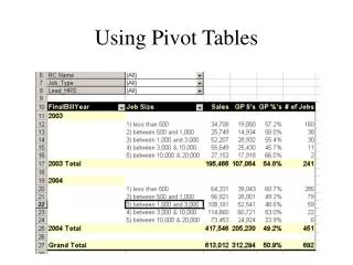
Step-by-Step: Add Data from Another Worksheet • USE the workbook from the previous exercise. • On the Expense Historyworksheet, select cells A4:G9. • On the Insert tab, click the PivotTableicon then Click PivotTable. The Create PivotTable dialog box opens. Click the Existing Worksheet radiobutton as shown in the figure.
Step-by-Step: Add Data from Another Worksheet • Click on the PivotTable worksheetand highlight cells A8:F9. These cells should now be visible in the Create PivotTable dialog box as seen in the figure. Click OK. A new PivotTable with the data from the Expense History worksheet has now been inserted into thePivotTable worksheet.
Step-by-Step: Add Data from Another Worksheet • Your data from the Expense History sheet is now viewable in the PivotTable sheet. • Format the data to the worksheet by selecting the check boxes for the years 2004–2008 and Total in the PivotTable Field List. Click, hold and drag Total to the Report filter box. • SAVE the workbook as Sales vs. Expenses PivotTable. • LEAVE the workbook open for the next exercise.
Step-by-Step: Add a Chart to the PivotTable • USE the workbook from the previous exercise. • On the PivotTable worksheet, select cells A3:F4. • On the Insert tab, in the Charts group, click Column, 2D, Clustered Column. You have inserted the Clustered Column chart to reflect the data from the Expenses PivotTable. • Click, hold, and drag the chart to the left side, aligning the top with Row 12. You have moved the chart for better viewing. • Select cells A8:F9. Click on the Insert tab, in the Charts group, click Bar, 2D, Clustered Bar. You have inserted the Clustered Bar chart to reflect the data from the Expenses PivotTable. You will be able to differentiate the data easier by having unlike charts on the worksheet.
Step-by-Step: Add a Chart to the PivotTable • Click, hold, and drag the Bar chart to be adjacent below the first chart (Row 29). • Click on the Column chart to activate. In the Chart Layout group, click Layout 1. The new layout has changed the style of the chart. • In the Chart Styles group, choose and apply Style 4. Note that the style of the chart has changed. • Edit the Chart Title to read Sales History. You have retitled the chart. • Click on the Bar chart to activate. In the Chart Layout group, click Layout 2. Note that the style of the chart has changed.
Step-by-Step: Add a Chart to the PivotTable • In the Chart Styles group, choose and apply Style 5. The new layout can be seen applied in the workbook. • Edit the Chart Title to read Expense History. Your completed charts are visible in the figure. • SAVE the workbook as Sales_Expenses_Charts. • LEAVE the workbook open for the next exercise.
Step-by-Step: Use Slicer to Bring Data Forward • USE the workbook from the previous exercise. • The PivotTable worksheet is still active. Click on cell A4 to select it. • Click on the Insert tab and click on the Slicer icon. The Insert Slicers dialog box appearsas shown in the figure. • In the Insert Slicers dialog box is a check box list of the data from the PivotTable. Click to select the Total check box and click OK. The slicer is now inserted in the worksheet and the Slicer Tools tab on the Ribbon is now active.
Step-by-Step: Use Slicer to Bring Data Forward • To move the Slicer, click, hold, and drag it next to the Sales History chart in column G as shown in the figure. • Right-click on the Slicerto access the short-cut menu. Click Slicer Settings. The Slicer Settings dialog box opens. • The insertion point appears in the Name text box. Key Sales Slicer. Press Tab twice.
Step-by-Step: Use Slicer to Bring Data Forward • The insertion point is now in the Caption text box. Key Sales Total 2004 and click OK. • On the Slicer Tools Options tab on the Ribbon, in Slicer Styles, choose Slicer Style Light 2. The toolbar should resemble the figure.