Download
1 / 26
310 likes | 571 Vues
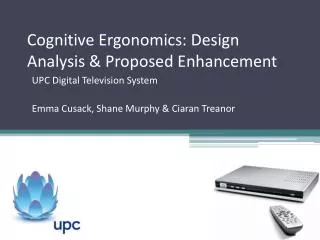
Cognitive Ergonomics: Design Analysis & Proposed Enhancement. UPC Digital Television System Emma Cusack, Shane Murphy & Ciaran Treanor. Overview. What is the UPC system? What problems were identified? Conceptualisation of problems What research design was undertaken?

E N D
Cognitive Ergonomics: Design Analysis & Proposed Enhancement UPC Digital Television System Emma Cusack, Shane Murphy & Ciaran Treanor
Overview • What is the UPC system? • What problems were identified? • Conceptualisation of problems • What research design was undertaken? • What is the proposed redesign? • Does the redesigned system address the problems identified?
The UPC System • Allows users to chose from a range of channels, pause and rewind live television and set programmes to record in advance. • Navigate using a remote control which allows the user to access the various menus, settings and TV guide available. • Although potentially many areas need improvement; the channel and system navigation will be the centre point of this design analysis.
The UPC Remote Control • Power buttons/ switch to DVD etc. • Numerical buttons to input channel number etc. • Menu, Guide, On demand Services buttons • Directional arrows to navigate channels/ TV guide • Volume & channel up/down buttons • Information, help, Back buttons • Recording and playback buttons (rewind, pause etc.)
Use Scenario 1: Set recording/reminder • Current channel /current time: Press record button (red arrow icon appears) • Future recording: Navigate using directional navy arrows to find programme, then press record (red clock icon appears) • Set reminder: Navigate using directional navy arrows to find programme, once programme is located press ‘OK’ button (blue clock icon appears)
Problems Identified • System does not inform the user that current/planned recording can be cancelled by pressing the stop button • User then goes to TV guide in order to carry out action • Some display icons are ambiguous
Use Scenario 2: Changing channel • To change the channel user must use the ‘+’ and ‘-’ buttons on right hand side of remote • Channel can also be changed by pressing the ‘OK’ button in the centre of the remote and use the left/right directional button • User must press ‘OK’ button to confirm their choice of channel
Problems Identified • Pressed up/down directional arrows when they needed to press left/right to view other channels. • Users thought the up/down directional arrows would change the channel; but they needed to use the + and – buttons • Accidentally pressed the rewind button when trying to change the channel
Problems Identified continued • User pressed the back button twice when trying to remove the menu from the screen, which resulted in returning to the previous channel. • After accidentally pressing the left arrow (rewind), pressing the right arrow does not fast forward it, the user must press the fast forward button at the bottom of the remote control.
Use Scenario 3: TV Guide Channel Navigation • ‘Guide’ button is pressed, after some delay (lag) the TV guide appears • The ‘Page Up/Down’ (found above/below directional arrows) and the directional arrow buttons are used to navigate the menu. • The user will then scroll through the TV listings until they find the programme they wish to view. The user presses ‘OK’ to select the channel. • Once the channel is selected and being viewed the user must press the ‘Back’ button once to get rid of the on screen menu.
Problems Identified • Lag occurs when the TV guide button is pressed and also when the user navigates or scrolls through the TV guide. • If the user accidentally presses the back button twice to remove on-screen information (due to lag), the user is returned to the previously viewed channel. • The TV guide text is confusing as the guide is semi-transparent; the user is still able to see what is going on the channel and this can be distracting.
Conceptualisation:Mental Models • The system does not follow the expected mental model; users are left confused by some of the system’s actions as it does not act as is expected (e.g., the remote control does not follow normal conventions; left/right instead of up/down to navigate). • It is not consistent with the population stereotype (Smith, 1981) (the mental model for television systems which is shared among a large population).
Mental Models continued • Users could also be influenced by the anchoring heuristic (Tversky & Kahneman, 1974) what users are exposed to first has a lasting effect as they use this information to create a mental model about the system Principle of pictorial realism and principle of the moving part • Some icons do not ‘look like (i.e., be a picture of) the variable it represents’ (Wickens, Lee, Liu & Gordon Becker, 2004) • Channel navigation is not represented correctly; the information does not move in a way that is consistent with the user’s mental model e.g., looking through channels should be an up/down process not left/right.
Conceptualisation:Visual confusion and proximity compatibility principle • When changing the channel, the + and – buttons on the remote are in close proximity with the ‘Page up’ and ‘Page down’ button. • This contradicts Wickens and Andre’s (1990) idea of spatial separation of items which are relevant to one another • In this case the + and - buttons, and items which are irrelevant, the ‘Page up’ and ‘Page down’ buttons.
Visual confusion and proximity compatibility principle continued • Wickens and Andre (1990) also state that objects on a cluttered display which share the same color will be compared to one another. • This concept can be applied when considering the errors users made when using the remote control to change the channel • The + and - buttons on the right hand side of the remote share the same colours as the navy up/down directional buttons in the center of the remote, and are also in close proximity.
Visual confusion and proximity compatibility principle continued • TV Guide function: A cluttered information display hinders the user’s visual sampling and target search to find the programme they wish to view or find information about (Wickens, Lee, Liu, & Becker, 2004). • Once the information has been located and/or selected, the user will press the back button to return to the programmeviewing screen. • However the onscreen menu is still in place and the user must press back a second time to make the menu disappear.
Visual confusion and proximity compatibility principle continued • This can be a problem as sometimes the system lags and does not immediately complete the action • This can result in pressing the back button a second time and the user is brought back to the previously viewed channel.
Conceptualisation:Attention • The attention of the user can be compromised by the systems faults. • There are many issues with selective attention; becoming too selective can lead users to miss an event or target they are searching for and thus, lead to errors (Wickens, Lee, Liu, & Becker, 2004) e.g., In the TV Guide the information is too cluttered and this can lead the user to miss the target(s) they are searching for. • The user becomes too selective when reading the cluttered text and may miss what they were looking for.
Attention continued • Focused attention is the attention of which a user attempts to concentrate on a particular task and disregard less relevant competing tasks. • The remote control’s unclear button functions and improperly placed buttons can result in errors when changing the channel. • This then leads the user to have to stray from the primary task of changing the channel to now fix any errors they have incidentally made. (Kramer, Wiegmann, & Kirlik, 2006).
Research Design • Found errors of the system by carrying out use scenarios; we got real users to carry out simple tasks and recorded any errors/ comments made by the user. • These errors are the problems that were taken into consideration when we redesigned the system.
System Redesign • All channel navigation should be carried out in a vertical direction (i.e., an up/down movement not left/right). • Change display icons (more realistic representation of the function e.g., currently recording icon) • The information presented to the user needs to be more well organised (less cluttered display on TV guide)
System Redesign continued • Move the + and - buttons away from directional navy buttons (so as to avoid confusion and errors) • Change the colour of either the directional buttons or the + and - buttons (too similar and cause confusion)
Does the redesign solve the problems? • Making all channel navigation an up/down movement means the UPC system would conform to the population stereotype (large mental model) and also adhere to the principle of the moving part. • Changing the display icons would allow the system to meet the principle of pictorial realism; thus adhering to the user’s mental model. • Giving users a less cluttered display allows for better target search and more effective selective attention
Does the redesign solve the problems? • Moving the + and – buttons away from the directional buttons should resolve the issues regarding the proximity compatibility principle and also aid focused attention (the user can focus wholly on the task at hand) • Changing the colour of the similar buttons (e.g., the + and – buttons) should also reduce the visual confusion experienced by the user
References Kramer, A. F., Wiegmann, D. A., & Kirlik, A. (2006). Attention: From Theory to Practice: From Theory to Practice. New York: Oxford University Press. Smith, S. L. (1981). Exploring compatibility with words and pictures. Human Factors, 23(3), 305-315. Tversky, A., & Kahneman, D. (1974). Judgement under uncertainty: Heuristics and biases. Science, 185, 1124-1131. Wickens, C. D., & Andre, A. D. (1990). Proximity compatibility and information display: Effects of color, space, and objectnessof information integration. Human Factors, 32, 61-77. Wickens, C.D., Lee, J.D., Liu, Y & Gordon Becker, S.E. (2004). An Introduction to Human Factors Engineering (2nd Edition). New Jersey: Pearson Education Inc.
Thank you! ? Any questions?


![Intro to Adaptive Web Design [ChaDev Lunch]](https://cdn4.slideserve.com/7566148/intro-to-adaptive-web-design-dt.jpg)