Download
1 / 39
390 likes | 451 Vues
Explore the elements and principles of design and how they come together to create successful artwork. Learn how artists use color, line, shape, texture, value, balance, rhythm, contrast, movement, unity, and harmony to convey their message. Discover how emphasis plays a crucial role in making certain elements stand out in a composition.

E N D
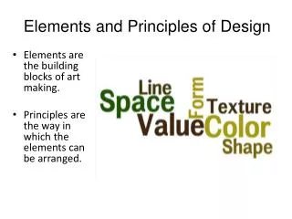
What are the Elements and Principles of design? Art is a visual language. In any language, grammatical rules organize words to create sentences. The sentences communicate information. The elements are like words. The principles are like the rules of grammar. Just like in language, the elements and principles combine to communicate ideas. For an artist, the finished work of art is like the literary piece to a writer- an essay, a term paper, a speech, a story. The artist uses the principles of art to organize the elements in order to create a successful work of art. What is a successful work of art? Although there are many answers, a good piece of artwork should show an effective use of the elements and principles. Effective use of the elements and principles results in an interesting and meaningful composition - in other words, a great work of art.
Every artist uses the elements and principles; fashion designers, graphic designers, painters, sculptors, and so on. When creating a work of art, the artist gives some thought to how each of the elements are used (or not used) and arranged according to the principles of design. How the elements and principles are used determines what kind of message the finished composition (artwork) actually sends.
For example… • When artists use red in a composition, it triggers hunger. Would a graphic designer want to use red in an advertisement for diet pills? • Asymmetrically balanced compositions make a viewer feels excitement or agitation. • Putting an image directly in the center of a composition creates a focal point so strong the viewer wont look at anything else in the picture. • Strong contrasts in value create an immediate focal point and can be useful when the artist wants the viewer to pay attention to a very specific part of a composition. • When designing a logo, artists choose simple shapes and patterns. The simpler the design, the more memorable the logo and more recognizable the company. Can you name the company / brand behind each logo?
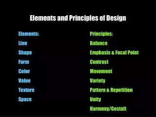
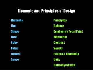
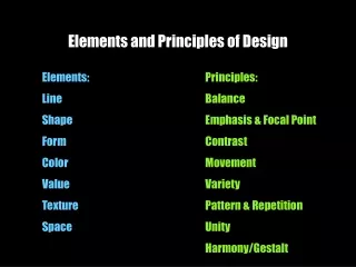
The Elements, defined Line - is a mark on a surface that describes a shape or outline. It can create texture and can be thick and thin. Types of line can include actual, implied, vertical, horizontal, diagonal and contour. Color - refers to specific hues and has 3 properties, Chroma, Intensity and Value. The color wheel is a way of showing the chromatic scale in a circle using all the colors made with the primary triad. Complimentary pairs can produce dull and neutral color. Black and white can be added to produce tints (add white), shades (add black) and tones (add gray). Texture - is about surface quality either tactile (they way it feels) or visual (the way it looks). Texture can be real or implied by different uses of media. It is the degree of roughness or smoothness in objects. Shape – are 2-dimensional areas defined by a line. Shapes are flat and can be grouped into two categories, geometric and organic (free form). Value – refers to the degree of light and dark. It is the contrast between black and white and all the tones in between. Value can be applied to color as well as black and white. Contrast refers to the difference between to or more values. Form – A form is a three dimensional object, or an image that has the illusion of being three-dimensional.
The Principles, defined Balance - is a feeling of visual equality in shape, form, value, color, etc. Balance can be symmetrical or evenly balanced or asymmetrical and un-evenly balanced. Objects, values, colors, textures, shapes, forms, etc., can be used in creating a balance in a composition. Rhythm - is a movement in which some elements recurs regularly. Like a dance it will have a flow of objects that will seem to be like the beat of music. Contrast - offers some change in value creating a visual discord in a composition. Contrast shows the difference between shapes and can be used as a background to bring objects out and forward in a design. It can also be used to create an area of emphasis. Movement - is a visual flow through the composition. It can be the suggestion of motion in a design as you move from object to object by way of placement and position. Directional movement can be created with a value pattern. It is with the placement of dark and light areas that you can move your attention through the format. Unity - means keeping your design in a sort of harmony in which all sections of the pattern make other sections feel complete. Unity helps the design to be seen as one design instead of randomness all around your design. Harmony - brings together a composition with similar units. If your composition was using wavy lines and organic shapes you would stay with those types of lines and not put in just one geometric shape. (Notice how similar Harmony is to Unity - some sources list both terms) Emphasis – Artists use emphasis to make parts of a composition stand out and grab your attention. The center of interest or focal point is the area that first attracts attention in a composition. This area is more important when compared to the other objects or elements in a composition. This can be by contrast of values, more colors, and placement in the format.
Line – (element) is a mark on a surface that describes a shape or outline. It can create texture and can be thick and thin. Types of line can include actual, implied, vertical, horizontal, diagonal and contour. Contour Line Outline Implied Line
More on Line Varying the thickness or thinness of a line can add interest and give a sense of 3-Dimensionality. Here, the thick lines of this drawing represent the shadows or darker areas of the seal. Using line loosely and quickly can help convey motion or movement. Below are some examples of gesture drawings.
Vincent Van Gogh “Starry Night” How some artists use line…
Shape (element) are 2-dimensional areas defined by a line. Shapes are flat and can be grouped into two categories, geometric and organic (free form). Geometric shapes can be defined by a mathematical formula. ( L x W = Area ) Organic or freeform shapes have no particular formula to how they are created.
How some artists use Shape M.C. Escher
Joan Miro “Personage Etoile” Takashi Murakami
Form (element)A form is a three dimensional object, or an image that has the illusion of being three-dimensional. Benini “Pluto and Persephone” These are pictures actual sculptures, or three-dimensional forms Erwin Wurm
A painting of a person that looks 3-Dimensional (uses Form) Leonardo Da Vinci “Mona Lisa”
Versus a painting of a person that looks flat (uses shape) Stewie
Value (element) refers to the degree of light and dark. It is the contrast between black and white and all the tones in between. Value can be applied to color as well as black and white. Contrast refers to the difference between to or more values. Examples of different value scales
An example of how value gives form to flat shapes: To make a flat shape look three dimensional, we add value. Specifically, we add shadows, highlights, and midtones.
In this M.C. Escher drawing, value is used in a number of ways. The artist uses value to give a sense of 3-Dimensionality to the cities at the bottom of the drawing. How does he use value symbolically?
Texture - is about surface quality either tactile (the way it feels) or visual (the way it looks). Texture can be real or implied by different uses of media. It is the degree of roughness or smoothness in objects. How does artist Meret Oppenheim use texture in this work of art? What do you think she was trying to make the viewer feel by covering a teacup in fur?
The Principles, defined Balance - is a feeling of visual equality in shape, form, value, color, etc. Balance can be symmetrical or evenly balanced or asymmetrical and un-evenly balanced. Objects, values, colors, textures, shapes, forms, etc., can be used in creating a balance in a composition. Rhythm - is a movement in which some elements recurs regularly. Like a dance it will have a flow of objects that will seem to be like the beat of music. Contrast - offers some change in value creating a visual discord in a composition. Contrast shows the difference between shapes and can be used as a background to bring objects out and forward in a design. It can also be used to create an area of emphasis. Movement - is a visual flow through the composition. It can be the suggestion of motion in a design as you move from object to object by way of placement and position. Directional movement can be created with a value pattern. It is with the placement of dark and light areas that you can move your attention through the format. Unity - means keeping your design in a sort of harmony in which all sections of the pattern make other sections feel complete. Unity helps the design to be seen as one design instead of randomness all around your design. Harmony - brings together a composition with similar units. If your composition was using wavy lines and organic shapes you would stay with those types of lines and not put in just one geometric shape. (Notice how similar Harmony is to Unity - some sources list both terms) Emphasis – Artists use emphasis to make parts of a composition stand out and grab your attention. The center of interest or focal point is the area that first attracts attention in a composition. This area is more important when compared to the other objects or elements in a composition. This can be by contrast of values, more colors, and placement in the format.
Balance - is a feeling of visual equality in shape, form, value, color, etc. Balance can be symmetrical or evenly balanced or asymmetrical and un-evenly balanced. Objects, values, colors, textures, shapes, forms, etc., can be used in creating a balance in a composition. What kind of balance does Rene Magritte use in this artwork? What effect does it have on the artwork?
Symmetrical and Asymmetrical Balance Symmetrical balance is easiest to see in perfectly centered compositions or those with mirror images.
Asymmetrical Balance Asymmetrical balanced designs are typically off-center or created with an odd or mismatched number of disparate (different) elements. Asymmetrical designs still have balance. Think of it like standing on one foot- you wont fall because you shift your weight in order to balance and remain standing.
Visual Weight & Balance Asymmetrical Symmetrical
Symmetrical Balance Asymmetrical Balance Unbalanced
Balance Examples of radial balance (elements move outwards from a point equally in all directions). Mayan Calendar Salvadore Dali
Rhythm – (principle) is a movement in which some elements recurs regularly. Like a dance, it will have a flow of objects that will seem to be like the beat of music. The repeating lines of the bridge supports and the reoccurring colors of the people on the bridge create rhythm. What are the people doing? Why did the artist make rhythm an important principle in this painting?
Rhythm - is a movement in which some elements recurs regularly. Where does artist Takashi Murakami use repetition in this artwork?
Contrast is the difference between two values An example of low contrast An example of high contrast An example of low contrast between two colors An example of high contrast between two colors
Contrast - offers some change in value creating a visual discord in a composition. Contrast shows the difference between shapes and can be used as a background to bring objects out and forward in a design. It can also be used to create an area of emphasis. Look at this work by Barbara Kruger. How does artist Barbara Krueger use contrast in this artwork? Why do you think she uses such strong contrast?What is she trying to say? How does she use the principle of contrast to support her message? Please answer the questions above in your notes. There are no right or wrong answers… I just want you to think about it! Barbara Kruger “Your Body is a Battleground”
Movement – (principle) is a visual flow through the composition. It can be the suggestion of motion in a design as you move from object to object by way of placement and position. Directional movement can be created with a value pattern. It is with the placement of dark and light areas that you can move your attention through the format. Please answer the following questions in your notes: Do you remember the name of this artist? We said this painting used a lot of line to create visual interest. How does line create movement in this work of art? How do your eyes move through the painting?
Unity – (principle) means keeping your design in a sort of harmony in which all sections of the pattern make other sections feel complete. Unity helps the design to be seen as one design instead of randomness all around your design. Repeating elements in a design helps a composition feel unified. What elements are repeated? Does this piece feel unified to you?
Emphasis (principle)– Artists use emphasis to make parts of a composition stand out and grab your attention. The center of interest or focal point is the area that first attracts attention in a composition. This area is more important when compared to the other objects or elements in a composition. This can be by contrast of values, more colors, and placement in the format. Mary Cassat “The Letter” What is the focal point, or area of emphasis, in this painting? How did Cassat create emphasis in this painting? Why do you think the artist choose to make that particular part of the painting the focal point?
Emphasis – Artists use emphasis to make parts of a composition stand out and grab your attention. This area is more important when compared to the other objects or elements in a composition. This can be by contrast of values, more colors, and placement in the format. This is another painting by Rene Magritte. Where is the emphasis (focal point) of this painting? Is the focal point an important part of this painting? Why would Magritte make this area the focal point?
Figure-Ground • Figure–ground relationsare a type of perceptual grouping which is a vital necessity for recognizing objects through vision. It is how the object relates to the background. For example: Is it a vase, or two faces?
Proportion/Scale • Both refer to relative size. Is the apple really large, or is the room really small?