Download
1 / 15
160 likes | 394 Vues
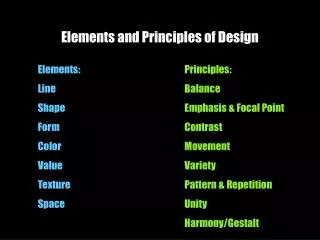
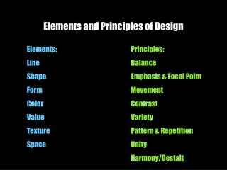
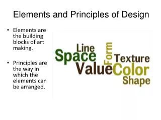
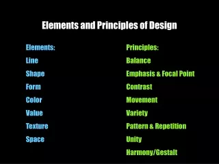
Elements and Principles of Design. http://www.princetonol.com/groups/iad/Files/elements.htm. Element One: LINE.

E N D
Elements and Principles of Design http://www.princetonol.com/groups/iad/Files/elements.htm
Element One: LINE • An element of art that is used to define shape, contours, and outlines, also to suggest mass and volume. It may be a continuous mark made on a surface with a pointed tool or implied by the edges of shapes and forms. • Characteristic of Line are: • Width- thick, thin, tapering, uneven • Length - long, short, continuous, broken • Direction- horizontal, vertical, diagonal, curving, perpendicular, oblique, parallel, radial, zigzag • Focus- sharp, blurry, fuzzy, choppy • Feeling- sharp, jagged, graceful, smooth
LINE - examples Egon Schiele Albrecht Dürer
Element Two: COLOUR • Color comes form light; if it weren’t for light we would have no color. • Color Wheels a tool used to organize color. It is made up of:· • Primary Colors-Red, Yellow, Blue these color cannot be mixed, they must be bought in some form. • Secondary Color-Orange, Violet, Green, these colors are created by mixing two primaries. • Intermediate Colors- Red Orange, Yellow Green, Blue Violet, etc.; mixing a primary with a secondary creates these colors. • Complementary Colors-are colors that are opposite each other on the color wheel. When placed next to each other they look bright and when mixed together they neutralize each other.
COLOUR - Harmonies • Color Harmonies is when an artist uses certain combinations of colors that create different looks or feelings. • Analogous Colors are colors that are next to each other on the color wheel for example red, red orange, and orange are analogous colors. • Triadic Harmony is where three equally spaced colors on the color wheel are used for example, yellow, Red, Blue is a triadic harmony color scheme. • Monochromatic is where one color is used but in different values and intensity. • Warm colors are on one side of the color wheel and they give the felling of warmth for example red, orange and yellow are the color of fire and feel warm. • Cool colors are on the other side of the color wheel and they give the feeling of coolness for example blue, violet, are the color of water, and green are the color of cool grass.
COLOUR - examples Hans Hofmann N.C.Wyeth
Element Three: VALUE • Value is the range of lightness and darkness within a picture. Value is created by a light source that shines on an object creating highlights and shadows. It also illuminates the local or actual color of the subject. Value creates depth within a picture making an object look three dimensional with highlights and cast shadows, or in a landscape where it gets lighter in value as it recedes to the background giving the illusion of depth.
VALUE - examples Bernie Wrightson Georgia O’Keefe
Element Four: TEXTURE • Texture is the surface quality of an object. A rock may be rough and jagged. A piece of silk may be soft and smooth and your desk may feel hard and smooth. Texture also refers to the way a picture is made to look rough or smooth. • Categories of Texture • Real Texture is the actual texture of an object. Artist may create real texture in art to give it visual interest or evoke a feeling. A piece of pottery may have a rough texture so that it will look like it came from nature or a smooth texture to make it look like it is machine made • Implied Texture is the where a two-dimensional piece of art is made to look like a certain texture but in fact is just a smooth piece of paper. Like a drawing of a tree trunk may look rough but in fact it is just a smooth piece of paper
TEXTURE - examples Real Texture Implied Texture Winslow Homer Vincent Van Gogh
Element Five: SHAPE • Shape: When a line crosses itself or intersects with other lines to enclose a space it creates a shape. Shape is two-dimensional it has heights and width but no depth. • Categories of Shapes: • Geometric Shapes-Circles, Squares, rectangles and triangles. We see them in architecture and manufactured items • Organic Shapes-Leaf, seashells, flowers. We see them in nature and with characteristics that are free flowing, informal and irregular. • Positive Shapes-In a drawing or painting positive shapes are the solid forms in a design such as a bowl of fruit. In a sculpture it is the solid form of the sculpture. • Negative Shapes-In a drawing it is the space around the positive shape or the shape around the bowl of fruit. In sculpture it is the empty shape around and between the sculptures. • Static Shape-Shapes that appears stable and resting. • Dynamic Shape-Shapes that appears moving and active.
SHAPE - examples JC Leyendecker Edvard Munch
Element Six: SPACE • The representation of 3D form on a 2D surface • Categories of Space • Positive space-Like in positive shape it is the actual sculpture or building. • Negative space-Also like negative shape it is the space around the sculpture or building. • Picture Plane is the flat surface of your drawing paper or canvas. • Composition is the organization and placement of the elements on your picture plane. • Focal Point is the object or area you want the viewer to look at first.