Understanding Least Squares Regression in Bivariate Data Analysis
590 likes | 711 Vues
Explore the concept of least squares regression in analyzing bivariate data, determining the line of best fit, making predictions based on numerical descriptions, correlation vs. regression, and predictive extrapolation. Learn about key properties and how to compute regression lines effectively.

Understanding Least Squares Regression in Bivariate Data Analysis
E N D
Presentation Transcript
Least Squares Regression Fitting a Line to Bivariate Data
Correlation tells us about strength (scatter) and direction of the linear relationship between two quantitative variables. In addition, we would like to have a numerical description of how both variables vary together. For instance, is one variable increasing faster than the other one? And we would like to make predictions based on that numerical description. But which line best describes our data?
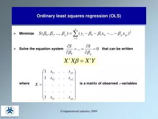
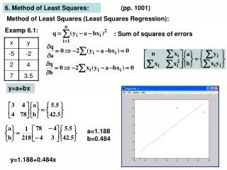
Distances between the points and line are squared so all are positive values. This is done so that distances can be properly added (Pythagoras). The regression line The least-squares regression line is the unique line such that the sum of the squared vertical (y) distances between the data points and the line is the smallest possible.
is the predicted y value (y hat) b1 is the slope b0 is the y-intercept Properties The least-squares regression line can be shown to have this equation: where “b0" is in units of y "b1" is in units of y / units of x
How to: First we calculate the slope of the line, b; from statistics we already know: r is the correlation. sy is the standard deviation of the response variable y. sx is the the standard deviation of the explanatory variable x. Once we know b1, the slope, we can calculate b0, the y-intercept: where x and y are the sample means of the x and y variables This means that we don't have to calculate a lot of squared distances to find the least-squares regression line for a data set. We can instead rely on the equation. But typically, we use a 2-var stats calculator or stats software.
BEWARE!!! Not all calculators and software use the same convention: Some use instead: Make sure you know what YOUR calculator gives you for a and b before you answer homework or exam questions.
Software output intercept slope R2 absolute value of r R2 intercept slope
The equation completely describes the regression line. NOTE: The regression line always passes through the point with coordinates (xbar, ybar).
Hubble telescope data about galaxies moving away from earth: These two lines are the two regression lines calculated either correctly (x = distance, y = velocity, solid line) or incorrectly (x = velocity, y = distance, dotted line). The distinction between explanatory and response variables is crucial in regression. If you exchange y for x in calculating the regression line, you will get the wrong line. Recall that Regression examines the distance of all points from the linein the y direction only.
Correlation versus regression The correlation is a measure of spread (scatter) in both the x and y directions in the linear relationship. In regression we examine the variation in the response variable (y) given change in the explanatory variable (x).
Nobody in the study drank 6.5 beers, but by finding the value of from the regression line for x = 6.5 we would expect a blood alcohol content of 0.094 mg/ml. Making predictions: interpolation The equation of the least-squares regression allows to predict y for any xwithin the range studied. This is called interpolating.
= - ˆ y 0 . 125 x 41 . 4 = - ˆ y 0 . 125 x 41 . 4 (in 1000’s) There is a positive linear relationship between the number of powerboats registered and the number of manatee deaths. The least squares regression line has the equation: Thus if we were to limit the number of powerboat registrations to 500,000, what could we expect for the number of manatee deaths? Roughly 21 manatees.
!!! !!! Extrapolation Extrapolation is the use of a regression line for predictions outside the range of x values used to obtain the line. This can be a very stupid thing to do, as seen here. Height in Inches Height in Inches
The y intercept Sometimes the y-intercept is not a realistic possibility. Here we have negative blood alcohol content, which makes no sense… y-intercept shows negative blood alcohol But the negative value is appropriate for the equation of the regression line. There is a lot of scatter in the data, and the line is just an estimate.
R-squared = r2; the proportion of y-variation explained by changes in x. r2 representsthe proportion of the variation in y(vertical scatter from the regression line) that can be explained by changes in x. r2, the coefficient of determination, is the square of the correlation coefficient.
r = 0.87 r2 = 0.76 Changes in x explain 0% of the variations in y. The value(s) y takes is (are) entirely independent of what value x takes. r = 0 r2 = 0 Here the change in x only explains 76% of the change in y. The rest of the change in y (the vertical scatter, shown as red arrows) must be explained by something other than x. r = -1 r2 = 1 Changes in x explain 100% of the variations in y. Y can be entirely predicted for any given value of x.
SAT scores: result r2 = (-.868)2 = .7534 About 75% of the variation in state mean SAT scores is explained by differences in the % of seniors that take the test. If 57% of NC seniors take the SAT, the predicted mean score is
r =0.9 r2 =0.81 There is a great deal of variation in BAC for the same number of beers drunk. A person’s blood volume is a factor in the equation that was overlooked here. r =0.7 r2 =0.49 We changed number of beers to number of beers/weight of person in lb. • In the first plot, number of beers only explains 49% of the variation in blood alcohol content. • But number of beers / weight explains 81% of the variation in blood alcohol content. • Additional factors contribute to variations in BAC among individuals (like maybe some genetic ability to process alcohol).
Grade performanceIf class attendance explains 16% of the variation in grades, what is the correlation between percent of classes attended and grade? 1. We need to make an assumption: attendance and grades are positively correlated. So r will be positive too. 2. r2 = 0.16, so r = +√0.16 = + 0.4 A weak correlation.
Transforming relationships A scatterplot might show a clear relationship between two quantitative variables, but issues of influential points or non linearity prevent us from using correlation and regression tools. Transforming the data – changing the scale in which one or both of the variables are expressed – can make the shape of the relationship linear in some cases. Example: Patterns of growth are often exponential, at least in their initial phase. Changing the response variable y into log(y) or ln(y) will transform the pattern from an upward-curved exponential to a straight line.
Exponential bacterial growth In ideal environments, bacteria multiply through binary fission. The number of bacteria can double every 20 minutes in that way. 1 - 2 - 4 - 8 - 16 - 32 - 64 - … Exponential growth 2n, not suitable for regression. log(2n) = n*log(2) ≈ 0.3n Taking the log changes the growth pattern into a straight line.
Body weight and brain weight in 96 mammal species r = 0.86, but this is misleading. The elephant is an influential point. Most mammals are very small in comparison. Without this point, r = 0.50 only. Now we plot the log of brain weight against the log of body weight. The pattern is linear, with r = 0.96. The vertical scatter is homogenous → good for predictions of brain weight from body weight (in the log scale).
Inference for least squares lines Inference for simple linear regression Simple linear regression model Conditions for inference Confidence interval for regression parameters Significance test for the slope Confidence interval for E(y) for a given x Prediction interval for y for a given x
The data in a scatterplot are a random sample from a population that may exhibit a linear relationship between x and y. Different sample different plot. Now we want to describe the populationmean response E(y) as a function of the explanatory variable x:E(y)= b0 + b1x. And to assess whether the observed relationship is statistically significant (not entirely explained by chance events due to random sampling).
Simple linear regression model In the population, the linear regression equation is E(y) = b0 + b1x. Sample data then fits the model: Data = fit + residual yi = (b0 + b1xi) + (ei) where the eiare independent and Normally distributed N(0,s). Linear regression assumes equal standard deviation of y(s is the same for all values of x).
E(y) = b0 + b1x The intercept b0, the slope b1, and the standard deviation s of y are the unknown parameters of the regression model. We rely on the random sample data to provide unbiased estimates of these parameters. • The value of ŷ from the least-squares regression line is really a prediction of the mean value of y (E(y)) for a given value of x. • The least-squares regression line (ŷ = b0 + b1x) obtained from sample data is the best estimate of the true population regression line (E(y) = b0 + b1x). ŷunbiased estimate for mean responseE(y) b0unbiased estimate for interceptb0 b1unbiased estimate for slopeb1
The population standard deviation sfor y at any given value of x represents the spread of the normal distribution of the ei around the mean E(y) . The regression standard error, s, for n sample data points is calculated from the residuals (yi – ŷi): se is an unbiased estimate of the regression standard deviation s.
Conditions for inference • The observations are independent. • The relationship is indeed linear. • The standard deviation of y,σ, is the same for all values of x. • The response y varies normallyaround its mean.
Using residual plots to check for regression validity The residuals (y−ŷ) give useful information about the contribution of individual data points to the overall pattern of scatter. We view the residuals in a residual plot: If residuals are scattered randomly around 0 with uniform variation, it indicates that the data fit a linear model, have normally distributed residuals for each value of x, and constant standard deviation σ.
Residuals are randomly scattered good! Curved pattern the relationship is not linear. Change in variability across plotσ not equal for all values of x.
What is the relationship between the average speed a car is driven and its fuel efficiency? We plot fuel efficiency (in miles per gallon, MPG) against average speed (in miles per hour, MPH) for a random sample of 60 cars. The relationship is curved. When speed is log transformed (log of miles per hour, LOGMPH) the new scatterplot shows a positive, linear relationship.
Residual plot: The spread of the residuals is reasonably random—no clear pattern. The relationship is indeed linear. But we see one low residual (3.8, −4) and one potentially influential point (2.5, 0.5). Normal quantile plot for residuals: The plot is fairly straight, supporting the assumption of normally distributed residuals. Data okay for inference.
Standard Error for the Slope • Three aspects of the scatterplot affect the standard error of the regression slope: • spread around the line, se • spread of x values, sx • sample size, n. • The formula for the standard error (which you will probably never have to calculate by hand) is:
Confidence interval for 1 Estimating the regression parameters b0, b1 is a case of one-sample inference with unknown population standard deviation. We rely on the t distribution, with n – 2 degrees of freedom. A level Cconfidence interval for the slope, b1, is proportional to the standarderror of the least-squares slope: b1 ± t* SE(b1) t* is the t critical for the t (n – 2) distribution with area C between –t* and +t*. We estimate the standard error of b1with where n is the sample size, sx is the ordinary standard deviation of the x values
Confidence interval for 0 A level C confidence interval for the intercept, b0 , is proportional to the standarderror of the least-squares intercept: b0 ± t* SEb0 • The intercept usually isn’t interesting. Most hypothesis tests and confidence intervals for regression are about the slope.
Hypothesis test for the slope We may look for evidence of a significant relationship between variables x and y in the population from which our data were drawn. For that, we can test the hypothesis that the regression slope parameter β1is equal to zero. H0: β1 = 0 vs. Ha: β1 ≠ 0 Testing H0: β1 = 0 also allows to test the hypothesis of no correlation between x and y in the population. Note: A test of hypothesis for b0 is irrelevant (b0 is often not even achievable).
Hypothesis test for the slope (cont.) We usually test the hypothesis H0: β1 = 0 vs. Ha: β1 ≠ 0 but we can also test H0: β1 = 0 vs. Ha: β1 < 0 or H0: β1 = 0 vs. Ha: β1 > 0 To do this we calculate the test statistic Use the t dist. with n – 2df to find the P-value of the test. Note: Software typically providestwo-sided p-values.
Using technology Computer software runs all the computations for regression analysis. Here is some software output for the car speed/gas efficiency example. SPSS Slope Intercept Confidence intervals p-value for tests of significance The t-test for regression slope is highly significant (p < 0.001). There is a significant relationship between average car speed and gas efficiency.
Excel “intercept”: intercept “logmph”: slope P-value for tests of significance confidence intervals SAS
Confidence Intervals and Prediction Intervals for Predicted Values • Once we have a useful regression, how can we indulge our natural desire to predict, without being irresponsible? • Now we have standard errors—we can use those to construct a confidence interval for the predictions and to report our uncertainty honestly.
An Example: Body Fat and Waist Size • Consider an example that involves investigating the relationship in adult males between % Body Fat and Waist size (in inches). Here is a scatterplot of the data for 250 adult males of various ages:
Confidence Intervals and Prediction Intervals for Predicted Values(cont.) • For our %body fat and waist size example, there are two questions we could ask: • Do we want to know the mean %body fat for all men with a waist size of, say, 38 inches? • Do we want to estimate the %body fat for a particular man with a 38-inch waist? • The predicted %body fat is the same in both questions, but we can predict the mean %body fat for all men whose waist size is 38 inches with a lot more precision than we can predict the %body fat of a particular individual whose waist size happens to be 38 inches.
Confidence Intervals and Prediction Intervals for Predicted Values(cont.) • We start with the same prediction in both cases. • We are predicting for a new individual, one that was not in the original data set. • Call his x-value xν. • The regression predicts %body fat as
Confidence Intervals and Prediction Intervals for Predicted Values(cont.) • Both intervals take the form • The SE’s will be different for the two questions we have posed.
Confidence Intervals and Prediction Intervals for Predicted Values(cont.) • The standard error of the mean predicted value is: • Individuals vary more than means, so the standard error for a single predicted value is larger than the standard error for the mean:
Confidence Intervals and Prediction Intervals for Predicted Values (cont.) Confidence interval for Prediction interval for y
Confidence Intervals for Predicted Values • Here’s a look at the difference between predicting for a mean and predicting for an individual. • The solid green lines near the regression line show the 95% confidence intervals for the mean predicted value, and the dashed red lines show the prediction intervals for individuals. • The solid green lines and the dashed red lines curve away from the least squares line as x moves farther away from xbar.
More on confidence intervals for As seen on the preceding slides, we can calculate a confidence intervalfor the population mean of all responses y when x takes the value x (within the range of data tested): denote this expected value E(y) by This interval is centered on ŷ, the unbiased estimate of .The true value of the population mean at a particularvalue x, will indeed be within our confidence interval in C% of all intervals calculated from many different random samples.
