Download
1 / 49
490 likes | 538 Vues
Learn how to construct frequency distribution, histograms, and scatter diagrams. Understand relative frequencies, stem-and-leaf plots, cumulative graphs, and more special forms. Dive into various charts including pie, bar, and line for insightful data visualization.

E N D
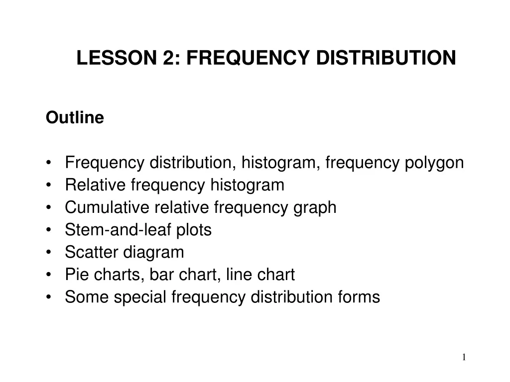
LESSON 2: FREQUENCY DISTRIBUTION Outline • Frequency distribution, histogram, frequency polygon • Relative frequency histogram • Cumulative relative frequency graph • Stem-and-leaf plots • Scatter diagram • Pie charts, bar chart, line chart • Some special frequency distribution forms
FREQUENCY DISTRIBUTION Consider the following data that shows days to maturity for 40 short-term investments
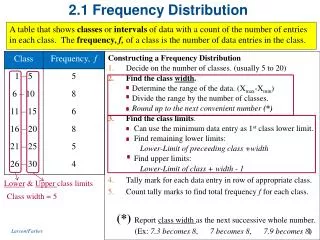
FREQUENCY DISTRIBUTION • First, construct a frequency distribution • An arrangement or table that groups data into non-overlapping intervals called classes and records the number of observations in each class • Approximate number of classes Number of observation Number of classes Less than 50 5-7 50-200 7-9 200-500 9-10 500-1,000 10-11 1,000-5,000 11-13 5,000-50,000 13-17 More than 50,000 17-20
FREQUENCY DISTRIBUTION • Approximate class width is obtained as follows:
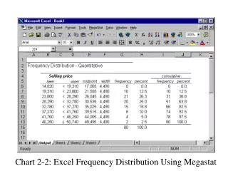
FREQUENCY DISTRIBUTION Classes and counts for the days-to-maturity data
FREQUENCY POLYGON • A frequency polygon is a graph that displays the data by using lines that connect points plotted for frequencies at the midpoint of classes. The frequencies represent the heights of the midpoints.
RELATIVE FREQUENCY HISTOGRAM • Class relative frequency is obtained as follows:
RELATIVE FREQUENCY HISTOGRAM Relative-frequency distribution for the days-to-maturity data
OGIVECUMULATIVE RELATIVE FREQUENCY GRAPH • A cumulative relative frequency graph or ogive is a graph that represents the cumulative frequencies for the classes in a frequency distribution.
OGIVE CUMULATIVE RELATIVE FREQUENCY GRAPH 1.000 1.000 0.900 0.800 0.725 0.600 0.550 Cumulative Frequency 0.400 0.300 0.200 0.100 0.075 0.000 40 50 60 70 80 90 100 Number of Days to Maturity
STEM-AND-LEAF DISPLAY • When summarizing the data by a group frequency distribution, some information is lost. The actual values in the classes are unknown. A stem-and-leaf display offsets this loss of information. • The stem is the leading digit. • The leaf is the trailing digit.
STEM-AND-LEAF DISPLAY Diagrams for days-to-maturity data: (a) stem-and-leaf (b) ordered stem-and-leaf Stem Leaves Stem Leaves 3 3 4 4 5 5 6 6 7 7 8 8 9 9 (a) (b)
SCATTTER DIAGRAM • Often, we are interested in two variables. For example, we may want to know the relationship between • advertising and sales • experience and time required to produce an unit of a product
SCATTTER DIAGRAM • Scatter diagrams show how two variables are related to one another • To draw a scatter diagram, we need a set of two variables • Label one variable x and the other y • Each pair of values of x and y constitute a point on the graph
SCATTTER DIAGRAM • In some cases, the value of one variable may depend on the value of the other variable. For example, • sales depend on advertising • time required to produce an item of a product depend on the number of units produced before • In such cases, the first variable is called dependent variable and the second variable is called independent variable. For example, Independent variable Dependent variable Advertising Sales Number of units produced Production time/unit
SCATTTER DIAGRAM • Usually, independent variable is plotted on the horizontal axis (x axis) and the dependent variable on the vertical axis (y axis) • Sometimes, two variables show some relationships • positive relationship: two variables move together i.e., one variable increases (or decreases) whenever the other increases (or, decreases). Example: advertising and sales. • negative relationship: one variable increases (or, decreases) whenever the other decreases (increases). Example: number of units produced and production time/unit
SCATTTER DIAGRAM • Relationship between two variables may be linear or non-linear. For example, • the relationship between advertising and sales may be linear. • the relationship between number of units produced and the production time/unit may be nonlinear.
PIE CHART • A pie chart is the most popular graphical method for summarizing quantitative/nominal data • A pie chart is a circle is subdivided into a number of slices • Each slice represents a category • Angle allocated to a slice is proportional to the proportion of times the corresponding category is observed • Since the entire circle corresponds to 3600, every 1% of the observations corresponds to 0.01 3600 = 3.60
BAR CHART • Bar charts graphically represent the frequency or relative frequency of each category as a bar rising vertically • The height of each bar is proportional to the frequency or the relative frequency • All the bars must have the same width • A space may be left between bars • Bar charts may be used for qualitative data or categories that should be presented in a particular order such as years 1995, 1996, 1997, ...
LINE CHART • Line charts are often used when the categories are points in time. Such a chart is called a time-series chart. For example, consider a graph that shows monthly or weekly sales data. • Frequency of each category is represented by a point above and then points are joined by straight lines
CHOICE OF A CHART • Pie chart • Small / intermediate number of categories • Cannot show order of categories • Emphasizes relative values e.g., frequencies • Bar chart • Small / intermediate/large number of categories • Can present categories in a particular order, if any • Emphasizes relative values e.g., frequencies
CHOICE OF A CHART • Bar chart • Small/intermediate/large number of categories • Can present categories in a particular order, if any • Emphasizes relative values e.g., frequencies • Line chart • Small/intermediate/large number of categories • Can present categories in a particular order, if any • Emphasizes trend, if any
READING AND EXERCISES Lesson 2 Reading: Section 2-1, pp. 22-33 Exercises: 2-1, 2-9, 2-13, 2-14