Mastering Design Principles in Business Publications
Explore key design principles including balance, alignment, contrast, proximity, repetition, and white space. Learn how to create visually appealing business publications that engage readers effectively. Enhance your design skills and elevate your publication quality.

Mastering Design Principles in Business Publications
E N D
Presentation Transcript
Design Principles 3.02 Understand business publications
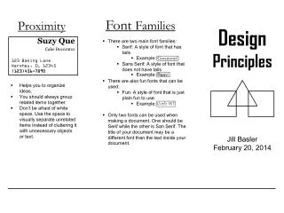
Five Principles of Design • Balance • Proximity/unity • Alignment • Repetition/consistency • Contrast • White space 3.02 Understand business publications
Balance • Graphics don’t overpower text • Page is not too heavy on one side or the other • Example: http://www.ithinktoo.com/Design1/balance/balance_example/balanceeg.html 3.02 Understand business publications
Proximity/Unity • Distance between elements on a page • Used to demonstrate a relationship or a lack of relationship between elements • Example: http://www.ithinktoo.com/Design1/Proximity/proximity_example/proximityeg.html 3.02 Understand business publications
Alignment • Justification of elements • Related items should be justified the same to emphasize their relationship to each other. • Example: http://www.ithinktoo.com/Design1/alignment/alignment_example/alignmenteg.html 3.02 Understand business publications
Repetition/Consistency • Consistent pattern of font and color schemes and graphic types • Specific font, size, and style for headings, subheadings, and body text. • Do not mix photographic images and cartoon images on the same page. • Example: http://www.ithinktoo.com/Design1/repetition/repetition_example/repetitioneg.html • Scheme - a planned combination of elements, such as a combination of font styles and sizes 3.02 Understand business publications
Contrast • Emphasizing the most important elements on a page with color and size • Example: http://www.ithinktoo.com/Design1/contrast/contrast_example/contrasteg.html 3.02 Understand business publications
White Space • Blank or negative space on a page • Used to focus the reader’s attention on important details • Used to give the reader’s eyes a break • Does not have to be white • Example: http://www.ithinktoo.com/Design1/white_space/whitespace_example/whitespaceeg.html 3.02 Understand business publications

