Lesson 1 – Objectives
Lesson 1 – Objectives. Understand how pixels and size can effect a website Look at the classic website layouts Consider more advanced designs Creating a background. Scrolling is bad. One of the worst website sins is scrolling The goal is to have no horizontal scrolling


Lesson 1 – Objectives
E N D
Presentation Transcript
Lesson 1 – Objectives Understand how pixels and size can effect a website Look at the classic website layouts Consider more advanced designs Creating a background
Scrolling is bad One of the worst website sins is scrolling The goal is to have no horizontal scrolling Minimal vertical scrolling In order to do this you need to understand screen resolution
Screen resolution The screen is made up of many dots known as pixels. Screen resolution is the number of pixels horizontally and vertically. The higher the number the better quality the screen.
Average screen size The average screen size is – 1024 x 768 A good size for a website is 1000 x 700
Classic design Logo Title Menu Main menu
Alternative layout Logo Title Menu Main menu
Try out different layouts Menu Main menu Logo Title Use the shapes above and test out some layouts. Try and create ones which are different to the examples seen.
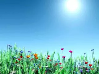
Pattern backgrounds The pattern on the left is blue fabric. The colour matches the rest of the theme and does not clash or detract the user.
Samsungs layout Logo Menu Title Main menu
Using GIMP to create a website background • You have two options • Use a image which will fill up the whole of the available area but will be mostly covered • Have a pattern • Both methods will be shown below
Option 1 – Partial image The image on the right will form the basis. Only part of it will be seen. The rest will be covered.
Crop and flip The base image needs to be altered so the key part of the image (the most interesting part) is on the far left (or right) side. A common trick is to make it look like it is on the edge by cutting ¼ off.
Remove background The background needs removing so we can blend it into a new one!
Adding a supernova Notice that the centre is largely left un-touched!
How to do the final touch! Create two layers. One with solid noise (which creates the shape) One with a plasma (which creates the colour) Note – both can be found under filters -> render -> cloud
Set blend mode Set both layers to use soft light and have opacity at around 50%
Final result Title Menu Main menu
Your task • Create a image based background • Find a base image (related to your product) which can be placed on the edge of the page • Perform the steps outlined in this PowerPoint • Test the image on the next slide to see how it will look with information on it!
Your Option 1 Title Menu Main menu
Option 2 • Option 2 is to use a repeating pattern to form the basis of the background. • The pattern should link in with your product in some way. • The pattern must be • Simple • Not too intense
Option 2 – Step by step Take the emblem / symbol from your logo. Copy the layer. It is important to only get the symbol and the background must be removed for this to work. This method works for any symbol you wish to use!
Paste as a new brush This allows you to draw with the symbol as if it was a brush!
Create a gradient background Choose two colours which are similar to your logo and do not clash too much. White and black make great second colours. ENSURE THIS IS FAIRLY PLAIN!
Add the symbol to form the pattern Do not put too many on! Also ensure this is on a new layer.
Set blend mode Set the blend mode to smooth the image out. Overlay works well for this.
Some extra tweaks Adding a extra pattern to the background to make it more interesting. This pattern is easy to make and works on most images.
Pattern effect – Add noise Add a new layer and render solid noise. This may look like a mess but it is the basis of a lot of cool effects! If in doubt try some noise!
Add waves Now add a wave. Play around with the settings to get the best effect. You can find waves in filter -> distort
Emboss Emboss will make the pattern more solid and give a etched feel. It removes some of the blending. It can be found under filters -> distorts
Invert colours The white parts will form the pattern. Inverting is a matter of taste but will give a different effect. To invert you goto colours - > invert
Blend mode Finally blend the layers using overlay to get the final image.
Your task • Create a pattern based background • Find a emblem (or use your logo) and create a brush from it. • Create a new image size 1000 x 700 • Add a gradient • In a new layer draw a pattern using the new brush • Blend and add effects as required. • Do not just use the ones suggested. Experiment based on your product!
Your Option 2 Title Menu Main menu
Comparing Copy both of your backgrounds into this slide. Decide which one you are going to use!