
Uploaded by
kenneth-roach
1 SLIDES
127 VUES
10LIKES
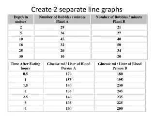
Visualizing Trends: Two Separate Line Graphs for Data Analysis
DESCRIPTION
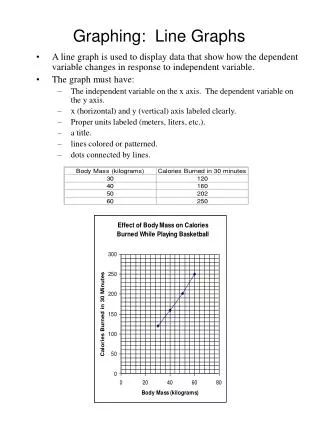
This project demonstrates how to create two separate line graphs to effectively visualize and compare distinct data sets over time. By plotting each data series on its own graph, we can highlight trends, patterns, and fluctuations without confusion. The tutorial guides you through the process of data preparation, graph creation, and interpretation, ensuring clarity in presenting insights. Perfect for analysts looking to enhance their data visualization skills.
Download
1 / 1
Télécharger la présentation 
Visualizing Trends: Two Separate Line Graphs for Data Analysis
An Image/Link below is provided (as is) to download presentation
Download Policy: Content on the Website is provided to you AS IS for your information and personal use and may not be sold / licensed / shared on other websites without getting consent from its author.
Content is provided to you AS IS for your information and personal use only.
Download presentation by click this link.
While downloading, if for some reason you are not able to download a presentation, the publisher may have deleted the file from their server.
During download, if you can't get a presentation, the file might be deleted by the publisher.
E N D


More Related