Download
1 / 13
130 likes | 215 Vues
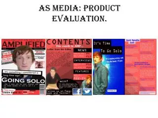
A magazine using real media product forms and conventions to stand out, from masthead to content page to double spread layout. Targeting teens with rock genre content.

E N D
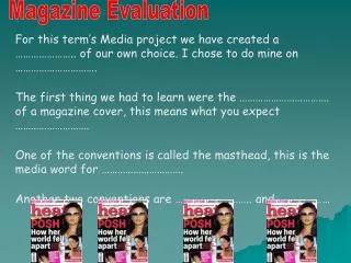
In what ways does my media product use, develop or challenge forms and conventions of real media product? Price Grabs attention as it’s right at the top next to the masthead . Cheap which encourages readers to purchase it Masthead Stands out even though it has that translucent effect it still look powerful because it is in all capital letters. It is a unique masthead and continues at the bottom of the magazine in larger font and colour making the magazine stand out from the rest. Image This image is very eye catching and attracts the target audience due to the hand gesture which is most known to my audience. Tag Engages readers interests Teasers These clues to the storyline create curiosity to the readers. Strap line This gives people and insight of what the magazine is all about and the fact that the word ‘Hard’ is used twice in the masthead and tagline , reflects on the type of genre it is. Barcode The printed code used for recognition by a bar code scanner.
From looking at both these magazines I have developed the forms and conventions to make it unique and different to my own magazine. I took the layout of the front cover of rock magazine and developed it. The position of the image is slightly similar to the image on my magazine. Both my image and rock magazine image are a mid shot view. I developed the positioning by putting it more to the left instead of the centre like the rock magazine leaving reasonable amount of space for the teasers in the right side. The Springsteen magazine influenced me as the artist is holding a guitar instead of my artist holding a guitar she is doing the rock sign. I wanted the hand sign to reflect on the genre just like the Springsteen magazine reflected the genre by using the guitar. Both masthead’s are clear and they both have a bar code at the bottom of the magazine just like mine.
The Content page In red to grab attention as it’s the only bright colour on the page. Page numbers of what’s in the magazine. In a large unique style to stand out Main image Clear view of the artist Image of the artist Second smaller image of my chosen artist.
When making my content page I looked at various other content pages to give me an idea of what my hard rock life content page is going to look like. I then came across this content page and I liked how it looked although the layout is pretty basic it is attractive and automatically grabs attention therefore I used this layout however developed it and made it different. The image of my artist is slightly covering more than a half of the page. Instead of the black background and white writing in rock sound content page I decided to do the opposite which is in contrast with these colours. A white background with black writing made the image stand out more. The title ‘contents’ in red brought colour to the page. I chose red as it’s a very alarming colour, a great way to grab attention. I wanted my content page to be different from the rest therefore instead of the simple menu, I made the letters large and placed it as if to look like its slightly all over the place. By these developments I created a unique version of rock sound content page. Instead of the quote at the bottom of the page I decided to place a different picture of the artist.
Quote A quote as a title gives a short insight of what the interview is going to be about. It’s effective as it grabs attention and gets readers wanting to read more. Black background, for a dramatic effect. The interview, the colours in red and white stand out. Competition to engage with the readers. Image of the artist, dramatic effects in order to reach it’s purpose which is to grab attention and also reflect on the genre.
These two examples of double spread magazine helped me to make my double spread page. The layout Is simple however effective. In both double spread pages displayed above have their main image covering 50% of the page. This is where I got my idea from however my image is more of a close up view compared to the two examples above. I also adopted the idea of a quote as the title as it engages readers as well as linking to the following text. My colour scheme is similar to the double spread on the right however my one is more unique as it seems to appear more dark and gloomy due to the effects. This makes it more eye catching and reflects on the genre as dark colours associate with rock.
How Does my media product represent particular social groups? The social group my magazine is aimed at are teenagers at the age of 15-19year olds who are interested in the genre rock. I have represented people of that age in my magazine by the language I have used which are simple and not too complex words that adults would relate to. Also the main image also represents the age group as the artist is a teenager. Hard rock life magazine is mostly aimed at teenage girls hence the main artist is a female. Also the gossip and fashion tips are mostly what girls would find most interesting. My magazine is aimed at all classes, it is fairly cheap therefore anyone can buy it.
What kind of media institution might distribute my media product and why? • The type of media institution that might distribute my hard rock life magazine is future publisher. The reason for this is because future is the biggest guitar and music making publisher in the UK. They publish all different types of rock magazine which are unique and attracts attention and are successful. I believe that my magazine definitely fits future’s success criteria as it is different and stands out from the rest. • Advantages • Excellent publicity for hard rock life • Help my magazine to grow • Disadvantage • Future dictator what will feature in my magazine • They will control the layout and design of my magazine
How did Iattract/address your audience? • I addressed my audience by creating online surveys and questionnaires. These two methods are a great way for public awareness. Their quick and easy to find out what you need to know. Their also very cheap and flexible as you are able to order questions, or questions can be skipped together depending on the answer to a previous question. I have also attracted my target audience by the powerful images that are used and the colour scheme which give a powerful statement. In my survey one of the questions were “how much would you buy a magazine?” This has helped me to decide the price range of my magazine. As my target audience had said they would pay roughly £1.50-£2.00 for a magazine. From this you are able to see the age group I am targeting. I asked “Are you a male or a female?” As you can see the response were equal as I wanted to see the responses from both genders.
What have I learnt about technologies from the process of constructing this product? • I have learnt a lot about technologies from the process of constructing a magazine. Such as learning how to take different camera shots, by using the Nikon cameras. I had to get used to using the apple mac computers and learning how things work as it is different to other computers that I am most used to, and I was successful in getting the hang of it. During the process of making my magazine I spent most of the time on Photoshop I never knew how to use Photoshop but during this process I now know how to use Photoshop. I have learnt so much, I know how to edit pictures and the different effects you can use. I learnt how to make different layers, and use different font text and use different colours. Also I have learnt how to use survey monkey, word press blog and developed my skills in power point and word. Therefore the process in making this magazine has been a great opportunity as it has allowed me to learn many exciting things that I was not aware about.
Looking back at your preliminary task, what do you feel you have learnt in the progression from it to the full product? • From looking back at my preliminary task I can see how much I have progressed. I have learnt so much in terms of using Photoshop. As you can see from this picture to all my other edits during the process of making my magazine. I’ve learnt to create many effects such as adjusting the curves and so on. Placing other pictures on it, experimenting different fonts and colours. I have developed magnificently.