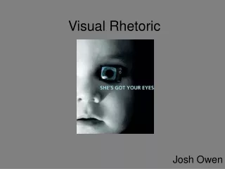
Impactful Ad Campaign Against Reckless Driving: A Call for Safety
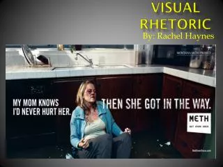
In 2009, the Utah Driving Safety Organization launched a gripping advertisement highlighting the severe consequences of reckless driving, particularly focusing on texting or drinking while driving. Featuring a young man in a wheelchair due to a spinal cord injury, the ad serves as a stark reminder of the real-life implications of careless behavior behind the wheel. With the slogan, “Drive stupid and score some kickin’ new wheels,” the ad aims to evoke emotions and encourage viewers, especially teens, to prioritize safety and responsibility while driving.

Impactful Ad Campaign Against Reckless Driving: A Call for Safety
E N D
Presentation Transcript
VISUAL rHETORIC By: Brooke Ogborn 10/30/13
Background In 2009, an Utah driving safety organization published the advertisement below to warn drivers of the dangers of texting or drinking while driving. The person in the ad is the real thing: he suffered a spinal cord injury in a car accident and now uses a wheelchair.
Purpose The purpose of the advertisement is to inform viewers of what possible outcomes of “stupid driving” may look like and to persuade them to drive carefully for the protection of themselves and others. Utah Driving Safety Organization is trying to get as many viewers as they can so that there are fewer car accidents and fatalities.
Focal Point The focal point of the picture is the slogan, “Drive stupid and score some kickin’ new wheels” along with the boy in the wheelchair. They both are the main focus, because without the slogan, you wouldn’t understand the boy in the wheelchair and without the boy in the wheelchair, you wouldn’t understand the slogan. Also because there’s nothing but a white background, directing your attention to the front.
Contrast Color and light contrast are used to make the boy stand out, so as to depict the importance of his condition. The background is very light, while dark shadows are given off around the boy. Your eye immediately jumps to the dark colors.
Ethos, Pathos, and Logos Ethos- The author shows ethos with the “zero fatalities” logo and web address on the bottom right-hand side. Pathos- The author tugs at your emotions of pity for the boy, sadness that he is handicapped for life , and fear that it might happen to you. Logos- Logically, seeing that this boy was driving recklessly and got severely injured for life makes viewers want to be careful so that they don’t injure themselves or even someone else.
Audience Anyone that drives, especially teens, is targeted by this ad. It shows the consequences of poor driving and gives them a good idea as to why they need to be cautious while on the road.
What interested the author… The author was interested, because it is a known fact that reckless and careless driving is becoming more and more common among teens, so the author is seeking a way to help lower that number. Also, the author probably took the picture because it shows the truth of what can happen and doesn’t bother to spare anyone’s feelings.
MLA Citation Janger, Michael. "Using Advertising To Engage, Not Alienate, Consumers With Disabilities." DrumBeat Consulting RSS. Utah Driving Safety Organization, 26 Jan. 2012. Web. 29 Oct. 2013. <http://drumbeatconsulting.com/blog/2012/01/26/using-advertising-to-engage-not-alienate-consumers-with-disabilities/>.