Download
1 / 15
150 likes | 169 Vues
Discover the impact of multi-screen websites in the digital age and why they are essential. Explore insights from Google, learn how to turn visitors into customers, and provide a customized experience for enhanced engagement. Unleash the power of dynamic content and make informed decisions to excel in the multi-screen landscape. Get started today and stay ahead of the game!

E N D
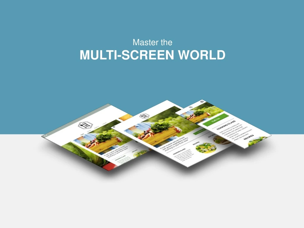
Master the MULTI-SCREEN WORLD
AGENDA • What is a multi-screen website? • The growing importance of multi-screen sites • What Google recommends • What Google requires • Turning visitors into customers • Providing a custom experience • Dynamic Content • Weighing your options • Getting started
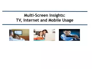
What is a MULTI-SCREEN SITE? A multi-screen site refers to one website that is optimized for desktop, tablet and mobile. A common, but more technical, term for these kind of websites is “responsive.”
Devices are diversifying & WEBSITES MUST ADAPT A desktop-only website used to cut it, but not anymore… Device share of website traffic: DESKTOP TABLET SMARTPHONE *E-commerce Monetate 2013 Quarterly report
DIFFERENT DEVICES DOESN’T MEAN DIFFERENT CUSTOMERS 90% use multiple screens sequentially to accomplish a task over time The average person uses a combination of 3 different screens every day Smartphones are the most common starting place for online activities PCs/laptops are most often a starting point for more complex activities Tablets are most often a starting point for shopping and trip planning HubSpot 2012
A MULTI-SCREEN SITE IS SEO GOLD Google has declared that they prefer responsive web design over separate mobile and desktop websites. THE REASON One single URL makes it easier for Google to search a site for relevant content. THEREFORE Responsive websites generally rank much higher in search results. HubSpot 2012
It’s Also Mandatory for Mobile Google has recently changed the way they rank websites in mobile searches. Unless your website passes their Mobile-Friendly Test, it won’t even show up. Up to 60% of all internet searches are now made on mobile devices. Small Business Trends 2014
WE GO BEYOND RESPONSIVE With Business-Driving Features Our multi-screen websites are unique. We build in high-powered features to meet the specific needs of your business and customers. Here are just a few examples. CLICK-TO-CALL Enables your customers to contact you with just the push of a button MAPS Ensures your customers will always be able to find their way to your door YELP REVIEWS Inspires confidence in your business and assures customers you’re the right choice CUSTOM COUPONS Places your most enticing deal front and center on your website
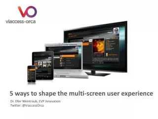
To Provide a Custom ExperienceDEVICE BY DEVICE Different devices means different customer needs. When visitors land on your site via mobile or a tablet, they don’t necessarily need all of the same information that’s on your desktop site. v Image Slider for tablet users A Click-to-Call button for mobile users Full navigation only for desktop users
And Leverage DYNAMIC CONTENT Everyone wants a personalized experience and we can deliver just that. Using technology that has traditionally been reserved for enterprise-level companies like Amazon, we’ll set up a custom experience for your customers based on their physical location, time of day, number of previous visits to the site and more. FIRST-TIME VISITORS Will view a welcome video AFTER HOURS Ask your users to leave a message
THE ECOMMERCE OPTION In addition to creating a website that encourages customers to visit your brick-and-mortar store, we can give them the convenience to shop anywhere from any device. Depending on your needs, your store can include: E-GOODS Offer digital content for purchase and download (e.g. video and audio files, images, documents, etc.). COUPON CODES Generate coupon codes for a particular product, or overall order, for customers to use at checkout. 30+ PAYMENT OPTIONS Customers can pay using secure, trusted payment providers like PayPal, Stripe, Authorize.net and more. AND SO MUCH MORE.
WHICH WAY DO YOU WANT TO GO? Create a responsive website? Stick with what you’re doing
THE RESULTS You only get one chance to make a first impression. A responsive website ensures you’ll be putting your best foot forward, no matter what device your customers are using to view your site. STAY THE COURSE GO MULTI-SCREEN: 73% of visitors prefer a site that’s optimized for mobile Faster load times Takes full advantage of the 4.4 hours of leisure time customers spend in front of different screens each day 61% of visitors will abandon a site that isn’t mobile-friendly 40% of consumers will abandon a web page that takes more than 3 seconds to load KISSmetrics Google 2013
ONE LAST REASON TO BE RESPONSIVE It’s future-proof! Our multi-screen websites are built using a framework that adapts to all device types. This means that no matter what someone is using to view your site, it will display perfectly. So in the future, as new devices, like TVs, watches and Google Glass, grow in web capabilities, your responsive site will still provide visitors with a fantastic user experience.
READY TO GET STARTED? CONTACT NAME XXX-XXX-XXX EMAIL www.yoursite.com