Download
1 / 19
190 likes | 217 Vues
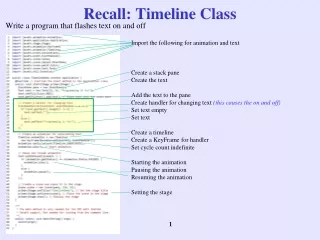
Recall: Timeline Class. Write a program that flashes text on and off. Import the following for animation and text Create a stack pane Create the text Add the text to the pane Create handler for changing text (this causes the on and off) Set text empty Set text Create a timeline

E N D
Recall: Timeline Class Write a program that flashes text on and off Import the following for animation and text Create a stack pane Create the text Add the text to the pane Create handler for changing text (this causes the on and off) Set text empty Set text Create a timeline Create a KeyFrame for handler Set cycle count indefinite Starting the animation Pausing the animation Resuming the animation Setting the stage
Chapter 16JavaFX UI Controls and Multimedia Previous chapters introduced several GUI components. This chapter introduces the frequently used GUI components. FUN and EASY chapter
Frequently Used UI Controls NOTE: Throughout your book, the prefixes lbl, bt, chk, rb, tf, pf, ta, cbo, lv, scb, sld, and mp are used to name reference variables for Label, Button, CheckBox, RadioButton, TextField, PasswordField, TextArea, ComboBox, ListView, ScrollBar, Slider, and MediaPlayer.
Labeled The Label class defines labels. A label is a display area for a short text, a node, or both. It is often used to label other controls (usually text fields). These common properties are defined in the Labeled class.
Example - Label Import the following for labels Create a label for an image Set label/node position Create another label for a circle Set the label/node position Create a label for a rectangle Create a label for a shape Create a label for a pane Setting the stage
ButtonBase and Button A button is a control that triggers an action event when clicked (you have already covered). JavaFX provides regular buttons, check box buttons, and radio buttons. The common features of these buttons are defined in the ButtonBase class. Button Example A CheckBox is used for the user to make a selection. Checkbox Example
ButtonBase and Button A button is a control that triggers an action event when clicked (you have already covered). JavaFX provides regular buttons, check box buttons, and radio buttons. The common features of these buttons are defined in the ButtonBase class. Radio buttons, also known as option buttons, enable you to choose a single item from a group of choices. Radio button Example
Button Type Example Import the following for a checkbox type button Creating a pane for checkboxes (recall the value of this) Create a checkbox with two choices Create a handler for the checkbox using Lambda Set the handler for action
TextField A text field can be used to enter or display a string. A TextArea enables the user to enter multiple lines of text. TextField is a subclass of TextInputControl. TextField Example
TextArea A TextArea enables the user to enter multiple lines of text.
ComboBox A combo box, also known as a choice list or drop-down list, contains a list of items from which the user can choose. This example lets users view an image and a description of a country's flag by selecting the country from a combo box.
ComboBox Example Import the following for a combobox Creating an array of strings of countries Create an array of ImageViews of national flags Declare an array of strings for flag descriptions (enter info later) Create a description pane Create a combobox for selecting countries Set Canada to be the first country displayed Set up pane for combobox Setup the observable list Add to the combobox Based on some action, display the selected country
ListView A list view is a component that performs basically the same function as a combo box, but it enables the user to choose a single value or multiple values.
ScrollBar A scroll bar is a control that enables the user to select from a range of values. The scrollbar appears in two styles: horizontal and vertical. This example uses horizontal and vertical scrollbars to control a message displayed on a panel.
Example: Using Scrollbars Import the following for a scrollbar Create horizontal scroll bar Create vertical scroll bar Add text to a pane Create a pane to hold text and scroll bar Set new location for text Create listener horizontal bar change Set new location for text Create listener vertical bar change
Slider Slider is similar to ScrollBar, but Slider has more properties and can appear in many forms. Example - Using a sliders to control a message displayed on a panel instead of using scroll bars.
Media You can use the Media class to obtain the source of the media, the MediaPlayer class to play and control the media, and the MediaView class to display the video. MediaPlayer The MediaPlayer class playes and controls the media with properties such as autoPlay, currentCount, cycleCount, mute, volume, and totalDuration. MediaView The MediaView class is a subclass of Node that provides a view of the Media being played by a MediaPlayer. The MediaView class provides the properties for viewing the media.
EXAMPLE: This example displays a video in a view. You can use the play/pause button to play or pause the video and use the rewind button to restart the video, and use the slider to control the volume of the audio. Import the following Create media Create media player Create a media view Play media Pause media Create a rewind button Create handler for rewinding Create a slider for volume Set volume Bind volume with slider Add buttons and slider to hBox Place media view in a pane
Example: Using Media This example displays a video in a view. You can use the play/pause button to play or pause the video and use the rewind button to restart the video, and use the slider to control the volume of the audio. MediaDemo Run