Download
1 / 20
200 likes | 306 Vues
This guide explores the fundamental differences between bar graphs and histograms, including how to determine class width and the representation of data through line graphs. It dives into stem-and-leaf plots with example data points, demonstrating practical applications. Furthermore, it addresses the five common methods people use to mislead viewers with graphs: truncated graphs, scaling, readability issues, misuse of data percentages, and misleading images. Clear examples and exercises are provided to understand regular vs. misleading graphs.

E N D
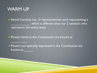
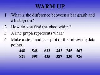
WARM UP • What is the difference between a bar graph and a histogram? • How do you find the class width? • A line graph represents what? • Make a stem and leaf plot of the following data points. 468 548 632 842 745 567 821 598 435 387 830 926
Section 2.5 Misleading Graphs There are FIVE ways we will look at that people try to mislead you with their graphs.
Truncated • The vertical scales of graphs are altered to distort information.
Are they the same? • The graphs below show the number of people who rode buses from September through February.
SCALING • The size of a graph or a figure is altered to distort information.
TOO MUCH INFORMATION 3) HARD TO READ
CREATE TWO GRAPHS • One regular graph • One misleading graph • Label both graphs clearly!