Download
1 / 32
320 likes | 435 Vues
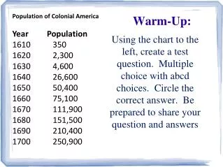
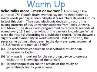
The debate on whether women talk more than men has been fueled by claims suggesting women speak nearly three times as many words daily. To test this assertion, researchers recorded the speech patterns of 396 university students without their knowledge. Results revealed that women averaged 16,215 words per day while men used 15,669, indicating a nearly equal communication rate. This study exemplifies the importance of observational approaches in research, as well as the challenges of generalizing results to broader populations based on specific demographics and contexts.

E N D
Warm Up Who talks more—men or women? According to the author of The Female Brain, women say nearly three times as many words per day as men. Skeptical researchers devised a study to test this claim. They used electronic devices to record the talking patterns of 396 university students from Texas, Arizona, and Mexico. The device was programmed to record 30 seconds of sound every 12.5 minutes without the carrier’s knowledge. What were the results? According to a published report, “Men showed a slightly wider variability in words uttered….But in the end, the sexes came out just about even in the daily averages: women at 16,215 words and men at 15,669.” Did researchers conduct an observational study or an experiment? Explain. Why was it important for the recording device to operate without the knowledge of the carrier? To what population can the results of this study be generalized? Justify your answer.
Lesson 3: Organization of Data Table 2.1 Level of Education of People 25 to 34 Years Old in the United States, 2007 From Statistics Through Application pg. 37
Displaying Distributions within a Table Classes: Counts: Rates: Distribution: Table 2.1 Level of Education of People 25 to 34 Years Old in the United States, 2007 From Statistics Through Application pg. 37
Consistency Round off errors: Table 2.1 Level of Education of People 25 to 34 Years Old in the United States, 2007 From Statistics Through Application pg. 37
Bar Graphs A bar graph (or bar chart) is a graphical display of data using bars of different heights. Lets say you took a survey of your friends to find out which kind of movie they liked best. The results of the survey would look like this in a table.
Bar Graphs Figure 2.1 Bar graph of the distribution of level of education for persons aged 25 to 34 in the United States in 2007. From Statistics Through Application pg. 38 Table 2.1 Level of Education of People 25 to 34 Years Old in the United States, 2007 From Statistics Through Application pg. 37
Constructing a Bar Graph Average cost per mile for passenger vehicles on state turnpikes
Constructing a Bar Graph Step 1: Draw and label the x- and y-axes 6¢ 5¢ COST 4¢ Y-Axis 3¢ 2¢ X-Axis 1¢ Maine Indiana Pennsy. Florida Oklahoma STATES
Constructing a Bar Graph Step 2: Draw the bars to the frequencies. Add a title. Average cost per mile for passenger vehicles on state turnpikes 6¢ 5¢ COST 4¢ 3¢ 2¢ 1¢ Maine Indiana Pennsy. Florida Oklahoma STATES
Different Reasons Why People Were Late to Work 35 30 25 20 FREQUENCY 15 10 5 Bus Sick Traffic Family Weather Slept Late REASONS
Pareto Chart A type of bar graph displaying categorical variables, in which the frequencies are arranged in order from highest to lowest
Constructing a Pareto Chart Step 1: Rewrite and arrange the data from largest to smallest according to frequency.
Constructing a Pareto Chart Step 2: Construct and label the x- and y-axes. $80 $70 Y-Axis $60 $50 Money Saved $40 X-Axis $30 $20 $10 Sue Kirk Allen Steve Grace Name
Constructing a Pareto Chart Step 3: Draw the bars to the frequencies. Add title. Savings for the Softball Team $80 $70 $60 $50 Money Saved $40 $30 $20 $10 Sue Allen Kirk Steve Grace Name
Try One on Your Own Construct a Pareto Chart for the following data: Kyle has a bag of marbles with 7 green, 8 brown, 4 purple, 6 orange, and 13 red.
Kyle’s Marbles 14 12 10 Number of Marbles 8 6 4 2 Red Brown Green Orange Purple Colors
Dot Plots In a Dot Plot, a set of data is represented by using dots over a number line. It is the simplest graph for displaying the distribution of a quantitative variable. The frequency of the variables is represented by the dots.
Constructing a Dot Plot Step 1: Draw a horizontal line and mark it with a measurement scale (frequency range) that extends at least as low as the smallest value in the data set and as high as the largest value in the data set. Label the frequency range. 20 25 30 35 40 45 50 55 60 Ages
Constructing a Dot Plot Step 2: For each observation in the data set, locate the value on the measurement scale and represent it by a dot. If two or more observations have the same value, stack the dots vertically. Add title. Ages of Oscar Winners 20 25 30 35 40 45 50 55 60 Ages
Constructing Parallel Dot Plots It may be helpful to compare the distributions of female- and male-member ages. An effective way of doing this is to construct parallel dot plots. Female Male Here, parallel lines are drawn for each gender. The same scale is used for both lines, and the lines are labeled. 20 20 25 25 30 30 35 35 40 40 45 45 50 50 55 55 60 60
Parallel Dot Plots Is there a difference in the ages of the Oscar winners who were male and female? Comment on the similarities and differences that can be observed in the dot plot. Female Male 20 20 25 25 30 30 35 35 40 40 45 45 50 50 55 55 60 60
Try One on Your Own- Create a Dot Plot Table 2.3 Highway Gas Mileages for Model Year 2009 Midsize Cars
Answer Figure 2.4 Minitab dotplot of EPA highway gas mileage ratings for 24 model year 2009 midsize cars .
Key Concept The purpose of a graph is to help us understand the data. Ask, “What do I see?”
Key Concept Look for patterns and deviations.
Key Concept An outlier in any graph of data is an individual observation that falls outside the overall pattern of the graph. An outlier is clearly separated from the main body of observations. Many outliers are due to mistakes.
Key Concept Does it surprise you that the Bentley and Rolls-Royce midsize cars have much lower gas mileages than the other models? Bentley Arnage Rolls-Royce Phantom
Homework Chapter 1: (Monday’s lesson) Read pgs. 18-26 On page 22 problems: 1.25, 1.26, 1.29 On page 26 problems:1.31, 1.32, 1.33 Chapter 2: On pages 40 and 46 problems: 1.25, 1.26, 1.29, 1.31, 1.32, 1.33, 2.1, 2.2, 2.3, 2.4(b-c), 2.5(b), 2.7, 2.9, 2.10