Download

1 / 29
290 likes | 371 Vues
Learn to read circle graphs comparing echinoderm species and car sales with interactive examples. Practice interpreting data for better understanding.

E N D
Warm Up Problem of the Day Lesson Presentation Lesson Quizzes
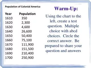
1 2 3 10 5 4 1 1 3 5 4 5 Warm Up Write each fraction as a percent. 1. 2. 3. Write each percent as a fraction. 4. 20% 5. 25% 6.60% 75% 10% 40%
Problem of the Day Riddle: When does 1 + 1 + 1 = 1? 1 ft + 1 ft + 1 ft = 1 yd
Learn to read and interpret data presented in circle graphs.
Vocabulary circle graph sector
A circle graph, also called a pie chart, shows how a set of data is divided into parts. The entire circle contains 100% of the data. Eachsector, or slice, of the circle represents one part of the entire data set.
The circle graph compares the number of species in each group of echinoderms. Echinoderms are marine animals that live on the ocean floor. The name echinoderm means “spiny-skinned.”
Additional Example 1A: Life Science Application Use the circle graph to answer the question. Which group of echinoderms includes the fewest number of species? The sector for sea lilies and feather stars is the smallest, so this group includes the fewest number of species.
about , so approximately 33% 1 3 Additional Example 1B: Life Science Application Use the circle graph to answer the question. Approximately what percent of echinoderm species are brittle stars and basket stars?
Additional Example 1C: Life Science Application Use the circle graph to answer the question. Which group is made up of a greater number of species, sea cucumbers or sea stars? The sector for sea stars is larger than the sector for sea cucumbers. This means there are more kinds of sea stars than sea cucumbers.
Luxury Large Midsize Small Check It Out: Example 1A Use the circle graph to answer each question. Which size car sold the most? The sector for midsize cars is larger than any other of the sectors of car sizes. This means midsize cars were sold the most.
Luxury Large Midsize Small Check It Out: Example 1B Use the circle graph to answer each question. Approximately what percent of cars sold were midsize? The midsize sector is approximately half or about 50%.
Luxury Large Midsize Small Check It Out: Example 1C Use the circle graph to answer each question. Which size sold less—large or small? The smallest sector between Large and Small is Large. Large sized cars sold less.
Additional Example 2A: Interpreting Circle Graphs Leon surveyed 30 people about pet ownership. The circle graph shows his results. Use the graph to answer each question. How many people own dogs only? The circle graph shows that 20% of the 30 people own dogs only. 20% of 30 = 0.2 • 30 = 6 6 people own dogs only.
Additional Example 2B: Interpreting Circle Graphs Leon surveyed 30 people about whether they own pets. The circle graph shows his results. Use the graph to answer each question. How many people own both cats and dogs? Since 20% is 6 people, 10% is 3 people. 3 people own both cats and dogs.
Check It Out: Example 2A Fifty students were asked which instrument they could play. The circle graph shows the responses. Use the graph to answer each question. flute 10% How many students do not play an instrument? drum 20% The circle graph shows that 50% of 50 students do not play an instrument. 50% of 50 = 0.5 • 50 no instrument 50% piano 20% = 25 25 students do not play an instrument.
Check It Out: Example 2B Fifty students were asked which instrument they could play. The circle graph shows the responses. Use the graph to answer each question. flute 10% Ten students said they play the piano. How many play the flute? drum 20% Since 20% is 10 students, 10% is 5 students. Five students play the flute. no instrument 50% piano 20%
Additional Example 3A: Choosing an Appropriate Graph Decide whether a bar graph or circle graph would best display the information. Explain your answer. the percent of U.S. population living in the different states A circle graph is the better choice because it shows how parts of a whole are divided.
Additional Example 3B: Choosing an Appropriate Graph Decide whether a bar graph or circle graph would best display the information. Explain your answers. the number of tickets sold for each night of a school play A bar graph is the better choice because it makes it easy to see how the number of tickets sold changed over each night.
Additional Example 3C: Choosing an Appropriate Graph Decide whether a bar graph or circle graph would best display the information. Explain your answers. the comparison between the number of students in a math class and the total student population. A circle graph is the better choice because it shows what part of the students are in a math class.
Check It Out: Example 3A Decide whether a bar graph or circle graph would best display the information. Explain your answers. the percent of people buying a certain color of a new vehicle A circle graph is the better choice because it makes it easier to see what part (or percent) of people is buying a certain color of vehicle.
Check It Out: Example 3B Decide whether a bar graph or circle graph would best display the information. Explain your answers. the comparison of different themes voted on for a school party A circle graph is a better choice because the sectors that represent the themes could be easily compared.
Check It Out: Example 3C Decide whether a bar graph or circle graph would best display the information. Explain your answers. the number of visitors to the Grand Canyon for the last ten years A bar graph is the better choice because it makes it easy to see how the number of visitors has changed over the years.
Lesson Quizzes Standard Lesson Quiz Lesson Quiz for Student Response Systems
41% Lesson Quiz: Part I Use the circle graph to answer questions 1-4. 1. Which group of CDs sold the most? 2. What percent of the CD sales are country? 3. Which type of CD sells the least? rock 27% rap 4. If a total of 500 CD’s are sold, how many are Jazz? 55
Lesson Quiz: Part II 5. Would a bar or circle graph best display the sales of a department store for the last 5 months? bar graph
Lesson Quiz for Student Response Systems 1. The members of a club were asked to vote for their favorite holiday destination. The results are shown in the form of a circle graph. Which destination was preferred the most by the members? A. Portugal B.France C. Greece D. Spain
Lesson Quiz for Student Response Systems 2. 300 students in a school play any one musical instrument. The circle graph shows what percentage of students play different instruments. How many students play guitar? A. 15 B.36 C. 96 D. 144
Lesson Quiz for Student Response Systems 3. Which of the following would be the best display for the nutritional value of a food item? A. bar graph B.double bar graph C. histogram D. circle graph