Creating Graphs by Hand: A Guide to Pie, Bar, and Line Charts
120 likes | 236 Vues
This comprehensive guide covers the fundamental techniques for creating pie, bar, and line graphs by hand. Learn how to effectively represent data through pie charts to display percentages, bar graphs for quantities, and line graphs to show continuous change. The guide emphasizes the importance of accuracy in measurement, labeling axes, and providing clear titles. It also discusses conversion factors, the significance of starting points, and best practices to enhance readability, ensuring your graphical representations convey valuable insights effectively.

Creating Graphs by Hand: A Guide to Pie, Bar, and Line Charts
E N D
Presentation Transcript
Making Graphs by HAND Pie, Bar , and Line
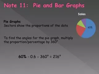
Making Pie Charts Pie charts are best used to represent _____________________ PERCENTAGES (%) 100 % The whole circle equals _____________ But it also equals_____________________ 360 degrees 100 % 360 = 100 % = 360degrees Because of this we can say that _________________________ 1 % = 3.6 If we simplify this, we get _____________________
Making Pie Charts To Make a Pie Chart, You must use a ____________ Protractor (1) Once you know your Percentages, Multiply each by the conversion factor of 3.6 /1%. For Example: Percentage of different pets owned by the 8th graders of Franklin Regional Degrees 3.6 42% 151.2 === 151.2 x = 1% === 118.8 === 68.4 === 21.6
Making Pie Charts (2) Use your Protractor to measure out the correct number of degrees for each category. Percentage of different pets owned by the 8th graders of Franklin Regional 6% Own Rabbits 19% own Fish 42% own Dogs 33% own Cats
Making Bar Graphs Bar graphs are best used to represent _____________________ Quantities The more the bars separate, the easier it is to read. This means you don’t have to always start from _____________________ ZERO 5.7 7 5.6 6 5.5 5 Let’s Remake the SAME Graph, but not start at ZERO 5.4 4 5.3 3 5.2 2 5.1 1 5.0 0 WHICH ONE IS EASIER TO TELL THE DIFFERENCE BETWEEN THE BARS?
Making Bar Graphs ALWAYS Label the axes. The ___________should always be the Quantity or Amount of something Storage Size of Different Computer Photo File Types Y - Axis The ___________should always be the items or Categories being counted X- Axis 5.7 Average Amount of MB used 5.6 5.5 ALL Graphs MUST have a __________ 5.4 Title 5.3 5.2 5.1 Color GIF photo Color JPG photo Color PNG Photo 5.0 Black & White Photo
Making Line Graphs Continuous Change Line graphs are best used to show ____________________ Just like the Bar graphs you don’t have to always start from _____________ on the ________________ Y - Axis ZERO 42 70 40 60 50 38 Let’s Remake the SAME Graph, but not start at ZERO 40 36 30 34 32 20 30 10 0 28 70 70 50 50 60 60 0 0 30 30 10 10 20 20 40 40 WHICH ONE IS EASIER TO TELL THE DIFFERENCE IN THE LINE?
Making Line Graphs (1) Decide which way the paper should be (Landscape or Portrait) This can be done by finding the ____________of the __________________ and ________________________. Range Independent Dependent Variables Subtracting This can be found by __________________ the _____________ from the ____________for each variable. Highest Value Lowest value INDEPENDENT RANGE 10 mph 80 mph - 70 mph = DEPENDENT RANGE 18 m 137 m - 119 m =
Making Line Graphs X - AXIS The Independent Variable always goes on the ___________ Y - AXIS The Dependent Variable always goes on the ___________ So if the Range of the Independent Variable is Larger then paper should be __________________ More room for the larger range of numbers LANDSCAPE BUT if the Range of the Dependent Variable is Larger then paper should be ______________________ More room for the larger range of numbers PORTRAIT
Making Line Graphs (2) How to number the Axes? LINES Step 1 - Count the number of _________ on each axis. RANGE Step 2 – Divide the __________ for that axis by the that number Step 3 – Your answer will most likely be a decimal. So ______________to the _______________________________. ROUND UP NEXT EASIEST COUNTING NUMBER Examples: If Answer is 1.889 – Then ROUND UP and COUNT by 2 If Answer is 12.1 – Then ROUND UP and COUNT by 15 If Answer is 2.347 – Then ROUND UP and COUNT by 2.5 LOWEST NUMBER Step 4 – Start with the _____________________in your range and begin numbering your lines.
Making Line Graphs (3) Label your Axes Each Label has TWO PARTS: (a) The Measurement Name (What was Measured) (b) The Unit of Measurement (How it was Measured) Time (Minutes) Temperature (C) Examples: Speed (mph)
Making Line Graphs (4) Put a Title on your Graph Hypothesis The Best Title for your line graph is your ____________________ Not just THIS vs. THAT (5) Carefully PLOT your points and connect your line (6) If it is a multiple line graph you will need to make each line a different ______________, and include a _________________. Legend Color (7) Lastly, since you did all of that work, DON’T FORGET TO PUT YOUR NAME ON IT.