The Elements and Principles of Design
780 likes | 1.78k Vues
The Elements and Principles of Design. Presented By Mrs. Cole. Web Resources. http://www.brigantine.atlnet.org/GigapaletteGALLERY/websites/ARTiculationFinal/MainPages/LineMain.htm http://www.brigantine.atlnet.org/GigapaletteGALLERY/websites/ARTiculationFinal/MainPages/LineMain.htm.

The Elements and Principles of Design
E N D
Presentation Transcript
The Elements and Principles of Design Presented By Mrs. Cole
Web Resources • http://www.brigantine.atlnet.org/GigapaletteGALLERY/websites/ARTiculationFinal/MainPages/LineMain.htm • http://www.brigantine.atlnet.org/GigapaletteGALLERY/websites/ARTiculationFinal/MainPages/LineMain.htm
4 Categories of Art • Fine • Folk • Decorative • Functional
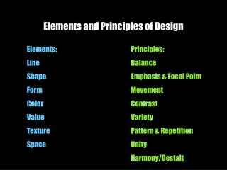
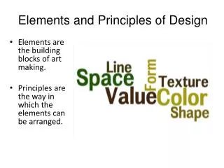
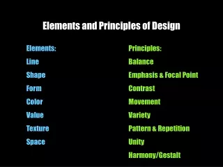
The Elements of Design are: • Line • Shape and Form • Value • Color • Space • Texture
The Principles of Design are: • Movement and Rhythm • Balance • Proportion • Variety and Emphasis • Harmony and Unity
Line • Line - is a mark on a surface that describes a shape or outline. It can create texture and can be thick and thin. Types of line can include actual, implied, vertical, horizontal, diagonal and contour lines.
Suptermarket- Ben Shahn • Look at this painting by Ben Shahn. What role do the lines play in this piece? Shahn drew these lines to define his subject. Because of the lines he made, we can see recognizable images. Look at the drawing. Look at the title. Can you tell what Shahn has drawn? He uses various line directions to draw his shopping carts. The lines are vertical, horizontal and diagonal.
Tapa Cloth – Island of Tonga • This large tapa cloth, from the Polynesian island of Tonga, is made of strips of mulberry bark fiber that have been pounded to softened them and make a paper-like textile for ritual use. It is stamped and hand painted. Bark cloth, or tapa, has been produced throughout the islands of the South Pacific--in both Polynesia and Melanesia. • The people of Tonga, Tahiti, Fiji, Samoa and other islands have made bark cloth in distinctive styles for both functional and ceremonial purposes. The cloth has played important roles in weddings, funerals and events associated with royalty. The decoration features geometricized plants and fish. • Look at the beautiful variety of lines. Repeated lines form patterns and designs.Can you find the repeated patterns? Why do artists repeat particular elements?
Pen and Ink- Beardsley • In this pen and ink drawing, the artist creates a beautiful image of two woman. The lines are soft and flowing giving the viewer the impression of elegance, softness and femininity. Beardsley uses curved lines to capture the lines of the elegant costumes worn by the woman. • Why do you think he curved the line of the skirt?By curving the line, the skirt appears to be swirling around the figure. This implies Movement. • Why do you think the artist chose to call this work "The Peacock Skirt"? • What do you know about the lives of these women from this drawing? Are they wealthy?
Needle Tower – Kenneth Snelson • This is a view of the Needle Tower looking directly up to the top from the ground. Notice the effect the lines create with the pipes and the wires. It creates a spiral. If you look closely, you may even see a six pointed star. Do you think the artist did this intentionally? Sculptor Kenneth Snelson's "Needle Tower" is a fragile-looking thing. Crisscrossing rods suspended by taut wires soar perilously upward 20 meters high. Surely it ought to crumble or fall over. Yet it doesn't. When the wind blows, the Needle Tower bends, not breaks. When someone shoves it, it shoves back. The tower is lightweight, strong and curiously beautiful. This is an example of a tensegrity (short for tensional integrity) sculpture. It balances compression with tension, and yields to forces without breaking. In the Needle Tower, the wires carry tension and the rods bear compression
Self Portrait- Kathe Kollwitz • Look at this stirring portrait. This is a self-portrait of the German artist Kathe Kollwitz. To learn of her art, you must first learn about her life. She experienced WW I married to a doctor. She lost her son in that war. She later lost her grandson in WW II. She saw the pain and suffering of the mothers, wives and children of the people lost in the war. • Look again at this work. Do you view it differently? • Notice the lines carved into this woodcut proof to create the texture of this print. The direction of the lines follow the contour of her face. What impact do the lines have on the overall quality of this print?
Shape and Form • Shape - is a 2-dimensional line with no form or thickness. Shapes are flat and can be grouped into two categories, geometric and organic.Form - is a 3-dimensional object having volume and thickness. It is the illusion of a 3-D effect that can be implied with the use of light and shading techniques. Form can be viewed from many angles.
Mondrian • This unique painting appears to be all about shapes. The shapes are squares and rectangles. This includes the spaces between the colored shapes as well. Even the shape of the canvas reflects the square patterns in the painting. Here Mondrian uses shape to convey his ideas about the mechanization of the world.
Fibonacci’s Numerals • This is a colored paper collage made up of organic shapes that overlap. If you look carefully, you may see that this composition was based on the Fibonacci Numerals. Each shape represents the sequence of numbers found in Fibonacci's order: 0,1,2,3,5,8,13,21... Note the rounded edges of the shapes. Would you recognize these shapes in nature?
Jaquar Mask- Mexico • This jaguar mask from Mexico also emphasizes Shape. What shapes do you see? Are they Geometric, Organic or both? • Are the shapes arranged symmetrically or asymmetrically? • What shape did the artist use to accent the nose? How about the eyes? • What did the artist do to the yellow shapes that make up the skin of the jaguar?
Icon- Byzantine Period • This is an icon. An icon is a religious painting created during the Byzantine period. It was usually a portrait of a saint or the Virgin Mary. Often these icons were using egg tempera on gessoed wood panels and decorated in gold leaf. These wooden panels were used to decorate alters and churches. They can still be found decorating Greek and Russian Orthodox churches. What shape do you notice first? • Chances are you noticed the circle around the woman's head. What does this circle represent? • Notice that the artist repeats the circle again and again throughout the painting. Why do you think he did this?
Greek bas-relief • This is a Greek bas-relief . The images are carved from a slab of marble, but they are not carved out completely. This type of low-relief sculpture was very popular on ancient building walls and were used to decorate doorways, facades and columns.
David- Michelangelo • This is a detail of the statue David created by Michelangelo. The complete sculpture, called a statue, stands 15 feet tall.When you visit the statue, you are able to walk around the sculpture seeing it from all sides and angles. This is truly a three-dimensional work.
Notre Dame Cathedral • This magnificent building is an architectural sculpture. Architecture is the art of designing buildings. Buildings are examples of works that occupy three-dimensional space. It took almost 200 years to complete the building begun in 1163.
Calder Mobile • Here we are looking at another type of three-dimensional sculpture called a mobile. This is a sculpture that moves. Suspended from the ceiling, this mobile moves slowly as air currents circle the room. Alexander Calder is credited with inventing the mobile as an art form.
Value • Value - is the degree of light and dark in a design. It is the contrast between black and white and all the tones in between. Value can be used with color as well as black and white. Contrast is the extreme changes between values.
Drawing • If you look carefully at this drawing, you will begin to see recognizable objects. This is a still life, a group of inanimate objects arranged together. What items do you recognize?The wide range of white, gray and black values of shading, give this work a realistic sense of form. Using values in drawings is a good way of showing light reflection and shadows. Adding these will make two-dimensional objects "look" like they are three-dimensional.
Self- Portrait • Look at this student self-portrait. Can you see what makes this unique? The values were created by stamping fingerprints. The closer the fingerprints, the darker the color appears. Darker fingerprints were added to give this picture shadows. The shadows make the face appear more realistic and three-dimensional. Objects that are dark appear to recede into the picture. Objects that are lighter in color or value appear to come to the front of the picture
Values and Color • Values can be exercised in all colors. The range of the values can be changed by adding white to lighten or tint a color. Adding black will create a shade of the original color which will appear darker.
Color • Color - refers to specific hues and has 3 properties, Chroma, Intensity and Value. The color wheel is a way of showing the chromatic scale in a circle using all the colors made with the primary triad. Complimentary pairs can produce dull and neutral color. Black and white can be added to produce tints (add white), shades (add black) and tones (add gray).
Color • What would our world look like without Color. There have been many studies into the psychological effects of Color. Artists have used Color in such ways as to create a mood or feeling of a piece of work. This is done by using colors realistically and by using colors "creatively". Color is also a very important Element Of Art. Here we will take a look at the science of Color, how we have organized Color and how artists have used Color to express their ideas and feeling in their artwork
Color Example 1 • Look at this wonderful painting. What strikes you at first glance? Chances are you notice the colors used first. Why do you think this is so?The artist's use of complementary colors, or colors opposite on the color wheel, creates an exciting painting. The colors appear very intense together.Has the artist done this intentionally? What does he want you to "feel" about the message within this work?Notice how the horses and clouds are expressed in whites, violets and blues. The people and the carousel are reds, golds and oranges. What parts of this painting do you notice first?
Color Example 2 • Notice the color scheme in this painting.Do you recall which color family the artist used? This is a monochromatic color painting which means the artist used one true color and added black and white to create tints and shades of that color. How does a monochromatic color scheme affect the overall "mood" of this piece?
Color Example 3- Piet Mondrian • This is a painting created by Piet Mondrian. Did he selectively use one particular family of colors?Absolutely. This piece is a good example of the Primary Colors used in a work of art.If you look at the Credit Line you will see the title and the size of this work. The title "Broadway Boogie-Woogie" should tell you something about this work? Do you know where Broadway is? It is a very famous street in New York City where all the theaters are concentrated. Are you familiar with the term "boogie-woogie"?
Illuminated Book of Hours- Part 1 • During the Middle Ages and into the Renaissance, every member of the middle and upper classes would have had to own an illuminated Book of Hours. These books were treasured and were given as gifts on special occasions, such as weddings. A Book of Hours was often the first and only book an individual owned. In the most luxurious books, made for the wealthiest patrons, each section was decorated with a miniature and words surrounded by beautifully decorated border designs.
Illuminated Book of Hours- Part 2 • The Book of Hours—the main prayer book used in medieval Europe—was divided into eight sections (or "hours") that were meant to be read at specific times of day. Each Book of Hours was personalized for the owners and often reflected their economic status.Historically, illuminated (decorated with silver and gold) manuscripts were produced by monks. By the thirteenth century, an increasing number were created by professional artisans working in commercial centers across Europe. This page represents the month of May and the book contained scenes from the other months as well.
Illuminated Book of Hours- Detail • Look at the startling and brilliant blue color that stands out from all the other colors. The three Limbourgh brothers used an ultramarine made from crushed Middle Eastern lapis-lazuli. (This was, of course, extremely expensive!) The original Riches Heures manuscript is stored in the Chantilly Museum, but is so degraded that it is no longer available to the public • Look at this detailed image. The May jaunt was a pageant celebrating the "joli mois de Mai" in which one had to wear green garments known as livree de mai. The riders are young noblemen and women, with princes and princesses being visible.
Space • Space - refers to variations in the proportions of objects, lines or shapes. There is a variation of sizes in objects either real or imagined. (some sources list Proportion/Scale as a Principle of Design)
Wooden Sculpure • Look at this wooden sculpture. Notice the open space carved through the torso of the body. See how this opening gives interest to the carving. The round shape created by the "hole" echoes the round shape of the head and the rounded form of the shoulders. Moore deliberately removed a piece of his sculpture.
Poster • This poster provides us with an interesting example of how artists use Space. The carver, including his head, arms and tools represent the Positive Space. The rest of the space becomes the Negative Space. Shahn chooses not to leave the Negative Space empty. Instead he fills a large portion of it with words. This Negative Space becomes a very important part of Shahn's message. The words speak to us about what ideals we, as humans, should live by. Shahn mentions ideas such as the Right To Be Safe and Justice For All. • Note how the arms of the carver encircle
The Persistence of Time - Dali • This is a unique work of art from the Surrealism movement. Surrealism artists painted objects very realistically...but place objects together that would never be found together. One could say that the artists painted their dreams or nightmares. Salvador Dali was one of the great Surrealism artists. How does he create a sense of Space in this painting?
Dali - Study • He uses one-point perspective. The brick like blocks all appear to be converging on one point on the horizon line. Look at the diagram below.
Texture • Texture - is about surface quality either tactile or visual. Texture can be real or implied by different uses of media. It is the degree of roughness or smoothness in objects.
Self-Portrait • This is a self-portrait. That means that the artist painted a picture of him/her self. The thick application of the paint and the use of many colors to accent the paint strokes gives this painting a Textured quality.
Coral Drawing • Look at this delicate pen and ink drawing of a piece of coral. Here the artist used lines to represent the actual texture of the coral. It looks as if you could reach out and touch the rough surface and feel the texture. • If the lines and texture were not added, would you be able to identify what was drawn?
Klee Painting • At first glance, with the image so small, you may notice the shapes used in this work first, before you notice the texture. Look below at the detail, or close-up of a section of this work and what do you notice first? • The entire surface of this painting is covered in thick, rectangular brushstrokes of color. Can you imagine what this painting would feel like if you could touch it?
Klee Detail • Klee (pronounced "clay") adds the texture to make the work visually interesting. The colors and lines of the work are extremely simple. The added texture adds detail. • How would circular brushstrokes have worked with this piece?
Movement and Rhythm • Directional Movement - is a visual flow through the composition. It can be the suggestion of motion in a design as you move from object to object by way of placement and position. Directional movement can be created with a value pattern. It is with the placement of dark and light areas that you can move your attention through the format.Rhythm - is a movement in which some elements recurs regularly. Like a dance it will have a flow of objects that will seem to be like the beat of music.
Tessellation Design • Here is an example of a cut paper tessellation design. What is used to create the appearance of Rhythm in this work? Possible answers could be:a) the fish design is repeated over and over.b) the colors white and orange appear as a pattern.Do you see anything else that is repeated in this artwork? How about the lines that form the scales of the fish. Or the black triangles that decorate the backbone of the fish.
Starry Night – Vincent Van Gogh • In Starry Night, famed artist Vincent Van Gogh creates Movement in his sky. How does he show us this?Possible answers could be:a) the swirling motion of the colors in the sky showing the artist's interpretation of windb) the repetition of the brushstrokes and paint dabs
Van Gogh 2 • Can you find anything else that appears to give this painting a sense of Movement?Look at the stars. They are all yellow and round, vary in size and placement, and they have "halos" of light encircling them. Look at the painting and concentrate on how your eyes bounce from one star to another. This is an example of how an artist can create Movement in a work of art.
Australian Aboriginals • This unusual work of art was created in Australia by the indigenous people of that country now called the Aboriginals. These mystical designs are based on ancient symbols and designs. The paint is applied with the fingers in a point by point method. Notice how the repeated patterns and rows of dots give the illusion that the surface of the paper is moving. Traditionally the Aborigines used colors made from organic materials. Modern Aboriginal artists often use brighter colors and modern paints. This does not take away from the ancient traditions these young artists are trying to preserve.
Aboriginal Detail • Look at this detail. Notice the rhythm created by the repetition of the dots and the colors. This rhythm creates Movement. How does it do that? Notice how each dot resembles a stepping stone on a path. That path leads the eye around the paper.