Analyzing Chicago's Spring and Summer Temperatures: Constructing Stem Plots and Histograms
This lesson explores the average daily high temperatures in Chicago, Illinois, for recent spring and summer months. Students will learn to construct a stem plot to visualize the temperature data (64, 61, 57, 68, 78, 75, 50, 83, 71, 58, 62, 80) and create a grouped frequency distribution table with four classes. Participants will identify the minimum, maximum, and class width. The lesson will also cover constructing histograms, analyzing shapes (symmetric, skewed, uniform, bimodal), and engaging in practical applications with historical data.

Analyzing Chicago's Spring and Summer Temperatures: Constructing Stem Plots and Histograms
E N D
Presentation Transcript
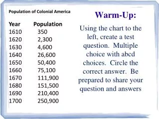
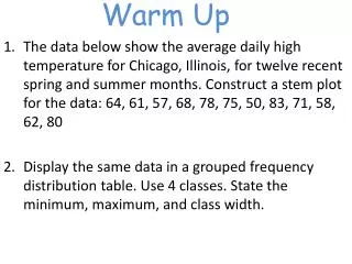
Warm Up The data below show the average daily high temperature for Chicago, Illinois, for twelve recent spring and summer months. Construct a stem plot for the data: 64, 61, 57, 68, 78, 75, 50, 83, 71, 58, 62, 80 Display the same data in a grouped frequency distribution table. Use 4 classes. State the minimum, maximum, and class width.
Lesson 6: Histograms We know how to organize the data into different types of frequency distributions. The next step is to take that info and create a histogram with it.
Examples Get out your Worksheet 1.4 #1.
Constructing a Histogram Step 1: Draw and label the x- and y-axes. Step 2: Represent the frequencies on the y-axis Represent the class limits on the x-axis Step 3: Draw vertical bars using the frequencies as the heights
Example #2
Example #3
Example #4
Example #5
Histogram Shape There are five main shape distinctions: Symmetric Skewed left Skewed right Uniform Bimodal
Histogram Shape Go back to Worksheet 1.4 Determine which shape distinction each of the previous work problems. #1 #2 #3 #4 #5
Figure 2.10-pg.54 The distribution of number of engineering doctorates earned by minority students at 115 universities over a 5-year period.
Ticket Out The Door On a 3x5 card please write the (approximate) number of texts you sent yesterday.
Homework Histograms Worksheet