Download
1 / 40
400 likes | 435 Vues
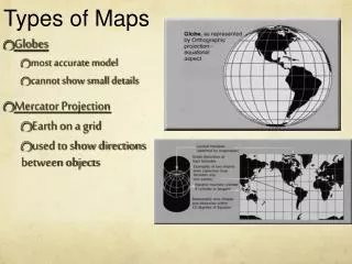
Types of Maps. How maps show data. A Cartographers job (a mapmaker) is to take information from images of the real world and transpose or convert them onto a human-made map. The Cartographer can then add or remove, complicate or simplify the information.

E N D
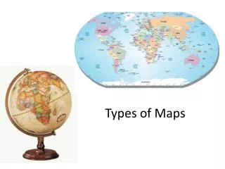
Types of Maps How maps show data
A Cartographers job (a mapmaker) is to take information from images of the real world and transpose or convert them onto a human-made map. The Cartographer can then add or remove, complicate or simplify the information. It all depends on who is audience is going to be.
This is an aerial photo of the Boston-Quincy area. The Cartographer can now create a MAP!
Let’s now look at the many kind of Maps we as Geographers can use, create and analyze. • This slide show will end with a brief look at the Geo-technology of Maps - in other words: • REMOTE SENSING • GPS • GIS
Reference Maps • Also known as General Purpose Maps. The above is a simple road map of downtown Toronto
Thematic Maps Quantitative – the darker the colour the higher the population change
Choropleth Maps- this is another name for a Quantitative Thematic Map • Data shown per enumeration area
Thematic Maps Qualitative – Soil types in Canada
Isoline (Isometric) Maps July January Average Temperatures in Ontario
Proportional (Graduated) Circle Maps Population of Males 0-14 by Province
Cartograms Total World Population – Click here to see some more interesting Cartograms.
Statistical Maps RCMP Service Locations in Canada
Stereographic Aerial Photos Sand Dunes in Algeria
Maps with Mistakes! Find the Mistake Human Geography - Canadian Edition, McGraw-Hill, by Fellmann and Getis, 2007, Page 213
Below is an example of an AP multiple choice exam question using a Thematic (Dot) map. The shaded areas in the map above illustrate the distribution of a. cattle b. cotton c. rice d. tobacco e. sheep
GPS - Global Positioning Systems Using Satellites to Triangulate your position on Earth.
Remote Sensing All humans can very little of the electromagnetic spectrum. Remote Sensing uses special scanners (in satellites) and sensors to ‘see’ more of the spectrum.
This is an infrared image of the Mississippi river. Infrared senses ‘heat’. The redder the objects the healthier - if it is vegetation.
Remote Sensing create images with colours that we are not accustomed to seeing on a map - these images are called False Colour Images
Discuss - Active And Passive Sensors
False Colour Image of Niagara Falls On the top portion of the image (predominantly red), the various towns and cities (in fact most unvegetated areas) are shown in a light blue to white tone. Vegetated areas are depicted in shades of red, depending on the type of vegetation, its health and its density. Water is dark blue to black, except where strong sedimentation exists, resulting in a light blue colour. Those agricultural fields which have little or no crops showing at this early June date, are represented in mottled green tones. The mottling is due mostly to variations in moisture in the surface layers. In the other band/colour combination shown on the bottom portion of the image, the representation of surface features is markedly different. The wood lots show up in a brownish-orange colour and can often be identified by their irregular outline (as opposed to farm fields with their sharp rectangular shapes). The bare fields are grey-blue.
Dust blowing over Morocco. Topographic map of Australia constructed from radar data
GIS - Geogragphic Information System GIS is fancy for desktop mapping. The ability to create layers and to add data to any point on a map has made GIS extremely valuable. Your teacher will explain GIS in more detail.
Geo-stationary orbit - the satellite matches the orbit of the earth taking the same picture all the time. Mostly Weather Satellites. Near Polar Orbit - the satellite orbits over the poles while the earth rotates underneath it. Can map the entire earth. Most Satellites are Near Polar and most images are taken by these satellites.