Learn Data Analysis with Bar Graphs and Histograms
Discover how to create, interpret, and analyze data using bar graphs and histograms. Learn to find mean, median, mode, and range. Practice with fun quizzes and examples. Improve your graphing skills with engaging lessons.


Learn Data Analysis with Bar Graphs and Histograms
E N D
Presentation Transcript
Warm Up Problem of the Day Lesson Presentation Lesson Quizzes
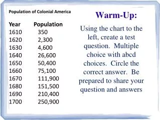
Warm Up Find the mean, median, mode, and range for the data set. 35, 45, 53, 27, 66, 36, 24, 53, 48 43; 45; 53; 42
Problem of the Day Which number does not belong with the others? Why? 81, 64, 36, 27, 49 Possible answer: 27; the others are perfect squares.
Learn to display and analyze data in bar graphs and histograms.
Vocabulary bar graph double-bar graph histogram
Hundreds of different languages are spoken around the world. The graph shows the numbers of native speakers of four languages. A bar graph can be used to display and compare data. The scale of a bar graph should include all the data values and be easily divided into equal intervals.
Additional Example 1A: Interpreting a Bar Graph Use the bar graph to answer the question. Which language has the fewest native speakers? The bar for Spanish is the shortest, so Spanish has the fewest native speakers.
Additional Example 1B: Interpreting a Bar Graph Use the bar graph to answer the question. About how many more people speak Hindi than Spanish? About 50 million more people speak Hindi than speak Spanish.
Check It Out: Example 1A Use the bar graph to answer the question. Which fruit was eaten the most? The bar for bananas is the longest, so bananas were eaten the most.
Check It Out: Example 1B Use the bar graph to answer the question. About how many more pounds of apples than pounds of grapes were eaten per person? About 10 pounds more apples were eaten than grapes per person.
You can use a double-bar graph to compare two related sets of data.
State Urban Rural Florida 65 mi/h 70 mi/h Texas 70 mi/h 70 mi/h Vermont 55 mi/h 65 mi/h Additional Example 2: Making a Double-Bar Graph The table shows the speed limits of three states on interstate highways. Make a double-bar graph of the data. Step 1: Choose a scale and interval for the vertical axis. 80 60 40 20 0
80 60 40 20 0 State Urban Rural Florida 65 mi/h 70 mi/h Texas 70 mi/h 70 mi/h Vermont 55 mi/h 65 mi/h Additional Example 2 Continued Step 2: Draw a pair of bars for each state’s data. Use different colors to show urban and rural speed limits.
80 60 40 20 0 State Urban Rural Florida 65 mi/h 70 mi/h Texas 70 mi/h 70 mi/h Vermont 55 mi/h 65 mi/h Additional Example 2 Continued Step 3: Label the axes and give the graph a title. Speed Limit on Interstate Roads Speed Limit (mi/h) TX FL VT States
80 60 40 20 0 State Urban Rural Florida 65 mi/h 70 mi/h Texas 70 mi/h 70 mi/h Vermont 55 mi/h 65 mi/h Additional Example 2 Continued Step 4: Make a key to show what each bar represents. Speed Limit on Interstate Roads Speed Limit (mi/h) TX FL VT States Urban Rural
Pet Class A Class B Dog 12 14 Cat 9 8 Bird 2 3 Check It Out: Example 2 The table shows the number of pets owned by students in two classes. Step 1: Choose a scale and interval for the vertical axis. 16 12 8 4 0
16 12 8 4 0 Pet Class A Class B Dog 12 14 Cat 9 8 Bird 2 3 Check It Out: Example 2 Continued Step 2: Draw a pair of bars for each pet’s data. Use different colors to show class A and class B.
16 12 8 4 0 Pet Class A Class B Dog 12 14 Cat 9 8 Bird 2 3 Check It Out: Example 2 Continued Step 3: Label the axes and give the graph a title. Pets Owned in Two Classes Number of pets Cat Bird Dog Pets
16 12 8 4 0 Pet Class A Class B Dog 12 14 Cat 9 8 Bird 2 3 Check It Out: Example 2 Continued Step 4: Make a key to show what each bar represents. Pets Owned in Two Classes Number of pets Cat Bird Dog Pets Class A Class B
A histogram is a bar graph that shows the frequency of data within equal intervals. There is no space between the bars in a histogram.
Number of Hours of TV 1 // 2 //// 3 //// //// 4 //// / 5 //// /// 6 /// 7 //// //// 8 /// 9 //// Frequency Number of Hours of TV Additional Example 3: Making a Histogram The table below shows the number of hours students watch TV in one week. Make a histogram of the data. Step 1: Make a frequency table of the data. Be sure to use equal intervals. 1–3 15 17 4–6 7–9 17
Frequency Number of Hours of TV 1–3 15 17 4–6 7–9 17 Additional Example 3 Continued Step 2: Choose an appropriate scale and interval for the vertical axis. The greatest value on the scale should be at least as great as the greatest frequency. 20 16 12 8 4 0
Frequency Number of Hours of TV 1–3 15 17 4–6 7–9 17 Caution! Because the intervals are equal, all of the bars should have the same width. Additional Example 3 Continued Step 3: Draw a bar graph for each interval. The height of the bar is the frequency for that interval. Bars must touch but not overlap. 20 16 12 8 4 0
Frequency Number of Hours of TV 1–3 15 17 4–6 7–9 17 Additional Example 3 Continued Step 4: Label the axes and give the graph a title. Hours of Television Watched 20 16 12 8 4 0 Frequency 7–9 1–3 4–6 Hours
Number of Hats Owned Frequency 1 // 2 //// 3 //// / 4 //// / 5 //// /// 6 //// 7 //// / 8 //// //// 9 //// //// Frequency Number of Hats Owned Check It Out: Example 3 The table below shows the number of hats a group of students own. Make a histogram of the data. Step 1: Make a frequency table of the data. Be sure to use equal intervals. 1–3 12 18 4–6 7–9 24
Frequency Number of Hats Owned Check It Out: Example 3 Continued Step 2: Choose an appropriate scale and interval for the vertical axis. The greatest value on the scale should be at least as great as the greatest frequency. 30 25 20 15 10 5 0 1–3 12 18 4–6 7–9 24
Frequency Number of Hats Owned Check It Out: Example 3 Continued Step 3: Draw a bar graph for each interval. The height of the bar is the frequency for that interval. Bars must touch but not overlap. 30 25 20 15 10 5 0 1–3 12 18 4–6 7–9 24
Frequency Number of Hats Owned Check It Out: Example 3 Continued Number of Hats Owned Step 4: Label the axes and give the graph a title. 30 25 20 15 10 5 0 Frequency 1–3 12 18 4–6 7–9 24 7–9 1–3 4–6 Number of Hats
Lesson Quizzes Standard Lesson Quiz Lesson Quiz for Student Response Systems
Lesson Quiz: Part I Use the bar graph at the top of the Guided Practice to answer each question. 1. Which fruit was eaten the most? 2. About how many more pounds of oranges t than pounds of grapes were eaten per t person? Bananas about 5 or 6 lbs
Average Number of Laps Run 16 12 8 4 0 Number of Laps 1995 1990 2000 Boys Girls Lesson Quiz: Part II 3. Make a double-bar graph of the data in the table.
Number of Laps Run 8 6 4 2 0 Number of Students 0–4 5–9 15–19 10–14 Number of Laps Lesson Quiz: Part III 4. The list shows the number of laps students ran one day. Make a histogram of the data. 4, 7, 9, 12, 3, 6, 10, 15, 12, 5, 18, 2, 5, 10, 7, 12, 11, 15
Lesson Quiz for Student Response Systems 1. A professor conducts a study to find out television programs that people prefer to watch. The bar graph shows the findings of the survey.About how many more people prefer comedy shows than sports? A. about 5 B.about 10 C. about 15 D. about 20
Lesson Quiz for Student Response Systems 2. The bar graph shows the number of books of each kind sold in a shop in a day. About how many more books on computers than sports were sold? A. about 10 B.about 15 C. about 20 D. about 30
Lesson Quiz for Student Response Systems 3. The table shows the population of male and female tigers in a sanctuary for three years. Identify a double-bar graph of the data in the table. A. B.