Histograms
Histograms. We are learning to…create and analyze histograms and identify misleading graphs. Definition. A Histogram is a graphical display of data using bars of different heights. How does a histogram differ from a bar graph?. There are 2 main differences between a histogram and bar graph

Histograms
E N D
Presentation Transcript
Histograms We are learning to…create and analyze histograms and identify misleading graphs.
Definition • A Histogram is a graphical display of data using bars of different heights.
How does a histogram differ from a bar graph? • There are 2 main differences between a histogram and bar graph • 1. There is no space between the bars in a histogram. • 2. A histogram uses intervals
Histograms vs. Bar Graphs • Many people confuse histograms with a bar graph. • A histogram looks very similar to a bar graph. There are two big differences between a histogram and a bar graph. • A bar graph compares items in categories while a histogram displays one category broken down into intervals. For example: • A bar graph would compare…the number of apples, to the number of oranges, to the number of bananas at a grocery store. • A histogram would compare…the number of people who eat 0-4 apples a week, to the number that eat 5-9, to the number who eat 10-14.
Histograms vs. Bar Graphs • The bars on a histogram touch. The bars found on a bar graph do not touch. • Why do you think that the bars will touch on a histogram? • It will make intervals of data easier to compare.
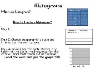
Frequency Chart • A Frequency Chart is a table that breaks data down into equal intervals and then counts the amount data in each interval. • A Frequency Chart is often used to sort a list of data to make a Histogram. • Make a Frequency Chart to display the data below: 90, 85, 78, 55, 64, 94, 68, 83, 84, 71, 74, 75, 99, 52, 98, 84, 73, 96, 81, 58, 97, 75, 80, 78 6 7 2 3 6
Creating a Histogram Don’t forget little things…like labels and equal intervals! 10 Math Test Scores 8 6 Frequency 4 2 90-99 80-89 50-59 70-79 60-69 100-109 Test Scores
Misleading Histograms • What does it the word “misleading” mean? • Deceptive or intentionally create a false impression. • Misleading Histograms.xls • Types of Misleading Histograms • Combing Intervals: The amount of data in each interval can make a histograms look different. • Stretched Graphs: Graphs might be stretched vertically so that data looks larger. • Excluded Intervals: Intervals may be skipped on the x or y-axis to make the data look smaller.

