Choosing the Right Graph for Data Representation: A Guide for Effective Communication
150 likes | 361 Vues
In this lesson, you will learn how to choose the most appropriate graph to display different types of data effectively. Understanding when to use bar graphs, line graphs, and pictographs is essential for clear communication. Bar graphs are ideal for comparing totals in distinct categories, while line graphs suit ordered numerical data such as years. Pictographs add visual appeal. Engage in practice exercises to apply your knowledge and determine the best graphical representations for various datasets. Explore the Arizona State Standard guidelines for a deeper understanding.

Choosing the Right Graph for Data Representation: A Guide for Effective Communication
E N D
Presentation Transcript
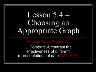
Lesson 5.4 – Choosing an Appropriate Graph Arizona State Standard: … Compare & contrast the effectiveness of different representations of data S2C1PO4
Guidelines for selecting the correct graph to display data. • Use a bar graph when the data fall into distinct categories and you want to compare totals. • Use a line graph when the categories have a numerical order, such as a sequence of years. • Use a pictograph instead of a bar graph when you want a high visual appeal REFER TO HANDOUT
Try it! • You take a survey to find out how much walking people do while at work. The results are shown below. • What is the best graph to display this data?
Example #2 – What is the best graph to represent the following data?
Let’s Practice! • Page 222 • # 1 - 4
1. How many more mi. per day do police officers walk than mail carriers? ANS: 2.4
2. In which occupation do people walk half the distance per day that police officers do? ANS: retail salesperson
4. Which is the least popular suit color for women? ANS: Brown-women Red - men
HOMEWORK • Page 222 • # 5 – 13 ALL