Download
1 / 37
370 likes | 388 Vues
Learn how to organize and visualize data using bar graphs, line plots, and histograms. Explore concepts such as frequency tables and distributions.

E N D
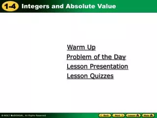
Warm Up Problem of the Day Lesson Presentation Lesson Quizzes
Do Now Create a bar graph of the data. Favorite rides at fair: Ferris wheel = 5, Loop the loop = 4, Merry-go-round = 3, Bumper cars = 7, Sit and spin = 9
Objective: SWBAT organize data in line plots, frequency tables, and histograms.
Vocabulary frequency frequency table line plot histogram
The frequency of a data value is the number of times it occurs. A frequency table tells the number of times an event, category, or group occurs.
whorl loop whorl loop arch arch loop whorl loop arch whorl arch arch whorl arch loop Ex. 1: Using Tally Marks to Make a Frequency Table Students in Mr. Ray’s class recorded their fingerprint patterns. Which type of pattern do most students in Mr. Ray’s class have? Make a table to organize the data.
Reading Math A group of four tally marks with a line through it means five. t llll = 5 llll llll = 10
whorl loop whorl loop arch arch loop whorl loop arch whorl arch arch whorl arch loop Number of Fingerprint Patterns Whorl Arch Loop Ex. 1 Continued Students in Mr. Ray’s class recorded their fingerprint patterns. Which type of pattern do more students in Mr. Ray’s class have? Step 1: Make a column for each fingerprint pattern. Step 2: For each fingerprint, make a tally mark in the appropriate column. Most students in Mr. Ray’s class have an arch fingerprint. l l l l l l l l l l l l l
Number of Fingerprint Patterns Whorl Arch Loop Class Example Students in Ms. Turant’s class recorded their fingerprint patterns. Which type of pattern do more students in Mr. Santos’s class have? Step 1: Make a column for each fingerprint pattern. Step 2: For each fingerprint, make a tally mark in the appropriate column.
A line plot uses a number line and x’s or other symbols to show frequencies of values.
Tennis Balls Collected 10 14 11 16 11 10 14 10 15 15 10 11 5 6 7 8 9 10 11 12 13 14 15 16 Example 2: Making a Line Plot Students collected tennis balls for a project. The number of balls collected by the students is recorded in the table. Make a line plot of the data. Step 1: Draw a number line. x x x x x x x x x x x Step 2: For each tennis ball, use an x on the number line to represent how many were collected. x
Fill in the frequency table. 1. Hockey players voted for a team name. The results are shown in the box. Which name got the fewest votes? 2.) Make a line plot of the data.
Pages Read Last Weekend 12 15 40 19 7 5 22 34 37 18 Ex. 3: Making a Frequency Table with Intervals Use the data in the table to make a frequency table with intervals.
Pages Read Last Weekend Number 1–10 11–20 21–30 31–40 Frequency Ex. 3 Continued Use the data in the table to make a frequency table with intervals 2 4 1 3 Step 1: Choose equal intervals. Step 2: Find the number of data values in each interval. Write these numbers in the “Frequency” row.
TOYO 1 • Use the data in the box below to complete the frequency table with intervals.
A histogram is a bar graph that shows the number of data items that occur within each interval.
Ex. 4: Making a Histogram Use the “Hockey” frequency table to make a histogram. Step 1: Title the graph and label the axes. Frequency Step 2: Choose an appropriate scale and interval. Step 3: Draw a bar for the number of students in each interval. The bars should touch but not overlap. Intervals
Class Example Use the data in the table to make a frequency table with intervals.
Number of Hours Spent Watching T.V. (Daily) Number Frequency Class Example Continued Use the data in the table to make a frequency table with intervals. Step 1: Choose equal intervals. Step 2: Find the number of data values in each interval. Write these numbers in the “Frequency” row.
Class Example Use the frequency table in our previous Class Example (TV Hours) to make a histogram. Step 1: Title the graph and label the axes. Step 2: Choose an appropriate scale and interval. Step 3: Draw a bar for the number of students in each interval. The bars should touch but not overlap.
Class Example Use the data in the table to make a frequency table with intervals.
Number of Hours Spent on the Computer (Daily) Number Frequency Class Example Continued Use the data in the table to make a frequency table with intervals. Step 1: Choose equal intervals. Step 2: Find the number of data values in each interval. Write these numbers in the “Frequency” row.
Objective: SWBATdescribe and compare data distributions by their center, spread, and shape, using box-and-whisker plots or dot plots.
Frequency distributions are categorized by their general shape. Shapes of a Distribution
Ex. 1: Displaying Distributions on Dot Plots A. The data set and dot plot display heart rate data. Describe the shape of the data distribution. 85, 84, 83, 82, 85, 80, 84, 90, 87, 85, 86, 88, 86, 85 The data is symmetrical about the center. It shows a normal shape of distribution.
Do Now 1.) Make a dot plot of the grades in Ms. Lee’s class. 2.) Describe the shape of distribution.
Ex. 2 B. The data set and dot plot display students’ quiz scores. Describe the shape of the data distribution. 10, 8, 7, 9, 10, 9, 9, 7, 8, 9, 6, 8 The data is skewed because it is not symmetrical about the center. The mean, median, and mode are varied.
Class Example The data set and dot plot display the shoe sizes of each student has in Mr. Santos’s class. Describe the shape of the data distribution. 1 2 3 4 5 6 7 8 9 10
Ex. 3: Displaying Distributions on Box-and-Whisker Plots A. The data set and box-and-whisker plot display the weights in kilograms of 12 cats. Describe the shape of the data distribution. 5, 2, 6, 4, 6, 3, 4, 9, 3, 5, 3, 4 The data is skewed. The mean, median, and mode are varied. I can tell because the median is not in the center of the box and the whiskers are different sizes.
TOYO 1 The data set and box-and-whisker plot display the number of pets that several students in Ms. Snow’s class own. Describe the shape of the data distribution. 9, 0, 4, 1, 1, 2, 3, 5, 2 The data is skewed. I can tell because the median is not in the center of the box and the whiskers are different sizes.
TOYO 2 The data set and box-and-whisker plot display the number of pets that several students in Mr. Miller’s class own. Describe the shape of the data distribution. 3, 4, 3, 10, 8, 2, 9, 6, 9
Class Example The data set display the age in months of each student in Mr. Santos’s class. Make a box-and-whisker plot and describe the data distribution.
Do Now 2. The data set and box-and-whisker plot display the number of seconds it takes 14 sports cars to reach a speed of 60 miles per hour. Describe the shape of the data distribution. 1. The data set and dot plot display the number of pets owned by 14 children. Describe the shape of the data distribution.
Ex. 5: Comparing Distributions using Box-and-Whisker Plots The box-and-whisker plots show the distribution of cars sold each day on two lots in a month. What conclusions can you make about the data? In general, more cars were sold each day in Lot A than in Lot B. The spread of the data is greater for Lot B, which means that there is more variation in the data.
TOYO 3 The box-and-whisker plots show the distribution of cars sold each day on two lots in a month. What conclusions can you make about the data? In general, more cars were sold each day in Lot B than in Lot A. The spread of the data is greater for Lot B, which means that there is more variation in the data.